
2025 Wallpaper Color & Light Matcher
Select your room's primary light source and the mood you want to create to see the recommended 2025 wallpaper palette.
1. Room Conditions
Recommended Palette
Select options above to generate recommendations.
2025 Trend Categories
| Trend Category | Key Colors | Best For | Mood |
|---|
You’re staring at a wall that feels too beige or too stark. You want change, but you’re terrified of picking a shade that looks dated by next spring. Here’s the truth: 2025 wallpaper color trends aren’t about bold, screaming statements anymore. They’re about depth, texture, and colors that feel like they’ve been there forever, even if you just hung them yesterday.
The shift away from the sterile "greige" era is complete. We are moving into a period where interiors feel grounded, organic, and slightly mysterious. If you’re planning to refresh your space with wallpaper, understanding these shifts isn’t just about style-it’s about creating a room that supports your mental state. Let’s break down exactly what’s hitting the market in 2025 and how to use it without turning your home into a showroom.
The Shift from Cool to Warm Earth Tones
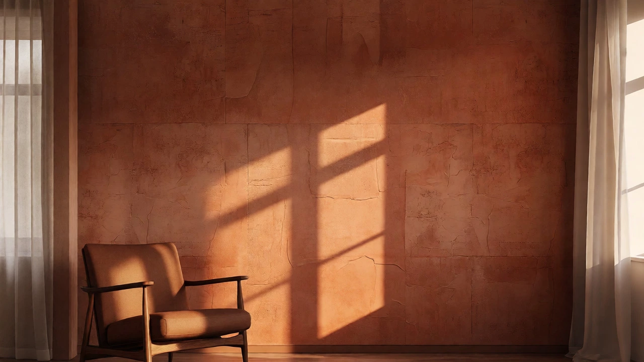
For the last decade, cool grays dominated. In 2025, the pendulum has swung hard toward warmth. But don’t confuse this with the yellowed oranges of the 1970s. This is sophisticated warmth. Think terracotta, clay, ochre, and deep browns. These colors work exceptionally well on textured wallpapers because they mimic natural materials like mud brick or aged wood.
Why does this matter? Warm colors lower visual tension. When you walk into a room painted in Terracotta a reddish-brown earth pigment, your brain registers safety and comfort. It’s primal. If you choose a flat, matte finish for these tones, the effect is calming. If you go for a slight sheen, it adds a touch of luxury. For small rooms, stick to lighter variations of these earth tones, like sand or pale clay, to avoid shrinking the space visually.
Moody Greens and Botanical Depth
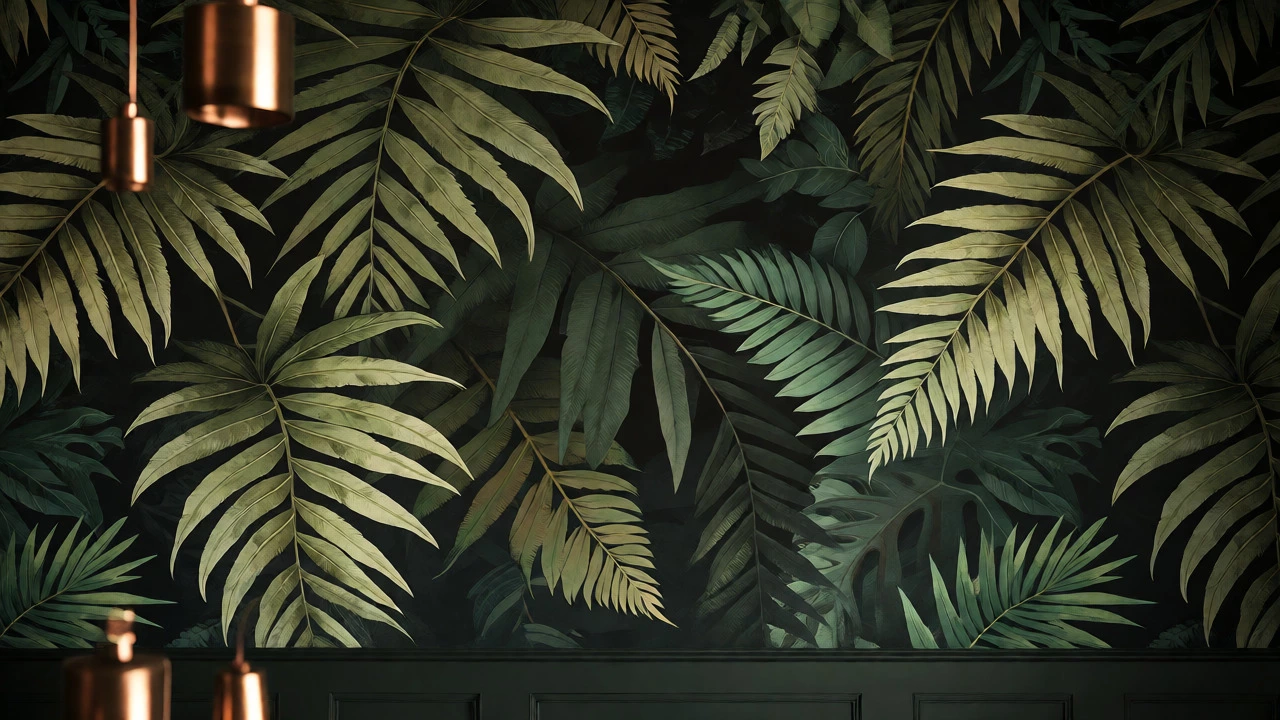
Green hasn’t left the trend cycle; it has evolved. We are seeing a move away from bright lime or mint toward Forest Green a dark, saturated shade of green reminiscent of dense foliage and olive. These shades pair beautifully with metallic accents like brass or copper, which are also surging in popularity.
Botanical patterns remain strong, but the execution is different. Instead of cartoonish leaves, look for realistic, detailed illustrations or abstract interpretations of plant life. A wallpaper featuring large, overlapping fern fronds in deep emerald creates an immersive experience. It turns a plain wall into a window into nature. This trend works best in dining rooms or studies where you want to encourage conversation or focus, respectively. Avoid using dark greens in rooms with minimal natural light unless you have strong artificial lighting to compensate.
| Trend Category | Key Colors | Best Room Application | Mood Effect |
|---|---|---|---|
| Warm Neutrals | Clay, Ochre, Beige-Brown | Living Rooms, Bedrooms | Grounding, Comfortable |
| Moody Naturals | Forest Green, Slate Blue | Dining Rooms, Studies | Focused, Intimate |
| Soft Pastels | Lavender, Sage, Dusty Pink | Kitchens, Kids' Rooms | Calm, Airy |
| Deep Jewel Tones | Burgundy, Indigo | Accent Walls, Bars | Dramatic, Luxurious |
The Return of Soft Pastels with a Twist
Pastels often get a bad rap for looking childish. Not in 2025. The new pastel trend involves muted, dusty versions of traditional hues. Lavender, sage green, and dusty rose are leading the charge. The key here is saturation-or rather, the lack of it. These colors are grayed out, giving them a vintage, timeless quality.
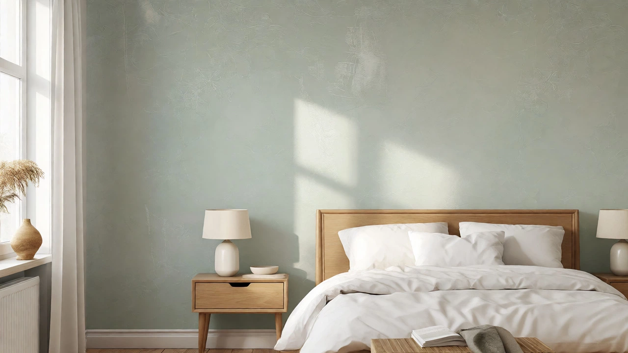
This trend is perfect for spaces where you need to decompress. A bedroom wrapped in Sage Green a soft, grayish-green hue associated with tranquility wallpaper promotes restful sleep. Unlike stark white, which can feel clinical, these soft tones provide a gentle backdrop that doesn’t compete with your furniture. Use these colors in smaller doses if you’re worried about them feeling overwhelming. An accent wall behind the bed or a feature niche in the living room is a safe entry point.
Texture as a Color Component
Here is something most people miss: in 2025, texture is part of the color story. Flat prints are taking a backseat to wallpapers with tactile elements. Embossed patterns, grasscloth, and vinyl textures that mimic plaster or fabric change how we perceive color. A beige wallpaper with a rough, plaster-like texture reads differently than a smooth, glossy beige print. The former feels rustic and handmade; the latter feels industrial.
When choosing your wallpaper, run your hand over the sample. Does it have depth? Does it catch the light? Textured wallpapers interact with sunlight throughout the day, shifting in appearance from morning to evening. This dynamic quality keeps a room interesting without needing frequent redecorating. Grasscloth, in particular, brings a natural fiber element that aligns perfectly with the broader biophilic design movement sweeping through homes.
How to Choose the Right Shade for Your Light
Color is relative. It depends entirely on the light source. Before you buy rolls of wallpaper, order samples. Hang them on the wall you plan to cover. Look at them at three times: morning (cool daylight), afternoon (warm daylight), and night (artificial bulb light).
- North-facing rooms: Receive cool, indirect light. Warm earth tones like clay or ochre will counteract the chilliness.
- South-facing rooms: Get abundant warm sunlight. Cool tones like slate blue or sage green will balance the heat.
- East-facing rooms: Bright in the morning, dimmer later. Soft pastels work well here, maintaining brightness without glaring.
- West-facing rooms: Hot, golden light in the evenings. Deep jewel tones or rich greens absorb this intensity beautifully.
Ignoring this step is the number one reason DIY wallpaper projects fail. A color that looks perfect in the store might turn muddy or neon under your specific lighting conditions. Always test before you commit.
Pairing 2025 Colors with Existing Furniture
You don’t need to throw out your sofa to embrace these trends. The beauty of modern wallpaper palettes is their versatility. Warm neutrals pair effortlessly with mid-century modern wood tones. Moody greens complement velvet upholstery and leather pieces. Soft pastels look fresh against white marble or light oak.
If your furniture is already bold, let the wallpaper recede. Choose a tone-on-tone pattern or a subtle texture in a neutral shade. If your furniture is neutral, let the wallpaper be the star. Go for a larger scale pattern or a deeper, more saturated color. The goal is balance. You want the eye to travel around the room smoothly, not jump erratically between competing focal points.
Are dark wallpapers still trendy in 2025?
Yes, but they are used strategically. Dark wallpapers like forest green, navy, or charcoal are popular for powder rooms, studies, and accent walls. They create intimacy and drama. However, they require good lighting to prevent the space from feeling cave-like. Pair them with metallic fixtures or light-colored furniture to maintain contrast.
What is the biggest mistake people make with 2025 color trends?
The biggest mistake is ignoring lighting conditions. A color swatch looks different under fluorescent store lights than it does in your home's natural light. Another common error is choosing a trend color that clashes with fixed elements like flooring or countertops that cannot be changed. Always coordinate with permanent fixtures first.
Do textured wallpapers show dirt more easily?
Textured wallpapers, such as grasscloth or embossed vinyl, can trap dust and are harder to clean than smooth surfaces. In high-traffic areas or rooms prone to splashes (like kitchens), opt for washable vinyl textures rather than delicate paper-based grasscloths. Regular vacuuming with a brush attachment helps maintain their appearance.
Is gray completely out of style for 2025?
Gray isn't gone, but its role has changed. Stark, cool grays are fading. Warm grays, taupe, and greige are still relevant, especially when mixed with other earth tones. Gray serves better now as a background or secondary color rather than the dominant wall color. It provides neutrality without the coldness of previous years.
How long do wallpaper trends typically last?
Classic styles like simple geometric patterns or solid earth tones tend to stay stylish for 5-10 years. Bold, novelty prints may feel dated within 3-5 years. To future-proof your choice, lean towards textures and classic color families rather than fleeting fads. High-quality removable wallpaper is also a great option if you anticipate changing tastes sooner.