Adorning your walls with pictures can transform the entire ambiance of your home, making it feel more personal and inviting. But before you start hammering nails into the wall, it's worth considering a few key principles that can make all the difference. Hanging wall art isn’t just about putting up a pretty picture—it's about creating a cohesive look that complements the room's design.
Whether you’re opting for a single dramatic piece or a thoughtfully curated gallery wall, understanding the fundamental rules of placement and proportion will help you make the most out of your space. From the right height for hanging your pictures to achieving the perfect balance, each decision contributes to the overall harmony of your room. Read on to discover simple yet effective strategies to display your artwork as beautifully as in a professional gallery.
- Choosing the Right Height
- Spacing and Balance
- Gallery Walls vs. Single Statement Pieces
- Incorporating Personal Style
- Tips for a Flawless Finish
Choosing the Right Height
Finding the perfect height for hanging your wall art can dramatically change the way your space is perceived. This is something every homeowner or interior decorator considers at some point, as it can make the decor feel inviting or awkward. The golden rule here is to align the center of your artwork roughly at eye level, or around 57 to 60 inches from the floor. This practice, often used in museums and galleries, helps create a harmonious viewing experience by ensuring the center of most art pieces aligns with the viewer's natural sightline.
The type and arrangement of your artwork also play a role in determining the right height. Single, standalone pieces may be centered according to the room's seating or focal points, like sofas or fireplaces. Conversely, when you're designing a gallery wall, it isn't just about maintaining a consistent height; it’s about maintaining a consistent sense of style and unity in layout. By organizing the wall art in lines or curves that guide the eye seamlessly, one can create an engaging display that effortlessly draws attention.
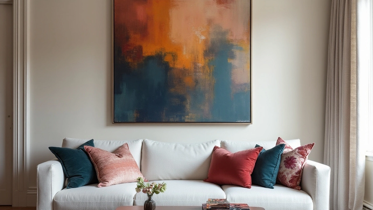
When hanging art above furniture, such as sofas or beds, a good rule of thumb is to position the bottom of the frame around 8 to 10 inches above the top of the furniture. This spacing maintains a visual connection between the furniture and the art, preventing a gap that feels disconnected. Granted, you might occasionally want to play with these guidelines, letting your artistic expression or particular room dynamics override standard practices.
"The rule of thumb for hanging art is to ensure that it feels like part of the room," suggests interior designer Jonathan Adler. “It should complement, not compete with, the other elements in your space."
Remember that personal preference and the unique attributes of your living space should be considered. Ceiling height, room size, and lighting can all influence your decision. In rooms with lower ceilings, hanging art slightly higher can give an impression of greater height, opening up the space visually. Conversely, high ceilings offer more freedom to experiment with larger formats or multi-tiered arrangements that fill the vertical space elegantly.
While these basics are tried and tested, allowing for flexibility can often lead to more visually inspiring environments. Ultimately, your wall art is a reflection of who you are and should resonate with your personal taste. So, don’t be afraid to test the boundaries of conventional design wisdom. As long as your art complements your space and brings you joy, that’s what truly matters.
Spacing and Balance
When it comes to hanging wall art, achieving the perfect balance and spacing is both an art and a science. It’s not just about the pictures themselves, but how they interact with everything else in the room. Start by considering the size of your wall and the furniture that sits against it. A general rule of thumb is to leave around 4 to 6 inches between the bottom of the artwork and the top of a piece of furniture below it. This helps to visually ‘anchor’ your art to the room rather than let it float awkwardly. The centerline of your art should ideally sit at eye level, generally around 57 to 60 inches from the floor, but this can vary depending on the average height of the people in your household or your guests.
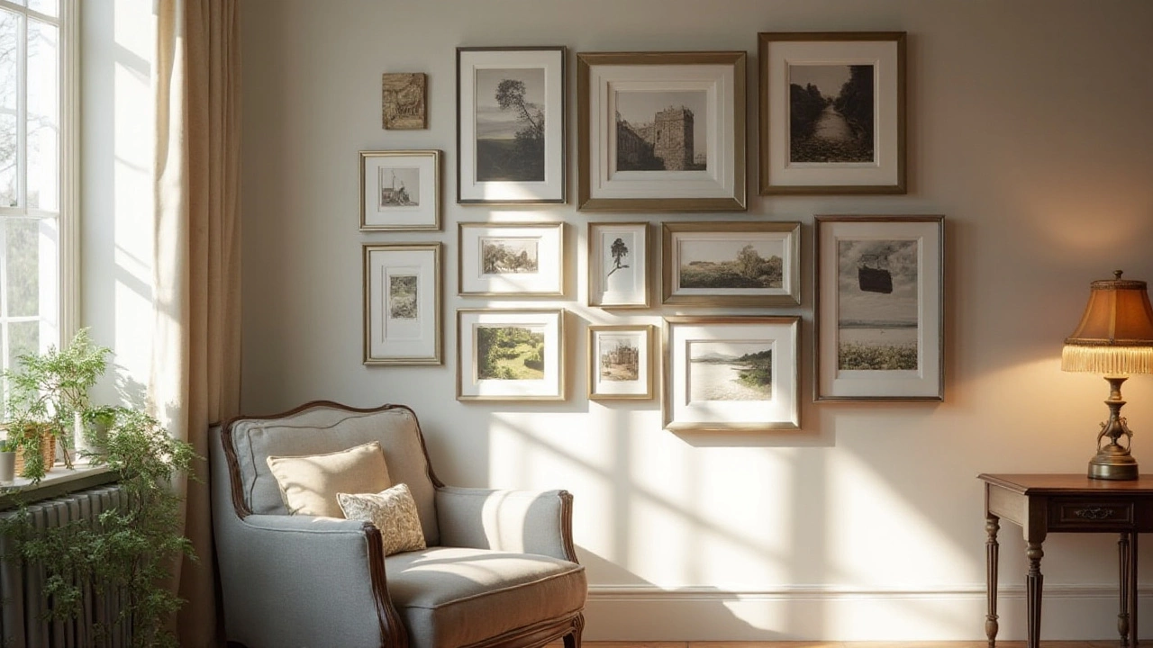
Spacing between multiple pieces of artwork is crucial to keeping a cohesive look. If you’re creating a gallery wall, try maintaining a uniform space of 2 to 3 inches between each frame, depending on their size. This consistency makes your arrangement appear neat and deliberate, rather than haphazard. If you’re going for a more eclectic look, some varied spacing can work, but keep some consistency to avoid visual chaos. The rule of thirds can also be applied here—imagine your wall as a grid and structure your art along these lines to create visual interest.
An often overlooked aspect of picture hanging is the room’s natural light, which can influence both the appearance of the art and the mood of the room. Hanging art near windows can mean fluctuating light sources throughout the day, so it might be wise to choose spots that have consistent lighting to ensure your art shines all day long. Consider shadows and reflections that might impact how your art is viewed. According to interior design expert Nate Berkus, "The right art on the right wall can dramatically change the feeling of a room from stark to welcoming." Remember, the aim is to create harmony within the space.
Tips for Achieving Balance
When organizing multiple frames, always step back and assess from a distance to ensure that your arrangement feels balanced. Using kraft paper cutouts the same size as your frames helps in visualizing the layout without causing damage to your walls. Don’t be afraid to mix shapes and sizes—in fact, varied dimensions can inject personality into a room. Just ensure there's a visual flow, often achieved by aligning the tops, bottoms, or centers of your frames. This creates a line for the eye to follow, bringing a sense of order. For those unsure about where to start, investing in online tools or apps that allow you to arrange art virtually might offer reassurance before committing to hammer and nails.
Ensuring that your pictures are level is critical to the balance of your wall. Using a laser level can ensure your artwork remains straight, offering a polished look. For a comprehensive look, adjust so that the most visually heavy piece acts as the focal point and is placed at eye level or slightly off-center for a dynamic approach. Balance doesn't mean symmetry—it simply means your artwork should feel evenly distributed, with no corners heavier than others.

Gallery Walls vs. Single Statement Pieces
The choice between creating a gallery wall or opting for a single statement piece often depends on the aesthetic you're aiming to achieve and the dynamics of the space available. A gallery wall is like an evolving art story that you get to both curate and narrate. It can showcase a range of styles, from personal photos to eclectic collections, and gives you the latitude to play with scale and theme. Imagine entering a room where every wall segment has something unique to contribute, yet together they create a unified visual dialogue. It's a fantastic way to keep the eye moving around the room, and it's perfect for those who love variety or have a large collection of art to display. The trick is to maintain coherence through elements like frame color or art style.
On the other hand, a single, bold piece of wall art has its charm. This approach is exemplary for those who prefer simplicity or have a masterpiece that deserves to shine without competition. A well-chosen statement piece can define the whole tone of a room. It has the power to anchor the decor, catch attention, and even become a room's signature element. Consider the psychological aspect; sometimes a lone piece becomes a focal conversation starter. You’ll want this art to be at eye level for a strong and noticeable impact. According to some interior designers, such as Nate Berkus, fewer, larger pieces can sometimes be more powerful than a collection of smaller ones. Berkus suggests, "If you love something, hang it. Art should fill a wall, whether it's floor to ceiling or a single dramatic piece."
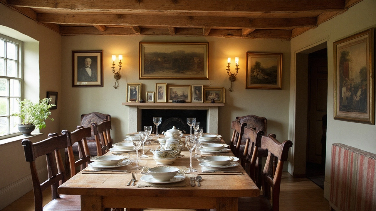
When it comes to choosing between these two styles, think about the room's function and personality. A gallery wall might feel more informal and evolving, often suited to spaces like living rooms or hallways. It might reflect numerous aspects of your personality or tell a story of places you've traveled. Conversely, a single piece might fit a formal dining area or offices where you'd want to evoke a specific feel without much distraction. It’s not uncommon, though, to mix elements of both; perhaps a predominant piece surrounded by a few smaller complementary pieces. The most important advice is to follow your personal taste because at the end of the day, your living space should resonate with who you are.
Incorporating Personal Style
Your home decor should tell a story about who you are, and wall art is a fantastic way to do that. Choosing artwork that reflects your personal tastes and experiences allows you to express individuality in a way that is both creative and meaningful. This isn't just about aesthetics; it’s about making your space truly yours. Personal style can range from favorite art genres to pieces that capture special memories, and with every choice you make, your space becomes more unique.
Consider incorporating pieces that you've collected over time. This doesn’t necessarily mean expensive art but could include photographs from your travels, prints that resonate with you, or even your own creative work. A collage of various media can serve as a vibrant focal point on any wall. By mixing styles—like pairing modern art with vintage photos—you create a dynamic visual experience that guests will find both engaging and intriguing.
"Art enables us to find ourselves and lose ourselves at the same time." - Thomas Merton
Don't shy away from using contrasting elements when incorporating personal style; contrast will often highlight different aspects of each piece. For example, a sleek, minimalist frame can make a vivid and colorful piece pop even more. In embracing diversity on your walls, you invite a kind of playful visual tension that keeps the eyes entertained and the mind curious. Too much uniformity can become monotonous, so aim to intersperse various textures and shapes, keeping your interior design fresh and dynamic.
An interesting approach is to choose a theme that holds personal significance—like nature, abstract figures, or cultural heritage—and build your wall around it. Not only does this offer cohesion, but it also brings a deeper layer of intimacy into your home decor. You might select pieces that chronicles your personal journey or achievements, such as certificates, awards, or meaningful mementos. According to a study by the University of Texas, incorporating personal achievements in your living space has been shown to boost self-esteem and motivation. Displaying them proudly on your walls can serve as a constant reminder of how far you’ve come.
Lastly, rotating your artwork is a savvy way to keep your space fresh and exciting. Changing artwork with the seasons or for special occasions lets you experiment without making permanent decisions. This flexibility also allows you to showcase pieces that may have sentimental importance for different times of the year. Isn’t it wonderful to find new ways to see your own home? Your walls can thus become a living exhibition, constantly evolving with your tastes and experiences. By embracing a flexible and diverse array of artwork, your walls become a true reflection of you.

Tips for a Flawless Finish
A stunning piece of wall art can captivate anyone who walks into the room, but what really sets apart a remarkable presentation is in the details. To achieve that perfect finish when hanging your pictures, consider some critical yet often overlooked elements. Start by ensuring that your artwork is properly secured. This might seem obvious, but it’s vital to check that your hooks are rated to support the weight of the piece. Nothing interrupts the enjoyment of a masterpiece like the thought of it slipping off the wall.
Beyond the practicalities of securing your art, think about the mood of the room. A cohesively styled room tells a story, and your interior design choices should flow seamlessly from wall to furnishings. One useful trick is to establish symmetry with your art by aligning the center of your pieces with focal points in the room, such as a couch or fireplace. This draws the eye naturally, creating an appealing balance that doesn’t feel forced or chaotic.
Lighting is another crucial aspect that often goes underestimated. Proper lighting can enhance the colors in your art, giving life to its subtleties and textures. Consider installing gallery lights or strategically placing floor lamps to offer soft, ambient lighting without overwhelming your walls. As artist Pablo Picasso once said,
"The purpose of art is washing the dust of daily life off our souls."The right lighting can indeed make your art not only visible but resonant on a deeper level.
Finally, don’t hesitate to break the mold. Rules are essential, but creativity thrives in the unstructured. Feel free to mix frames, integrate different styles, or add other elements like mirrors or plants to create a dynamic display. A mix of classic and contemporary styles provides endless opportunities for personal expression and can often be a delightful surprise for guests.
When all is said and done, creating a flawless finish is about a blend of technical know-how and artistic instinct. Whether you’re displaying a solitary statement piece or a complex gallery wall, let each choice be guided by both strategy and your own unique flair. Your space will not just be decorated; it will speak, echoing your personality and style in every corner.
The small details, like using a level to ensure that everything is perfectly horizontal, can make or break the end result. Never underestimate the power of stepping back and reassessing your arrangement from different angles. It’s often from a distance that the true magic of well-hung picture lines materializes, bringing the entirety of your vision into perspective.
 EN
EN
 HR
HR
 AR
AR

