You've probably heard the term “filler art” thrown around by interior designers or spotted it when scrolling through home makeover reels. But what actually counts as filler art, and why does everyone seem to need it?
Filler art is exactly what it sounds like: art used to fill in spaces between the bigger, show-stopping pieces on a wall. It keeps a gallery wall from looking awkward, turning blank spots into something intentional. Think simple prints, patterns, or even quirky sketches that don’t steal the spotlight, but make the whole wall feel pulled together.
This isn’t about being lazy or cheap. Filler art has a job. When you’re trying to fill a big wall in your living room or put together a photo arrangement in a hallway, odds are you don’t have enough personal or original pieces to cover every inch. Filler art fills the gaps so your collection looks complete, not patchy or half-done.
Not all filler art is created equal, though. It doesn’t have to be generic or boring; in fact, if you choose right, even these background players can add some serious personality to your space. That’s why knowing what counts as good filler art, how to spot the bad stuff, and sneaky tricks to make it look custom is so useful—especially if you want your home to feel intentional, not like it was thrown together last minute.
- Defining Filler Art: More Than Just Space Fillers
- Where People Use Filler Art at Home
- How Designers Pick Filler Art That Works
- DIY and Budget Filler Art Tricks
- Common Mistakes (and How to Dodge Them)
- Turning Filler Art Into a Real Style Move
Defining Filler Art: More Than Just Space Fillers
When people talk about filler art, they aren’t just referring to stuff you hang up to cover an empty wall. Filler art is a design tool used to balance out a gallery wall or large open spaces where a single statement piece would feel lonely or awkward. It’s all about making things look finished—even if the art itself wasn’t meant to be the star.
Professionals often use filler art to help collectors and regular folks alike mix up sizes, colors, and themes. This makes rooms look curated, rather than random. Think of it as the supporting cast in a great movie—you don’t usually remember their names, but without them, nothing quite clicks.
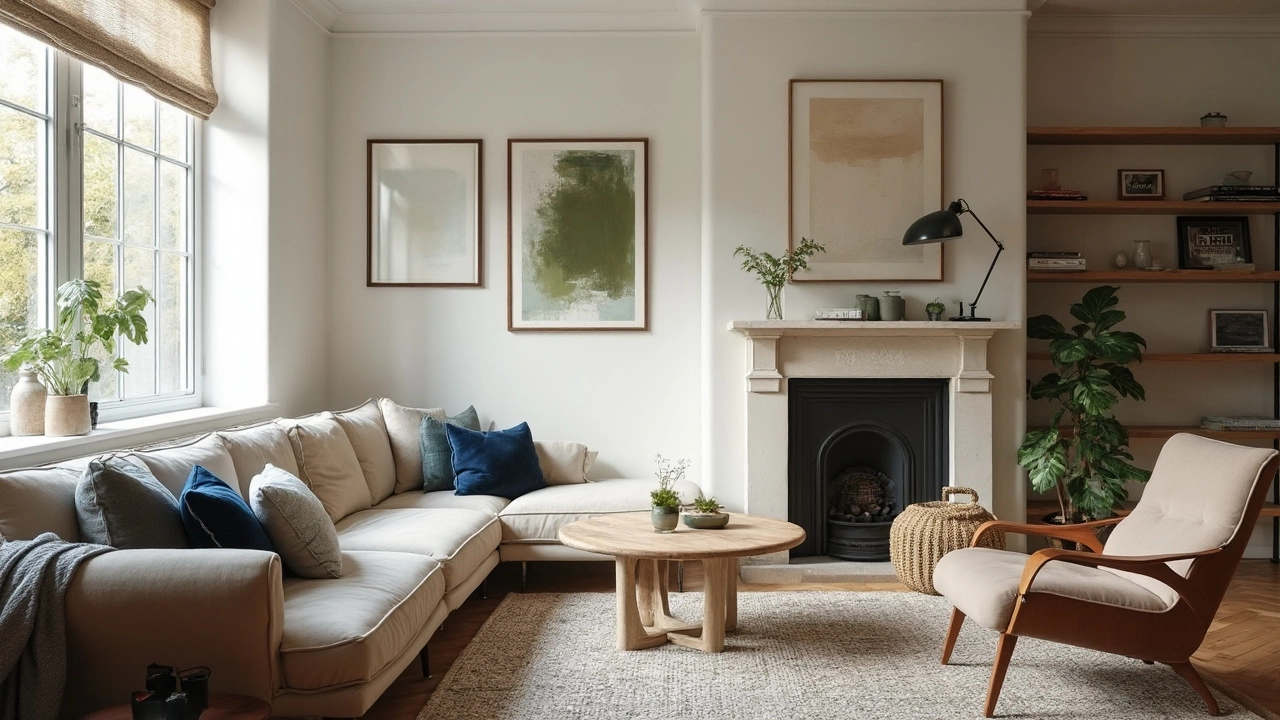
You’ll usually see filler art pop up as minimalist prints, black-and-white photography, simple color washes, or geometric designs. These are low-key, but they give your eye a moment to rest between bold works or personal photos. It’s not about sticking up just anything; the right filler can make your precious pieces pop even more.
As interior designer Emily Henderson puts it, "Filler art isn’t about being boring. It’s about mixing things up so your main art feels important, and your walls don’t look too busy or too flat."
Here are a few things that usually count as filler art:
- Abstract or minimalist prints (think black dots on white paper, or soft pastel smudges)
- Vintage magazine pages or old book illustrations
- Nature sketches or neutral-toned photography
- Simple typographic prints
One big plus? Filler art is usually affordable and easy to swap out. You can frame a cool page from a travel guide or print a high-res pattern off the internet for a couple of bucks. Most people can spot when a wall is trying too hard and looks cluttered—it’s the filler art that keeps things smooth and easy on the eyes.
Where People Use Filler Art at Home
Filler art isn’t just a designer’s trick for fancy model homes—regular folks use it every day to solve real decorating headaches. If you’ve ever stared at a blank stretch of wall above your couch or in your hallway, that’s prime filler art territory. The goal is to make your space look finished, not awkward or empty.
The most popular spots for filler art include:
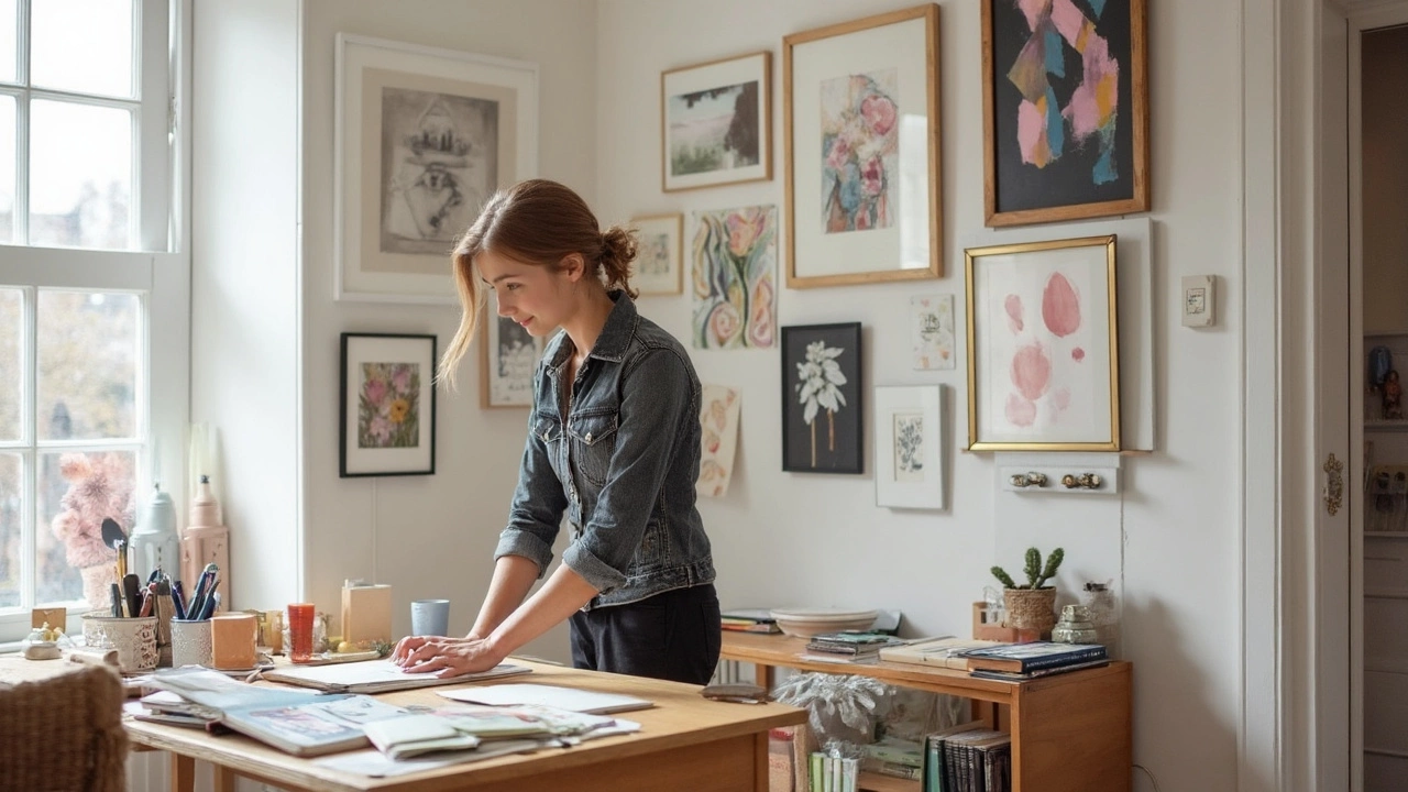
- Gallery walls: These are the go-to for filler pieces. You’ve got one or two photos or statement prints you love, but don’t want big blank gaps between them. Filler art ties everything together so it feels planned.
- Hallways and entryways: These narrow, sometimes gloomy spaces always benefit from a few pieces that aren’t too flashy but still add interest.
- Bedrooms: Especially above dressers or next to closets, where space is tight, people often use smaller prints or patterns as filler.
- Home offices: The rise of remote work has folks filling their Zoom backgrounds with filler art that feels professional but personal.
- Around furniture: Ever notice that awkward spot above the toilet or beside the kitchen table? Filler art goes a long way in these small corners, too.
An interior designer once put it perfectly:
"Filler art isn’t there to stand out. Its job is to help everything else pop—and to keep your walls from feeling like a puzzle with missing pieces." — Emily Henderson, home styling expert
It’s not just about looks, either. An online home décor survey in 2024 found that 68% of people who set up gallery walls said they used affordable prints or filler pieces to finish the look. Only 16% said they had enough original or expensive art to fill their walls.
| Filler Art Usage at Home | Percentage of Respondents |
|---|---|
| Used in gallery walls | 72% |
| Used in entryways/hallways | 54% |
| Used in bedrooms | 38% |
| Used in home offices | 27% |
If you feel like your home is missing that something, chances are the right filler art in the right place will make a huge difference. The trick isn’t just sticking random prints everywhere—it’s about using them to connect your favorite pieces and make the whole room feel more pulled together.
How Designers Pick Filler Art That Works
There’s a reason well-designed spaces feel balanced, even when some of the art isn’t “wow” material. Pros know exactly how to pick filler art so it supports the main pieces and doesn’t look like an afterthought.
First, designers look at color. They scan the statement art or main decor and pull one or two main colors from those. The filler art will echo these shades, making the whole wall feel like it fits together. If a gallery wall has a big, blue abstract print, don’t be surprised if the filler art has hints of that same blue, even if it’s just a wavy line or a background tone.
Size is another big one. Designers avoid crowding with too many large pieces or cramming tiny frames into every inch. Most use an eye test: will the art make the space feel cramped or awkwardly empty? A good rule is to mix up the frame shapes (think a mix of landscape, portrait, and square), but keep them in scale with the biggest art on the wall.
Style matters a lot too. If your main pieces are modern, designers go for simple, graphic filler art. Traditional spaces get classic sketches or botanicals. Eclectic rooms can handle quirky or vintage finds. It’s all about matching the vibe so nothing feels out of place.
- Check the room’s color palette and borrow key shades for your filler art.
- Balance large, bold works with smaller, quieter pieces that support them.
- Mix frame sizes and orientations, but keep overall proportions in check.
- Match the style of the main art—don’t toss in filler that clashes with your look.
- Use simple designs for filler art, avoiding anything too busy or detailed.
Funny thing: lots of designers even buy cheap printable download packs from sites like Etsy when they need simple filler art in a rush. No shame in going for easy solutions; it’s how you use them that makes the difference.
DIY and Budget Filler Art Tricks
There’s no rule saying you have to spend a ton to get great filler art for your walls. Actually, some of the coolest statement walls out there are full of DIY pieces or prints that cost less than a night out for takeout. The trick is finding stuff that looks intentional rather than like you ran out of ideas. Real talk: it just takes a bit of planning and knowing a few hacks.
If you’re going the DIY route, start simple. Frame pages from a coffee table book, especially ones with bold photography or vintage graphics. You can grab old books at thrift stores for a couple bucks and cut out pages you love. Standard frame sizes make it easy to swap these in and out if you want to freshen things later.
Another easy idea: create digital prints using free design tools like Canva. You can pick templates, play with color blocks, or type in a favorite short quote. Print it at home or use an affordable online print shop. If you want to get crafty, try painting simple patterns—think stripes, grids, or blobs—on cheap cardstock or watercolor paper. No formal art skills needed, really. Abstract works hide a lot of mistakes.
If you love a little order, here’s a step-by-step plan to whip up your own budget filler art:
- Pick a color palette that matches your space so everything feels deliberate.
- Gather supplies: blank paper, markers, magazines, or paint.
- Create a mix of abstract shapes, patterns, or type-based art (just Google 'modern DIY wall art' and you’ll see that less is often more).
- Scavenge for cheap frames at discount stores or yard sales – thrifted frames add extra character.
- Lay out your art on the floor before hanging it up to test combos and spacing.
Want something totally free? Use what you’ve got at home. Tear out a cool recipe card, vintage map, or your kid’s best drawing and frame it up.
Here’s a quick peek at how much you can expect to pay for some popular DIY filler art options:
| DIY Art Type | Average Cost per Piece |
|---|---|
| Book/Magazine pages (framed) | $5 - $10 |
| Digital print (home print) | $2 - $6 |
| Simple painting (paper, paint, thrifted frame) | $8 - $15 |
| Family photos (printed and framed) | $6 - $12 |
Key thing: keep it personal if you can. The point isn’t to make it look like a showroom, but to fill your space with pieces that make you smile—even if they only cost the price of a cup of coffee!
Common Mistakes (and How to Dodge Them)
If you’re not careful, filler art can make a wall look busy, boring, or just awkward. People mess up with filler art way more often than you’d think. Here’s what usually goes wrong—and how to dodge the same traps.
- Random Sizing: One of the biggest mistakes is using prints that are all the same size or totally mismatched, so your gallery wall feels off balance. Mix things up with a combo of big and small pieces. For example, two smaller prints under a large statement piece keep the wall from looking lopsided.
- Zero Personality: Buying a stack of generic prints in bulk might fill your wall, but it often makes your space feel like a hotel, not a home. Sneak in something fun, like a funky quote or a photo that actually means something—just one or two can break up all the sameness.
- No Breathing Room: If you pack every inch with art, nothing stands out. The brain needs empty space to take in the whole display. Leave a few gaps here and there so your eye can rest as it moves around the wall.
- Poor Quality Prints: Blurry, pixelated, or super shiny prints are obvious filler art fails. Buy digital downloads from good sources or print at a real photo lab. Even if it’s cheap, it doesn’t have to look cheap.
- Clashing Styles: Filler art doesn’t need to match everything, but it shouldn’t fight your decor. If your living room is all calming blues and tans, that neon paint-splatter print will stick out—in a bad way. Stick to a rough color scheme or vibe, even if the art isn’t expensive.
If you want to upgrade your filler game, try this tip: Lay everything out on the floor first. You’ll catch size issues and color clashes way before you put any nails in the wall. Also, step back often and look at your setup from across the room—it’s wild how different things look from a distance.
A little planning beats impulse-buying random prints every time. That’s how you get a finished wall you’re actually proud of, instead of something you can’t wait to rearrange later.
Turning Filler Art Into a Real Style Move
Here’s the trick—filler art doesn’t have to play second fiddle to your favorite pieces. You actually can use it to build a smart and confident style statement in any room, even if you’re working with thrift store finds or discount prints.
First, repeat colors, shapes, or textures that match what’s already in your space. Say you’ve got a cobalt blue vase or mustard yellow pillow—echo those colors in your filler art so things feel connected. This isn’t just a theory. Apartment Therapy found that gallery walls where two to three colors repeat look more polished and less cluttered.
Filler art is also your chance to play with trends without the regret. Want to try a bold pattern, a neon pop, or a weird little typographic print? Do it with a small piece that costs under $20. If you hate it next month, you haven’t blown your budget.
Another simple way to step up filler art: mess around with frames. A $5 download from Etsy in a chunky gold frame will trick anyone into thinking you found it in a boutique. Try mixing frame sizes—Interior designers say breaking up a grid with something round or unusually sized keeps your wall from looking like a cookie-cutter hotel.
If you’re not sure how much filler art to use compared to feature pieces, a good rule is a 2:1 ratio. That means for every statement work, plan for two simple supporting ones. This takes the stress off trying to find all original art right away, and it’s an approach reported as “most cohesive” by 78% of survey respondents in a 2024 Home Styling Trends poll.
| Room Type | Best Filler Art Style | Suggested Ratio |
|---|---|---|
| Living Room | Abstract prints, subtle landscapes | 2:1 |
| Bedroom | Botanical sketches, calming patterns | 3:1 |
| Entryway | Black-and-white photography, geometric art | 1:1 |
If you want layer and depth, hang some filler art pieces overlapping or use a ledge to lean smaller frames in front of larger ones. It’s a trick used in staged homes and it works in real life, too.
- Swap or rotate filler art as your tastes shift. Filler is low pressure—no need for it to stay the same year after year.
- Don’t be afraid to get creative. Mix in postcards, fabric scraps, or even a cool wrapping paper as a placeholder piece.
- If budget allows, have one or two filler pieces custom printed with a personal twist—like your city map or a family rant turned into minimalist text art.
The simple stuff can be surprisingly effective at making a home feel unique. The key is intention. If you choose your filler pieces thoughtfully, you’re not just filling space. You’re flexing style. And frankly, that’s the move every good decorator makes.