Curtain Color Selector
Based on interior design psychology and light interaction principles.
Staring at a wall of fabric swatches can feel like trying to decode an alien language. You want your curtains to look intentional, not accidental. The wrong shade can make a sunny Melbourne living room feel gloomy or turn a cozy bedroom into a clinical waiting area. Getting the color right is less about following strict rules and more about understanding how light, space, and mood interact in your specific home.
Picking curtain color isn't just about matching your sofa. It’s about controlling the atmosphere of the room. Whether you are aiming for a bright, airy vibe or a moody, dramatic retreat, the fabric hanging on your windows plays a huge role. This guide cuts through the noise and gives you practical steps to choose curtains that actually work with your existing decor.
Start With the Room’s Existing Palette
The biggest mistake people make is treating curtains as a standalone statement piece. They shouldn’t clash with what’s already in the room. Look at your walls, floor, and large furniture pieces. These form the foundation of your space.
If your walls are a neutral white or soft beige, you have freedom. You can go bold with navy, emerald green, or even mustard yellow. But if your walls are already painted a strong color, like a deep charcoal or terracotta, your curtains need to play a supporting role. In these cases, choosing a tone-on-tone approach works best. For example, pair dark grey walls with lighter grey curtains to add texture without adding visual chaos.
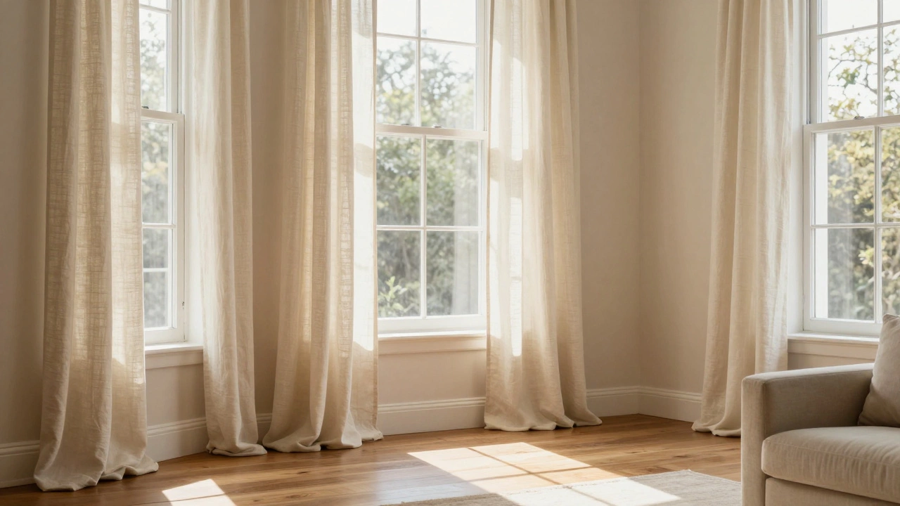
Consider the floor too. If you have rich hardwood floors, warm-toned curtains like cream, camel, or olive green will harmonize nicely. Cold-toned floors like slate tile or polished concrete pair well with cooler curtain shades like steel blue or crisp white. Think of your room as a conversation between these elements. The curtains should join the chat, not shout over everyone else.
Understand How Light Changes Everything
Light is the ultimate filter. A fabric sample looks completely different in the store under fluorescent lights than it does in your home under natural sunlight. In Melbourne, where weather shifts quickly from bright sun to overcast skies, this matters even more.
Check your windows at different times of day. Does the morning sun hit the west-facing window hard? Or is the north-facing window consistently dim? If a room gets little natural light, avoid dark, heavy colors unless you plan to use lots of artificial lighting. Dark fabrics absorb light, making small or dark rooms feel cave-like. Instead, opt for light neutrals, pastels, or whites to bounce whatever light you have around the room.
Conversely, if a room is blasted with harsh afternoon sun, very pale curtains might fade quickly or offer no privacy. Here, medium tones or lined curtains in deeper shades can help manage glare while still looking sophisticated. Always take physical samples home. Tape them to the window and watch them change throughout the day. What looks perfect at noon might look dull by 4 PM.
Decide on the Mood You Want to Create
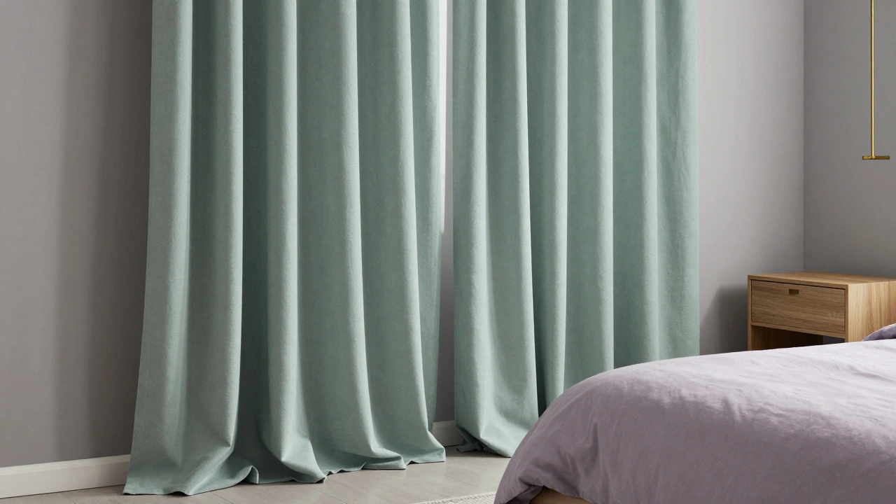
Colors trigger emotions. This isn’t just marketing fluff; it’s psychology. Do you want your bedroom to be a sanctuary for sleep? Cool blues, soft lavenders, and muted greens are calming and promote relaxation. They signal to your brain that it’s time to wind down.
For a dining room or kitchen, you might want energy and appetite stimulation. Warm yellows, oranges, and earthy reds can make meals feel more inviting and social. However, be careful with intense reds in small spaces-they can feel aggressive. Stick to softer terracottas or brick tones if you’re worried about overwhelming the room.
In living areas, versatility is key. Since you spend varied amounts of time there, neutral tones with subtle patterns often work best. They provide a backdrop for art, books, and changing decor trends without dating the room. If you love color, introduce it through cushions or rugs instead, keeping the curtains timeless.
Work With Your Furniture Scale and Style
The style of your furniture dictates the type of curtain fabric and color intensity you should choose. Modern, minimalist interiors with clean lines and low-profile furniture benefit from solid, monochromatic curtains. A sleek grey sectional looks great with crisp white linen curtains. It keeps the focus on the architecture of the room.
Traditional or eclectic spaces with ornate furniture, wood paneling, or vintage pieces can handle more complexity. Patterned curtains, such as florals, geometrics, or damasks, add depth and interest. When using patterns, pick one dominant color from the pattern to anchor the rest of your decor. For instance, if your floral curtain has hints of teal and gold, pull those colors out in throw pillows or lampshades.
Don’t ignore the hardware. Black metal rods suit industrial or modern looks, while brass or wood rods complement traditional or bohemian styles. The rod color should coordinate with other metals in the room, like drawer handles or light fixtures. Consistency here ties the whole look together.
Practical Tips for Testing and Buying
Before committing to a full set of curtains, do some due diligence. First, measure your windows accurately. Standard sizes rarely fit perfectly. Custom lengths ensure the curtains hang correctly-either pooling slightly on the floor for drama or hovering just above for a cleaner look.
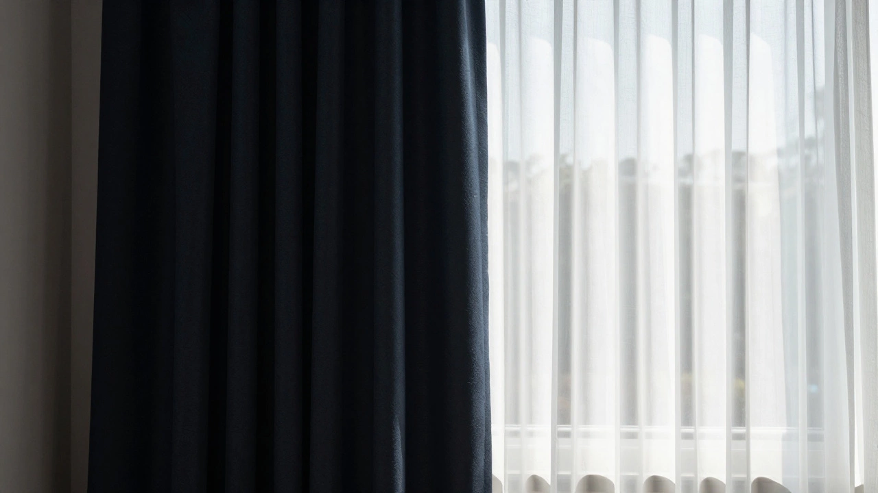
Second, consider the lining. Unlined curtains let in light but offer little insulation or privacy. Lined curtains block light better and last longer because the outer fabric is protected from UV damage. In Australia’s strong sun, lining is almost essential to prevent fading. Choose a lining color that matches the back of your curtain to maintain opacity.
Third, washability matters. If you have kids or pets, avoid delicate silks or dry-clean-only fabrics. Cotton blends, linen mixes, and polyester options are durable and easy to maintain. Check the care label before buying. You don’t want beautiful curtains ruined after one wash.
| Room | Recommended Colors | Avoid |
|---|---|---|
| Bedroom | Soft blues, greys, creams, sage green | Bright reds, neon accents |
| Living Room | Neutrals, earth tones, subtle patterns | Overly busy prints, stark contrasts |
| Kitchen | White, light grey, pastel yellow, mint | Dark, stain-prone fabrics |
| Dining Room | Warm tones, burgundy, navy, gold | Cool, sterile whites |
Common Mistakes to Avoid
One frequent error is ignoring the ceiling height. Long, vertical lines in curtain patterns can draw the eye up, making ceilings appear higher. Horizontal stripes do the opposite, widening the room but lowering the perceived height. Use this to your advantage if you have awkward proportions.
Another pitfall is matching everything exactly. Some designers advise against matching curtains precisely to the wall color. It creates a flat, boring look. Instead, aim for contrast. If walls are white, try off-white or light grey curtains. If walls are grey, try a warmer beige or cool blue. Subtle differences create depth.
Finally, don’t forget about the view. If you have a beautiful garden or city skyline, sheer or light-colored curtains allow you to enjoy the scenery while maintaining privacy. Heavy, dark curtains block the view entirely. Balance aesthetics with function. You want to feel connected to the outside world, not shut in.
Should curtains match the walls?
Not necessarily. While matching walls can create a seamless look, it often makes the room feel flat. It’s usually better to choose a shade that is slightly lighter or darker than the wall to add dimension. For example, if your walls are light grey, choose medium grey curtains. This contrast adds interest without clashing.
What is the best curtain color for a small room?
Light colors like white, cream, or pale pastels make small rooms feel larger and airier. They reflect light, which opens up the space. Avoid dark, heavy colors as they absorb light and can make the room feel cramped. Floor-to-ceiling hanging also helps elongate the walls visually.
Can I mix patterns and solids in my curtains?
Yes, mixing patterns and solids is a great way to add personality. Use a patterned curtain as a focal point and balance it with solid-colored cushions or rugs that pick up one of the colors from the pattern. Keep the scale of the pattern appropriate for the room size-large patterns in small rooms can overwhelm.
How do I choose curtain color for a north-facing room?
North-facing rooms receive indirect, cooler light. To counteract this, choose warm-toned curtains like creams, yellows, or soft oranges. These colors add warmth and coziness to the space. Avoid cool blues or greys, which can make the room feel cold and uninviting.
Do curtain rods affect the overall look?
Absolutely. The rod finish (brass, black, silver) should coordinate with other hardware in the room, such as door handles and light fixtures. A mismatched rod can distract from the beauty of the curtains. Also, ensure the rod is wide enough to allow the curtains to stack fully away from the window when open.