Ever walked into a dining room where everything matched perfectly and noticed... it felt a bit boring? There's a secret most designers won’t tell you: mixing light and dark dining room furniture is not only allowed, but it’s also a clever way to inject personality, balance, and visual intrigue into your space. For a long time, the myth that all your furniture must match lived rent-free in our minds. Now, more and more Australians (and the rest of the world, honestly) are tossing out this old rule and creating dining rooms that look like they belong in a magazine—without them ever feeling stuffy or sterile. The real trick isn’t about spacing your chairs just so, or finding that exact shade of mahogany everywhere. It’s about contrast, balance, and letting your style be the star.
Why Mix Light and Dark in Your Dining Room?
Let’s bust a myth right off the bat: not everything has to match to look pulled together. In fact, blending light and dark furniture can create a layered and inviting atmosphere. Think about great outfits: a crisp white shirt with black jeans just works. Your dining room is no different.
Here’s a surprising fact—according to a 2023 survey by Houzz, nearly 60% of people who renovated their dining spaces opted for mixed furniture tones over strictly matched sets. There’s a good reason for this rise. People crave uniqueness, and having both light and dark furniture helps you tell your own story rather than follow the script laid out by the big box stores.
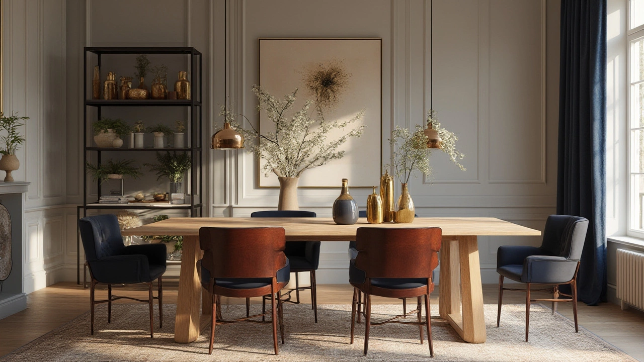
Mixing tones creates depth. A room full of the same shade of oak can look flat, but add a contrasting dark table or chairs, suddenly the whole space feels alive. Darker pieces ground the room, giving it a cozy and anchored vibe. Lighter items, on the other hand, bounce light around and make everything feel more open. This interplay is especially helpful in homes like those in Melbourne, where natural light can change throughout the year. A white or pale wood buffet next to a deep walnut table means your room never feels too heavy or too sparse, no matter the time of day.
One of my favourite ways to spot a thoughtful design is when the eye travels through the space. Dark-to-light transitions guide your gaze, drawing you into the room and highlighting key features—maybe it’s a showstopping sideboard, or an antique set of chairs with a story. This strategy isn’t about chaos or randomness. Good design is a bit like cooking: you want the right blend, not just a mess of ingredients thrown together. Even top designers like Greg Natale and Fiona Lynch lean into contrasts instead of rigid matching—just look at their recent projects in South Yarra and Fitzroy.
How to Find the Perfect Balance
Don’t worry, you don’t need a design degree to make this work. It’s less about strict rules, and more about creating harmony. The idea is to find bridges that connect each element. Think of it like a conversation between your pieces; you want them all talking to each other, not shouting over one another.
Start with a clear focal point. This could be a dining table with a rich, espresso finish, or maybe a set of pale oak chairs you grabbed from Facebook Marketplace. Once you have your main anchor, build around it. If your table is dark, go for chairs in a lighter wood, painted finish, or even upholstered seats in a soft neutral. Reverse it if your table is on the lighter side.
Here’s a little designer trick—repeat each tone at least twice in the room. A dark table? Match it with a framed mirror or a picture frame in a similar shade. A light bench? Echo it in a lamp base or ceramics on your sideboard. This ‘rule of two’ keeps the look intentional, not accidental.
To keep things from feeling haphazard, watch for undertones. If your dark pieces have cool undertones (think black or deep espresso), try pairing them with lighter woods that also lean cool (like ash or birch). Mixing undertones can feel jarring, and spaces start to look less harmonious. When uncertain, I always hold up sample boards or actual pieces next to each other in natural daylight to check if the colors play nicely.
Rugs and textiles are your friends here. A rug that combines both light and dark threads can tie the whole room together. Layering in pillows, throws, or table runners in complementary colors helps blend the look and softens the eye shifts between dark and light zones.
Check out this quick table of undertone matches:
| Dark Wood | Best Light Pairing | Avoid Pairing |
|---|---|---|
| Walnut (Warm) | White oak, Blonde ash | Cool grey-wash pine |
| Black-stained (Cool) | Bleached birch, Light grey oak | Yellowish maple |
| Mahogany (Red undertone) | Light cherry, Pale beech | White pine |
The data highlights what works best, but there are always exceptions. If you fall in love with an unexpected combo, chances are, it’s your taste that matters most.
Styling Tips and Mistakes to Avoid
Ready to pull off the look? Don’t just swap out everything overnight or panic buy because your friend just bought a whitewashed table. Slow and steady wins here, especially if you love a bit of hunting at markets or vintage shops.
One way to nail mixed dining room furniture is to stick to complementary shapes or lines. Got a chunky farmhouse table? Pair it with slim, mid-century bentwood chairs to avoid a blocky feel. If your table and chairs both have elegant, thin legs, you get instant cohesion, even if colors vary. Unify with comfort, not just color—a classic trick for Australian homes that are truly lived-in, not showrooms.
It’s easy to go overboard on contrast. If your room already has bold wall colors, vivid rugs or loud lighting, keep your light and dark furniture pairings more subtle. Otherwise, it starts to feel circus-like and loses that designer edge.
- Don’t force an exact 50/50 split. Natural spaces are rarely precise. Let one tone dominate a bit and use the other as an accent. For example, maybe your dark table takes centre stage, but touches of lighter wood and tan leather add the supporting roles.
- Get creative with finishes. Matte, gloss, distressed, painted—variety here is a secret weapon. If you want even softer blending, a whitewashed finish on dark wood chairs next to a black table can beautifully connect the tones without them feeling mismatched.
- Account for your floors! Light floors? Dark furniture stands out. Timber herringbone? Try mid-toned pieces to avoid too much contrast. The floor is your silent partner in the balancing act—ignore it and your look may fall flat.
- Mixing metals is fine, too—just keep it intentional. For example, if you’ve got black and white pieces, pull it together with matte black hardware and brushed chrome pendant lights.
- Add something unexpected. Sometimes, a rug in an earthy ochre or a splashy abstract piece of wall art can bridge light and dark zones better than more wood could ever manage.
Real Homes, Real Inspiration: Australian Dining Rooms with Mixed Tones
Don’t just take my word for it. Flick through any recent issue of Australian House & Garden or scroll the #mydiningroom tag on Instagram, and you’ll spot plenty of beautifully mixed dining combinations.
Consider the Jaworski family’s Melbourne home—a moody black dining table paired with vintage bentwood white chairs is their showpiece. The palette isn’t just black and white, either; they throw in leafy centrepieces and a blush rug, which stops things feeling too stark. It’s got this lived-in elegance that feels exactly right for both lazy Sundays and big festive dinners.
A beach house down Apollo Bay mixes a pale weathered table with crisp navy velvet chairs and a dark oak sideboard. Bright art, sandy-toned walls, and big windows keep the room light. It feels relaxed yet pulled together, thanks to the recurring navy threads in the rug and napkins that connect the dots.
Designers are even going bold in tiny spaces. In one inner-city apartment, a shiny black pedestal table sits atop tan parquet floors, surrounded by Eames-style shell chairs in pastel blue and a white sideboard. They take a risk, but the rule of repeating tones keeps everything looking like it belongs.
No one wants to end up with a dining room that feels like a mismatched thrift store, but the best spaces combine different tones with intention, repetition, and a couple of surprises. Real people (not just stylists) are mixing dark and light woods, painted furniture, metals, and textiles, because it lets their personality shine. Try swapping in just one piece to start, or grab a tester pot and paint those chair legs if you’re nervous.
So, can you mix light and dark dining room furniture? Absolutely—if you’ve got a plan, a bit of courage, and an appetite for a dining space that looks like you. Blend thoughtfully, repeat tones, and don’t be afraid of contrast. You’ll end up with a one-of-a-kind dining room that begs people to linger long after the food’s gone, and that’s what really matters.