Color Tips: Quick Ways to Boost Your Home’s Look
Feeling stuck with boring walls? You don’t need a full remodel to change the vibe. A few smart color moves can make a room feel larger, cozier, or more energetic in minutes. Below are practical tips you can try right now, no designer degree required.
Pick the Right Base Color
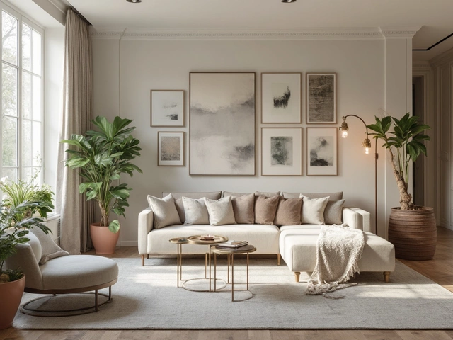
The base paint sets the mood, so start with a shade that matches the room’s purpose. Light neutrals—soft whites, warm greys, or pastel beiges—reflect light and make small spaces feel open. If you want a calming bedroom, try a muted blue or sage green; for a lively kitchen, a sunny yellow or warm terracotta works well. Test a small patch on the wall and watch it at sunrise, noon, and night. The color that looks good in all three is likely a safe bet.
Play with Accent and Trim
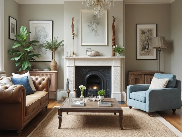
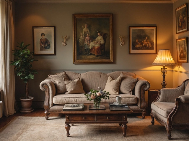
Once the base is set, add depth with accents. One wall painted a bold hue draws the eye without overwhelming the space. If painting an entire wall feels risky, use wallpaper, a painted door, or a colored ceiling as a subtle accent. Trim—baseboards, window frames, and door casings—can be painted in a contrasting shade to frame the room. A crisp white trim against a darker wall adds definition, while a matching trim gives a seamless look.
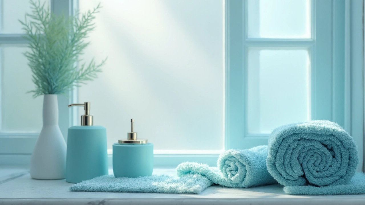
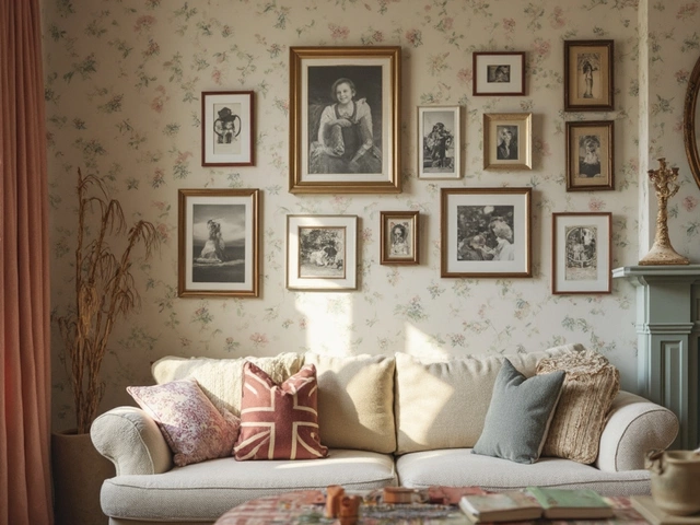
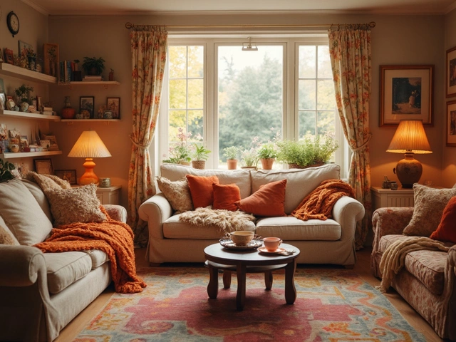
Don’t forget accessories. Throw pillows, rugs, and artwork are cheap ways to introduce accent colors. Pull a color from a piece of furniture you already love and repeat it in a few decorative items. This creates a cohesive palette without committing to large paint jobs.
Lighting plays a huge role in how colors appear. Warm LED bulbs boost earthy tones, while cooler lights highlight blues and greens. If you’re swapping colors, turn off the lights and look at the wall in natural daylight. That will show you the true hue before artificial light tricks it.
When you’re unsure about a shade, use the “3‑color rule.” Choose a dominant color (usually 60% of the room), a secondary color (30%), and an accent (10%). This balance prevents any one hue from dominating and keeps the space harmonious. For example, a living room could be 60% light grey walls, 30% navy sofa, and 10% mustard throw pillows.
Small rooms benefit from monochromatic schemes—different tones of the same color. Stick to one hue family, but vary the lightness and texture. A pale blue wall paired with a deeper blue rug and white curtains feels spacious yet intentional.
If you love patterns, start with a neutral base and let the patterned piece be the star. A geometric rug or a bold wallpaper can handle the color punch, while surrounding furniture stays understated.
Finally, always finish with a quality topcoat. A satin or low‑sheen finish hides brush marks and makes cleaning easier, especially in high‑traffic areas like hallways or kitchens.
With these color tips, you can experiment confidently and watch your home transform from drab to fab—one wall at a time.