Curtain Color Guide: Pick the Perfect Hue for Every Room
Choosing a curtain color can feel like a guessing game, but it doesn’t have to be. The right shade not only frames your windows, it can set the mood, balance a room’s palette, and even make the space feel bigger or cozier. In this guide we’ll break down simple steps you can take right now to pick a colour that works – no design degree required.
First, look at the dominant colour in the room. Is your sofa a soft grey? Are the walls a warm beige? Use that as your starting point. A curtain that echoes the main colour creates harmony and makes the space feel pulled together. If you love contrast, pick a hue that’s opposite on the colour wheel – think navy against a buttery yellow wall – for an instant pop.
Match Your Curtain Color to the Room’s Mood
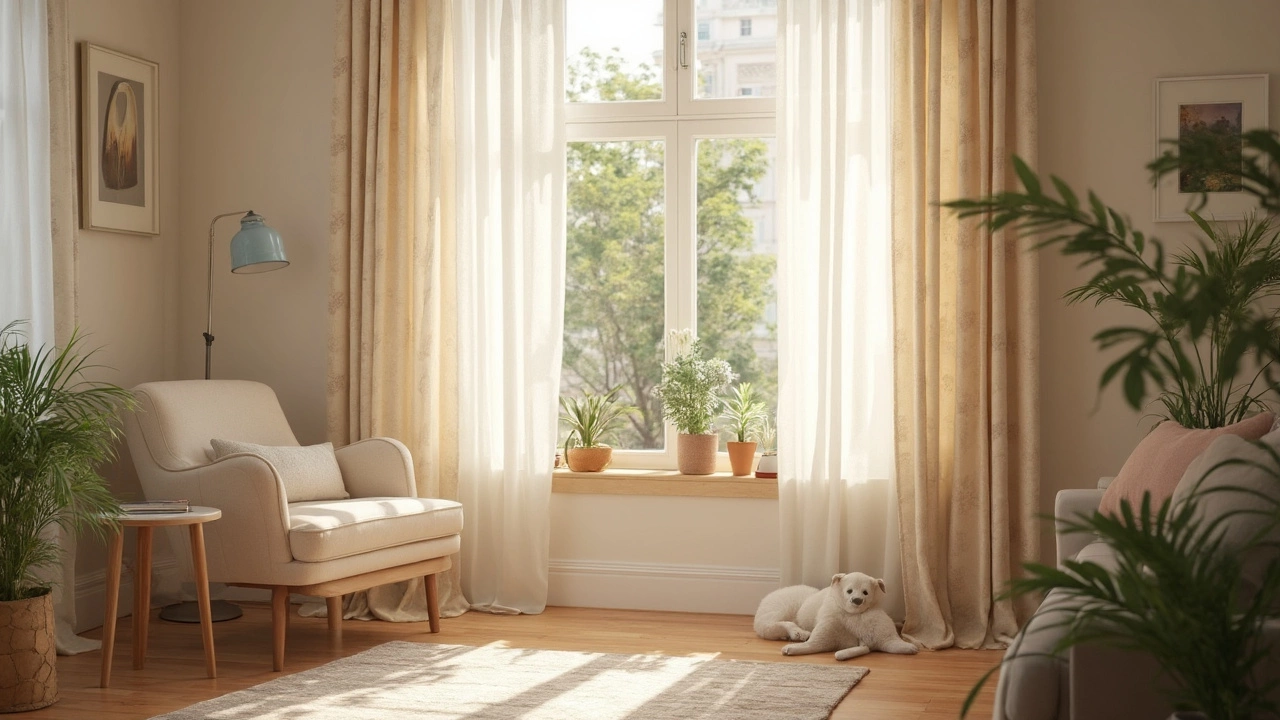
Rooms have different vibes, and your curtains should support them. For a tranquil bedroom, stick with cool blues, muted greens, or gentle lavender. These colours calm the mind and help you unwind. In a lively kitchen, you can go brighter – sunny yellows, citrus oranges, or even a crisp white that reflects light and keeps the area feeling fresh.
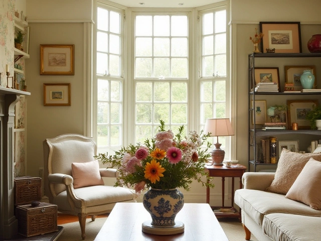
Living rooms are the most flexible. If you want a relaxed lounge, neutral tones like taupe, greige, or soft charcoal work great. Want a conversation starter? Choose a deep teal or rust that draws the eye without shouting. Remember, the curtain sits behind the furniture, so keep the overall balance in mind – a bold colour can handle a simple sofa, while a busy pattern may need a more subdued backdrop.
Bold vs. Neutral – When to Play Safe and When to Dare
Neutral curtains are the safe bet. They blend with most décor, hide dust well, and let you switch up accessories without a full redo. Whites, creams, and light greys are perfect for small rooms because they reflect light and make the area feel larger.
Bold curtains are like a piece of art. Pick them when you have a neutral wall colour that can handle a splash of colour, or when you want to highlight a particular window. Dark hues such as navy, emerald, or charcoal add drama and can make tall ceilings feel cozier. If you’re worried about the colour overwhelming the room, use the curtain as a focal point and keep other décor minimal.
Patterned curtains add texture but can be tricky. Stick to one dominant colour from the pattern and repeat that colour elsewhere in the room – maybe in cushions or a rug – to tie everything together. This trick prevents the space from looking disjointed.
Finally, think about light. Light‑filtering curtains in lighter shades let sunshine in while still offering privacy. Heavy blackout curtains work well in bedrooms or media rooms, and darker colours absorb more light, which can make a bright room feel snug.
To sum up, start with the room’s main colour, decide on the mood you want, and then choose either a neutral base or a bold statement. Test swatches on the wall, watch how they look at different times of day, and trust your gut. Your perfect curtain colour is just a few simple steps away – go ahead and give your windows the makeover they deserve.