House Color: How to Pick the Perfect Paint for Every Space
Choosing a house color feels big, but it’s really about what makes you feel good when you walk through the front door or sit on the sofa. The right shade can add curb appeal, brighten a room, or create a cozy vibe. Below you’ll get simple steps to find the perfect paint without guessing.
Understanding Color Basics
First, get the terms straight. A hue is the name of the color – red, blue, green. Tone tells you how light or dark it is, while temperature describes if it feels warm (like yellow or orange) or cool (like teal or gray). Warm tones add energy; cool tones calm a space. Knowing this helps you match a color to the room’s purpose.
Lighting changes everything. Natural sunlight shows the true color, while LED bulbs can add a blue cast and make cool shades look colder. Test a swatch on the wall, watch it at sunrise and sunset, and note how it looks under the lights you use most. This quick habit saves you from a mismatch later.
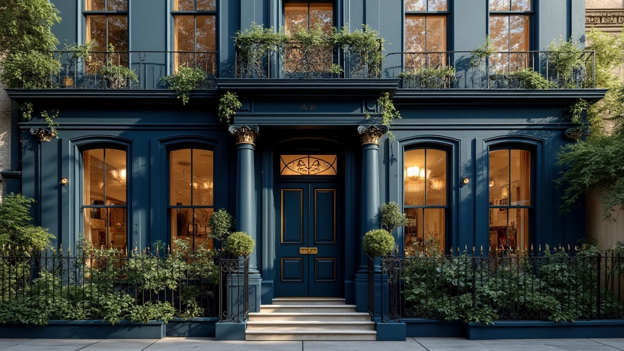
Tips for Choosing Exterior Colors
For the outside, think about the neighbourhood and the house’s architecture. A Victorian might shine with deep green or navy, while a modern bungalow often looks sleek in charcoal or light gray. Blend the roof, trim, and siding – a common rule is 70% main color, 20% trim, 10% accent. It creates balance without overwhelming the eye.
Climate matters too. In hot areas, lighter shades reflect heat and keep the house cooler. In cooler zones, darker hues absorb warmth and feel inviting. Also, consider how the color will age; some paints fade to a softer tone, so pick a base that still looks good when it mellows.
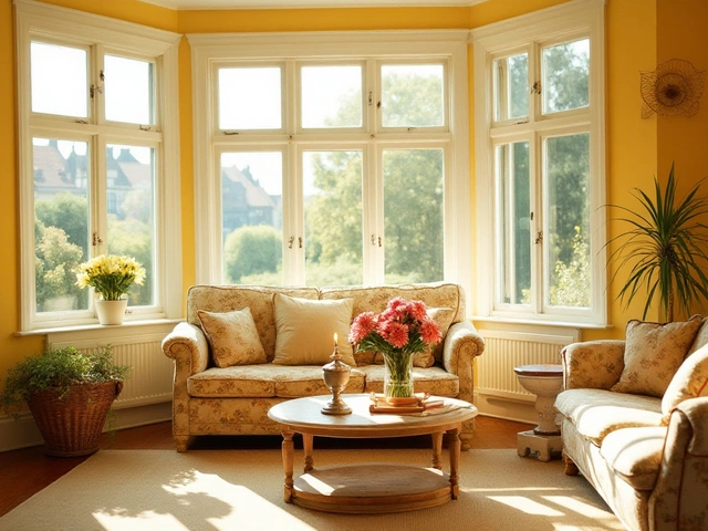
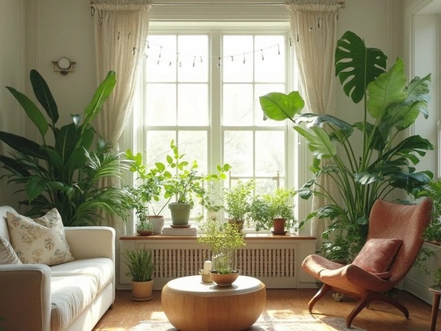
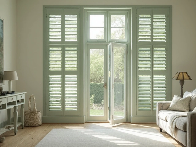
Inside, start with the living room – it’s the hub where you entertain. Neutral walls like warm beige or soft gray let furniture and art pop. If you love color, add a single accent wall in navy, muted teal, or sage. Keep the ceiling light and the floor neutral to avoid a busy feel.
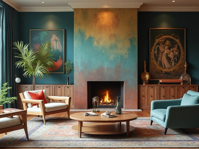
Bedrooms benefit from calm colors. Light blues, gentle lavender, or sage create a restful atmosphere. If you want drama, go dark on a feature wall and keep the other walls bright. Pair the dark side with soft bedding to balance the mood.
Kitchen walls should handle both function and fun. White and light gray keep the space clean and bright, but a sunny yellow or mint can add personality without hiding spills. For cabinets, two-tone schemes – light tops with darker bases – look modern and hide wear.
Bathrooms are small, so keep colors light to make them feel larger. Soft blues, pale green, or warm cream work well. If you love bold, try a dark tile splash behind the tub and keep the walls neutral.
Before you commit, use sample pots. Paint a 12‑inch square at three different heights on each wall. Live with it for a few days, note how it looks with your furniture, and check for any glare. This cheap step prevents costly re‑paints.
Quick checklist: 1) Test swatches in natural light. 2) Match color temperature to room purpose. 3) Keep a 70‑20‑10 balance for exteriors. 4) Use accent walls sparingly. 5) Finish with a durable, low‑VOC paint for health and longevity.