
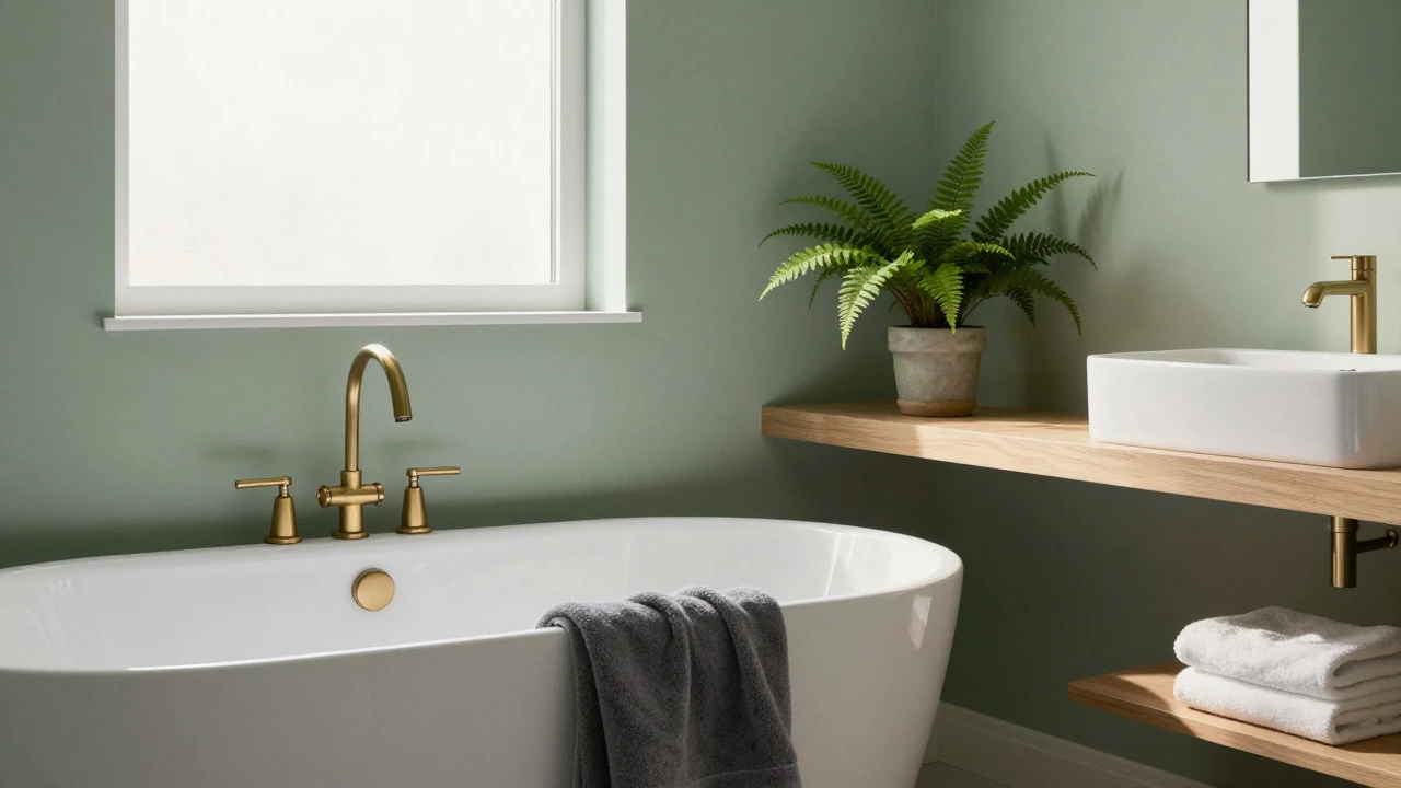
Bathroom Relaxation Color Planner
Select a base color that resonates with you, then customize your recommendations based on your bathroom's characteristics.
Soothing Blue
Water-inspired tranquility
Natural Green
Forest-like serenity
Warm Neutral
Classic spa elegance
Your Custom Bathroom Palette
Picture this: you walk into your bathroom after a long day. The air is cool, the lighting is soft, and the walls are painted in a shade that instantly lowers your heart rate. It doesn't feel like a utility room; it feels like a retreat. But what if the opposite happens? You step inside, and the bright yellow tiles or stark white surfaces make you feel exposed and energetic when all you wanted was rest. Color psychology plays a massive role in how we experience our homes, and nowhere is this more critical than in the bathroom.
Finding the right relaxing color for a bathroom isn't just about picking a paint swatch you like. It's about creating an environment that supports mental decompression. Whether you are renovating a small powder room or designing a master ensuite, the palette you choose sets the tone for your entire routine. Let's break down which colors actually work to create that spa-like atmosphere and why some popular choices might be doing more harm than good.
The Science of Calm: Why Blue Works
If you want a guaranteed path to relaxation, look no further than Blue is a color associated with water, sky, and tranquility that has been scientifically proven to lower blood pressure and slow breathing rates.. It’s not just a hunch; studies in environmental psychology consistently show that blue hues reduce physiological arousal. Think of it as visual deep breathing.
However, not all blues are created equal. Bright royal blue can feel stimulating rather than soothing. For a bathroom, you want muted, dusty, or grey-toned blues. Consider shades like:
- Slate Blue: Adds depth without feeling heavy. It pairs beautifully with natural wood accents.
- Aqua Mist: Lighter and airier, perfect for small bathrooms where you need to maintain a sense of space.
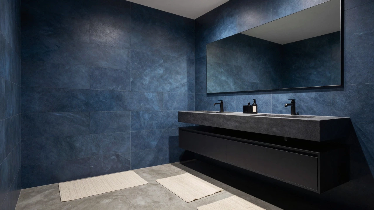
- Navy Blue: Use this sparingly on accent walls or cabinetry. It creates a cocooning effect that feels luxurious and private.
The key is saturation. Lower saturation means less visual noise, which allows your brain to relax. Pair these blues with matte black fixtures or brushed nickel hardware to ground the look and prevent it from feeling too childish or generic.
Green: Bringing Nature Indoors
Green is the other heavyweight champion of relaxation. Unlike blue, which mimics water, green connects us to forests and gardens. This concept, known as biophilic design, leverages our innate connection to nature to reduce stress. When you surround yourself with greens, your mind subconsciously registers safety and growth.
In a bathroom context, green works exceptionally well because it contrasts nicely with white porcelain and chrome fixtures. Here’s how to use it effectively:
- Sage Green: This is the ultimate chill-out color. It’s soft, earthy, and incredibly versatile. It looks stunning paired with light oak vanities and brass taps.
- Olive Green: For a more dramatic, moody vibe, olive adds warmth. It feels grounded and sophisticated, especially when used with stone countertops.
- Mint: A lighter option that brings freshness. Be careful not to go too pastel, or it can start to feel dated. Aim for a slightly greener mint to keep it modern.
Pro tip: If you’re hesitant to paint the whole room green, try using green tiles in the shower niche or on the back wall. The glossy finish of ceramic tiles reflects light differently than paint, adding a dynamic texture that enhances the calming effect.
Neutrals: The Power of Warmth
Many people assume that "neutral" means boring beige or sterile white. In reality, warm neutrals are among the most relaxing colors available. They provide a blank canvas that allows your mind to wander without distraction. The secret lies in temperature. Cool whites can feel clinical, like a hospital, while warm whites and creams feel inviting and cozy.
Consider these neutral variations:
- Cream and Ivory: These shades soften the harshness of fluorescent lighting. They reflect light gently, creating a diffused glow that is easy on the eyes.
- Greige (Grey-Beige): This hybrid color combines the stability of grey with the warmth of beige. It’s incredibly forgiving and works with almost any tile or fixture style.
- Warm Taupe: A deeper neutral that adds richness. It’s excellent for larger bathrooms where you want to avoid the space feeling cavernous.
To prevent a neutral bathroom from feeling flat, introduce texture. Think linen-like bath mats, rough-hewn wooden shelves, or ribbed glass shower doors. Texture adds visual interest without introducing competing colors, maintaining the serene atmosphere.
Colors to Avoid in a Relaxing Space
Not every color serves the purpose of relaxation. While personal preference matters, certain hues trigger alertness or anxiety due to their high energy levels. If your goal is a spa-like retreat, consider steering clear of:
- Bright Red: Red increases heart rate and stimulates appetite. It’s great for a dining room but jarring in a place meant for hygiene and rest.
- Vivid Orange: Energetic and cheerful, yes, but also demanding. It requires constant visual attention, which prevents mental downtime.
- Pure Black: While stylish, large expanses of black can feel oppressive in a small, windowless bathroom. If you love dark tones, opt for charcoal or deep navy instead.
Even purple can be tricky. Lavender is often marketed as relaxing, but in practice, it can sometimes lean towards pink, which may feel overly sweet or artificial. Stick to muted purples with significant grey undertones if you want to experiment with this hue.
Lighting: The Silent Color Modifier
You can pick the perfect relaxing color, but if your lighting is wrong, the effect will vanish. Lighting dramatically alters how colors appear. A sage green wall might look vibrant under daylight bulbs but muddy under warm incandescent lights.
Here’s what you need to know about lighting and color:
- Kelvin Temperature: Aim for 2700K to 3000K bulbs. This range provides a warm, yellowish-white light that mimics sunset, promoting melatonin production and relaxation. Avoid 5000K+ "daylight" bulbs, which are too blue and harsh for evening routines.
- Natural Light: If your bathroom has a window, observe how the color changes throughout the day. North-facing rooms get cooler light, so warmer colors balance it out. South-facing rooms get warm light, allowing for cooler colors like blue or grey.
- Layered Lighting: Combine ambient overhead lighting with task lighting near mirrors and accent lighting in niches. Dimmers are essential-they allow you to adjust the intensity based on whether you’re getting ready in the morning or unwinding at night.
Test your paint samples under both natural and artificial light before committing. Paint a large section of the wall and live with it for a few days. You’ll notice shifts in tone that a small chip won’t reveal.
Material Harmony: Beyond Paint
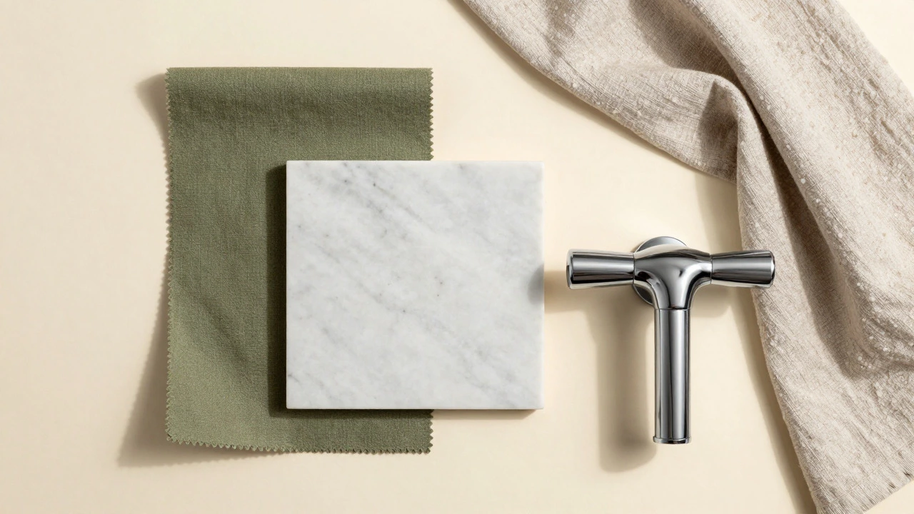
Color isn’t just about paint. Tiles, grout, fixtures, and textiles all contribute to the overall chromatic experience. To maintain a relaxing vibe, ensure these elements harmonize rather than clash.
| Primary Wall Color | Tile Suggestion | Fixture Finish | Textile Accent |
|---|---|---|---|
| Sage Green | Honed Marble (White/Grey) | Brushed Brass | Charcoal Grey Towels |
| Slate Blue | Cement Look Tile (Light Grey) | Matte Black | Cream Linen Bath Mat |
| Warm Cream | Wood-Look Porcelain | Polished Chrome | Soft White Cotton Robe |
| Olive Green | Travertine Stone | Oil-Rubbed Bronze | Mustard Yellow Soap Dispenser |
Notice the pattern? Each combination balances cool and warm tones. This contrast prevents monotony while keeping the overall palette subdued. Also, pay attention to grout color. Dark grout on light tiles can create a grid-like distraction. For a seamless, calming look, match the grout to the tile color as closely as possible.
Small Spaces vs. Large Suites
The size of your bathroom influences your color strategy. In small spaces, dark colors can make the room feel claustrophobic if not handled correctly. However, they don’t have to be avoided entirely. The trick is cohesion. Painting the ceiling, walls, and trim the same dark color eliminates visual boundaries, making the space feel infinite rather than cramped.
For larger bathrooms, you have more freedom to play with contrast. You can use darker colors on one wall to create a focal point, such as behind the bathtub or vanity. This draws the eye and adds architectural interest without overwhelming the senses.
In either case, mirrors are your best friend. They reflect light and color, doubling the visual impact. Place a large mirror opposite a window or a colored wall to amplify the relaxing effect.
Personalizing Your Retreat
Ultimately, the most relaxing color is one that resonates with you personally. While blue and green are statistically calming, your individual associations matter. If you associate cream with childhood comfort, it will be more relaxing for you than a trendy sage green. Reflect on places where you feel truly at peace-beach vacations, forest hikes, or cozy cabins-and translate those feelings into color.
Start small if you’re unsure. Change your towels, add a rug, or repaint a single accent wall. Observe how you feel in the space over time. Does it help you unwind? Does it make mornings easier? Adjust accordingly. Creating a relaxing bathroom is an iterative process, not a one-time decision.
What is the most relaxing color for a small bathroom?
Light sage green or soft aqua blue are ideal for small bathrooms. These colors reflect light well, making the space feel larger and airier, while still providing the psychological benefits of nature-inspired hues. Avoid dark colors unless you paint the entire room uniformly to eliminate visual breaks.
Can I use black in a relaxing bathroom?
Yes, but use it strategically. Pure black can feel heavy, so opt for charcoal or deep navy instead. Use black for accents like fixtures, towel bars, or a single feature wall. Pair it with plenty of light-colored tiles and warm lighting to balance the darkness and maintain a serene atmosphere.
How does lighting affect bathroom color choice?
Lighting drastically changes how colors appear. Warm lighting (2700K-3000K) enhances reds, oranges, and yellows, making them cozier. Cool lighting (4000K+) makes blues and greens pop but can make warm tones look dull. Always test paint samples under the specific lighting conditions of your bathroom, both during the day and at night.
Is white too sterile for a relaxing bathroom?
Pure white can feel clinical, but warm whites, creams, and ivories are highly relaxing. The key is to add texture through materials like wood, stone, and linen. These textures soften the starkness of white, creating a spa-like feel that is clean yet inviting.
What colors should I avoid in a bathroom?
Avoid high-energy colors like bright red, vivid orange, and neon yellow. These stimulate the nervous system and increase alertness, which is counterproductive to relaxation. Also, be cautious with bright pinks and purples, which can feel artificial or overwhelming in a confined space.
Should I match my grout color to my tiles?
For a relaxing, seamless look, yes. Matching grout to tile minimizes visual clutter and creates a smooth, continuous surface. Contrasting grout lines draw the eye and can make the space feel busy. If you prefer contrast, choose a subtle difference rather than a stark black-and-white grid.
How do I choose between blue and green?
Choose blue if you want a watery, airy feel reminiscent of the ocean or sky. Choose green if you prefer an earthy, grounded vibe connected to forests and plants. Both are equally relaxing, so base your decision on which natural element resonates more with your personal sense of calm.
Can I mix multiple relaxing colors?
Yes, but keep the palette limited. Combining sage green with cream or slate blue with warm wood tones works well. Avoid mixing more than two or three main colors to prevent visual chaos. Stick to analogous colors (next to each other on the color wheel) for the most harmonious result.