Wallpaper Style Matcher
Answer a few questions about your space, and we'll recommend an iconic wallpaper style that fits your personality.
How do you want your guests to feel when they enter the room?
Your Perfect Match:
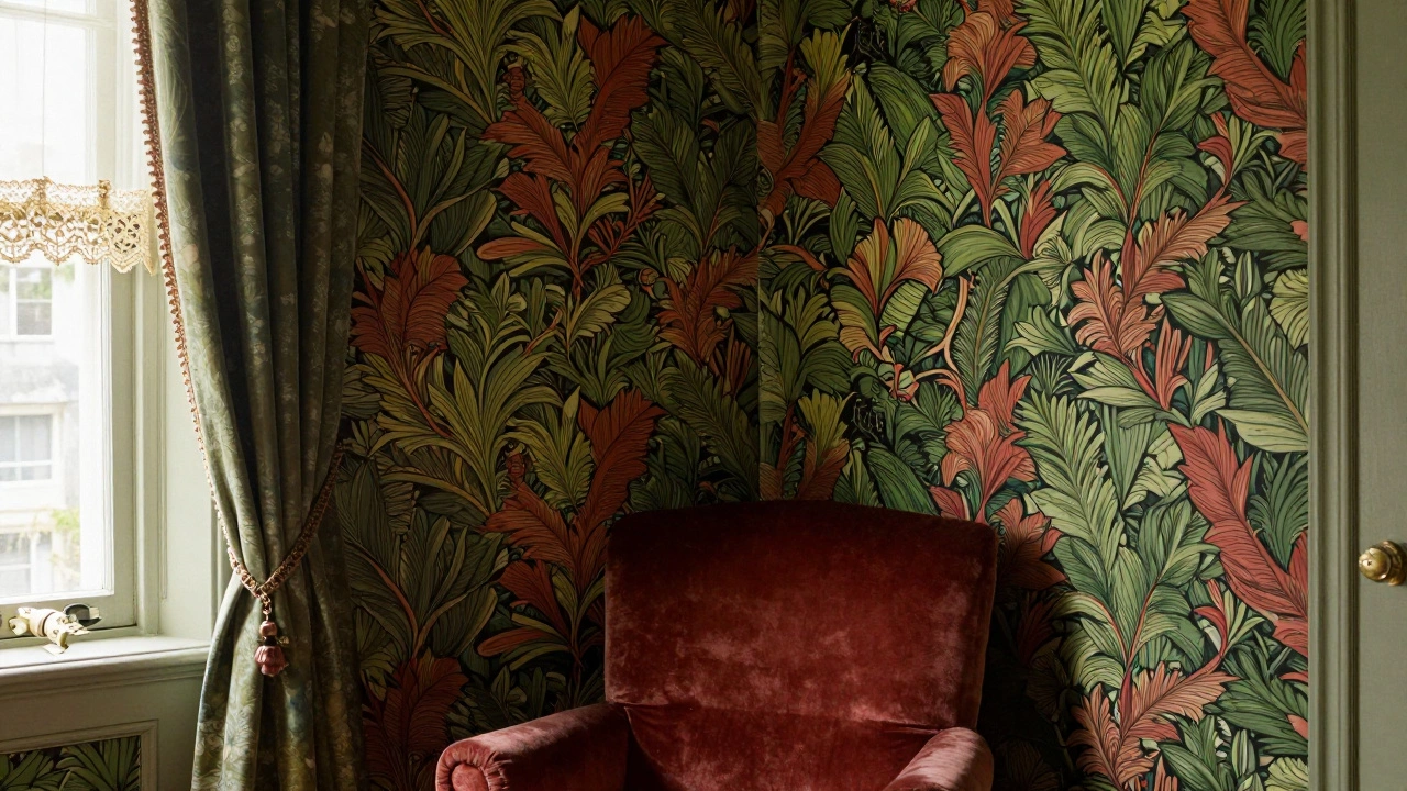
To start, we have to talk about William Morris, who is essentially the godfather of modern wall coverings. William Morris was a lead figure in the Arts and Crafts Movement of the 19th century, reacting against the soullessness of the Industrial Revolution by bringing intricate, hand-drawn nature back into the home. If you've ever seen a dense, winding pattern of acanthus leaves or intertwining flowers that looks like it belongs in a Victorian manor, you're looking at his legacy. His "Strawberry Roe" design is a prime example. It wasn't just about filling a wall; it was a political statement that craftsmanship mattered more than factory-made junk.
The patterns that won't die
Why do some designs stay relevant while others become jokes? Take the Damask pattern. This is a reversible, figured fabric pattern that eventually migrated to wallpaper. It's defined by its symmetrical, floral-like motifs, usually in a single color. For centuries, it has been the shorthand for "wealth." Whether it's a gold-on-cream set in a Parisian hotel or a moody charcoal version in a modern moody bedroom, Damask works because it provides a sense of formal balance that our brains find comforting. Then there's the mid-century explosion. In the 1950s and 60s, we moved away from the heavy florals of the Victorian era and jumped headfirst into Geometric Abstraction. Think of the "Atomic Age" patterns-boomerangs, starbursts, and overlapping circles in avocado green or mustard yellow. These weren't just shapes; they were a celebration of the Space Age and a new, optimistic future. If you walk into a curated mid-century modern home today, you'll likely see a high-contrast geometric accent wall that mimics this 1960s energy.| Style/Era | Key Visual Elements | Emotional Vibe | Modern Use Case |
|---|---|---|---|
| Arts and Crafts | Botanicals, vines, birds | Organic & Crafty | Reading nooks, cozy libraries |
| Mid-Century Modern | Boomerangs, bold colors | Optimistic & Playful | Accent walls, retro kitchens |
| Baroque/Damask | Symmetry, ornate florals | Opulent & Formal | Dining rooms, master suites |
| maximalism | Clashing prints, vivid hues | Bold & Eccentric | Powder rooms, creative studios |
The psychological pull of a pattern
Ever wonder why you feel calmer in a room with a soft Toile de Jouy pattern? This French style, which literally means "cloth from Jouy," typically features pastoral scenes-think shepherds, cows, and countryside villages-in a single color on a white background. It's a form of visual storytelling. By putting a miniature, idealized version of nature on your walls, you're essentially creating a window to a simpler time. It's less about the "art" and more about the feeling of escapism. Contrast that with the rise of Maximalism, a design philosophy where "more is more." In the 2020s, we've seen a massive surge in bold, clashing patterns. People are tired of the "millennial gray" aesthetic. They want walls that scream. This trend uses oversized florals, tropical leopards, and neon colors to express personality. It’s not about matching the sofa to the walls; it’s about creating a curated chaos that feels like a gallery of the homeowner's life.How to spot a timeless design vs. a trend
If you're trying to decide if a wallpaper is truly iconic or just a passing fad, look at the scale. Truly iconic patterns usually have a balanced scale that works regardless of the room size. For example, a small-scale botanical print can feel like a solid color from a distance but reveals intricate detail up close. This versatility is why Chinoiserie-the European interpretation of East Asian artistic traditions-has remained a staple for centuries. Its hand-painted look and sweeping landscapes don't age because they mimic the timelessness of a mural rather than a printed sheet of paper. One common pitfall people fall into is choosing a pattern that is too "loud" for the room's natural light. A dark, heavy Damask in a room with no windows doesn't feel iconic; it feels like a cave. The secret to making an iconic pattern work is contrast. If you have a busy wall, keep your furniture clean and simple. If your furniture is an eclectic mix of antiques, a more subdued, textured wallpaper like a Grasscloth-which uses real woven fibers-can provide the necessary grounding.The shift to digital and peel-and-stick
We can't talk about iconic walls without mentioning how the technology has changed. For decades, the only way to get a bold look was through heavy pastes and permanent commitments. Then came Peel and Stick Wallpaper. This innovation has democratized interior design. Suddenly, renters can experiment with the boldest patterns in the world without losing their security deposit. This shift has actually brought back several "dead" trends. We're seeing a revival of 70s-style psychedelia and 80s Memphis Group geometry because the risk of installing them is now almost zero. When you can rip a wall down in ten minutes, you're more likely to try something daring. This cycle of "try and toss" is accelerating the speed at which styles become iconic again.Which one is actually the most iconic?
If we have to pick one, the title likely goes to the Arts and Crafts patterns of William Morris. Why? Because he changed the philosophy of the home. Before him, wallpaper was often just a cheap imitation of expensive fabric. Morris insisted that the pattern should be honest and rooted in nature. Every time you see a "modern farmhouse" or "cottagecore" aesthetic today, you're seeing a diluted version of that 19th-century vision. He didn't just make a pretty pattern; he started a movement that prioritized the human connection to the environment. But for those who prefer the energy of the city, the geometric grids of the mid-century era hold the crown. They represent the moment we stopped looking at the garden and started looking at the stars. Whether you prefer the slow, winding vines of a Victorian parlor or the sharp, electric angles of a 1960s lounge, the most iconic wallpaper is the one that makes a room feel like a destination rather than just a space.What is the difference between Damask and Toile?
Damask is characterized by symmetrical, ornate, and often floral patterns that repeat in a formal grid, usually in a single color. Toile de Jouy, on the other hand, features detailed, illustrative scenes-like rural landscapes or historical events-that tell a story, typically appearing as small, scattered vignettes on a plain background.
Can I use bold wallpaper in a small room?
Absolutely. In a small room, like a powder room or a home office, a bold pattern can actually create a "jewel box' effect, making the space feel intentional and cozy rather than cramped. The key is to ensure you have high-quality lighting so the pattern doesn't make the room feel too dark.
How do I know if a wallpaper is 'dated' or 'vintage'?
The difference is usually in the execution. "Vintage" refers to patterns that have a timeless appeal or are being used intentionally to evoke a specific era (like Mid-Century Modern). "Dated" usually refers to trends that were popular for a short window (like the specific beige-on-beige patterns of the early 2000s) and haven't evolved into a recognized design movement.
What is the best way to remove old wallpaper?
The most effective method is using a steamer or a commercial wallpaper stripping solution to soften the adhesive. Once the paper is damp and peeling, use a wide putty knife to gently scrape it off. Always test a small area first to ensure you aren't damaging the drywall underneath.
Does wallpaper make a room look smaller?
It depends on the pattern. Large-scale prints can actually make a wall feel further away, creating an illusion of space. Conversely, very small, busy patterns can sometimes feel claustrophobic if they cover every single wall. A great middle ground is using a bold pattern on a single accent wall.
Next Steps for Your Space
If you're feeling inspired to change your walls, start by identifying your "vibe." Are you leaning toward the curated, historic feel of the Arts and Crafts movement, or do you want the high-energy punch of Maximalism? If you're nervous, buy a few peel-and-stick samples and live with them for a week. Notice how the pattern changes as the sun moves through the room. If you find that a pattern starts to annoy you after three days, it's a trend, not a timeless choice. Keep searching until you find a design that feels like a permanent part of your personality.