Timeless Bathroom Color Selector
Select a color and lighting condition to see how it performs in different times of day, just like the article recommends. Test your favorite paint colors before you commit!
When you’re redoing your bathroom, you don’t want to wake up five years from now and feel like you’re living in a 2025 time capsule. The goal isn’t to chase trends-it’s to create a space that feels calm, clean, and comfortable for years, even decades. So what bathroom color is truly timeless? The answer isn’t white. Not exactly. And it’s not beige, either. It’s something quieter, smarter, and more rooted in how light, water, and texture interact in a space meant for renewal.
White Isn’t the Only Option-But It’s the Foundation
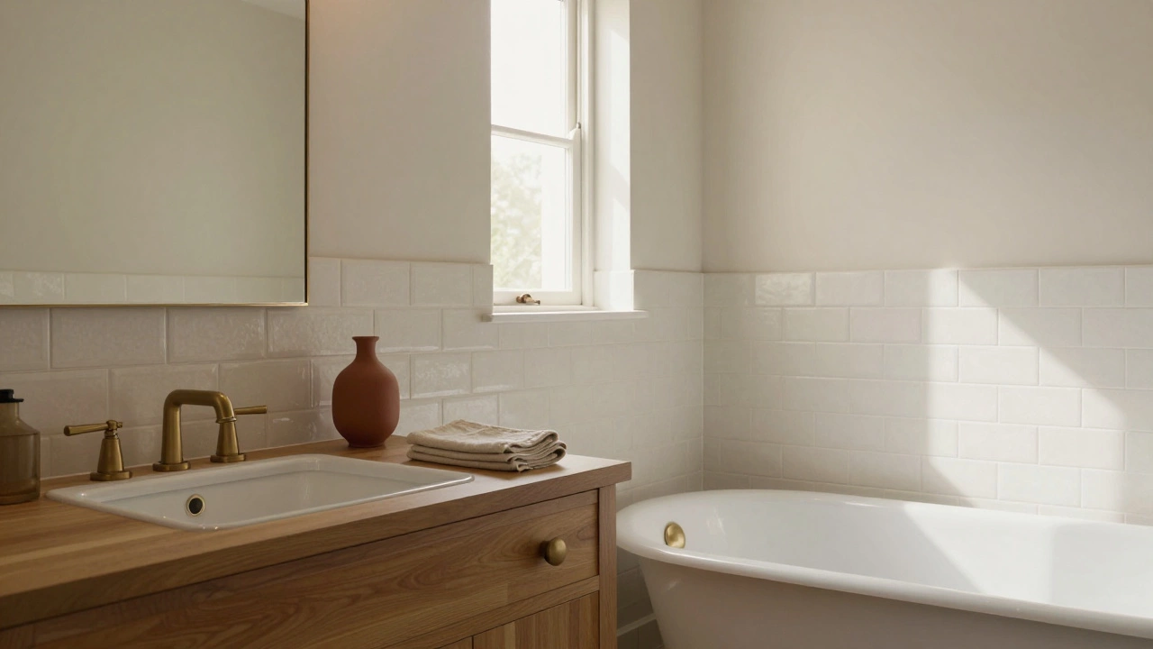
White has held its ground for a reason. It reflects light, makes small bathrooms feel larger, and pairs with any fixture, from brass taps to matte black showerheads. But not all whites are the same. Pure, icy white-like the kind you see in hospital rooms-can feel cold and clinical in a bathroom. The trick is to choose a white with warmth. Look for whites with a touch of cream, gray, or even a whisper of green. Benjamin Moore’s White Dove, Sherwin-Williams’ Alabaster, and Farrow & Ball’s Setting Plaster aren’t pure white-they’re soft, living whites that change with the light. They don’t scream "designer"-they just feel right.
Real-world proof? Walk into any bathroom in a 1970s home that’s been kept clean and well-maintained. Chances are, the walls are still white. Not because it was trendy then, but because it never went out of style. It’s the neutral canvas that lets the real character-the tile, the mirror, the towel rack-shine.
Soft Neutrals Are the Silent Heroes
Timeless doesn’t mean boring. If white feels too stark, try soft neutrals that breathe. Think warm grays, greiges, and muted taupes. These colors don’t compete with marble countertops or natural wood vanities-they hold them up. A color like Sherwin-Williams’ Repose Gray or Benjamin Moore’s Gray Owl works because it’s neither too cool nor too warm. It’s balanced. In morning light, it looks airy. In evening light, it feels cozy.
These tones are especially powerful in bathrooms with natural stone or unglazed ceramic tile. They let the texture speak. A bathroom with travertine floors and a soft gray wall doesn’t feel dated-it feels like a spa that’s been around since the 1950s and never needed an update.
And here’s the thing: these colors hide water spots, soap scum, and minor wear better than bright or dark hues. That’s not just aesthetics-it’s practicality. Timeless design isn’t just about looking good. It’s about lasting without constant upkeep.
Why Dark Colors Fail as Timeless
You’ve seen them: charcoal bathrooms, navy walls, black tiles. They look dramatic in magazines. But in real life? They’re high-maintenance. Dark colors show every speck of dust, every water mark, every stray hair. They make small bathrooms feel smaller and heavier. And if your lighting isn’t perfect? The space turns into a cave.
Some people swear by dark bathrooms, and that’s fine-if you’re going for a moody, intentional look. But if your goal is to sell your home in five years or just wake up every morning feeling relaxed, dark walls are a risk. They age poorly. Trends come and go. A dark bathroom from 2023 might look like a mistake by 2030.
There’s a difference between bold accents and bold walls. A dark vanity, a black faucet, even a single dark tile accent wall? Those can be timeless. But painting all four walls in black? That’s a gamble.
The Role of Tile and Fixtures
Color isn’t just paint. Tile matters just as much-and it lasts longer. The most enduring bathroom color schemes pair neutral walls with simple, classic tile. Think subway tile in white or off-white. Not the glossy, oversized kind from 2020. The small, 3x6 inch, slightly textured tiles that have been used since the 1920s. They’re cheap, easy to clean, and never look out of place.
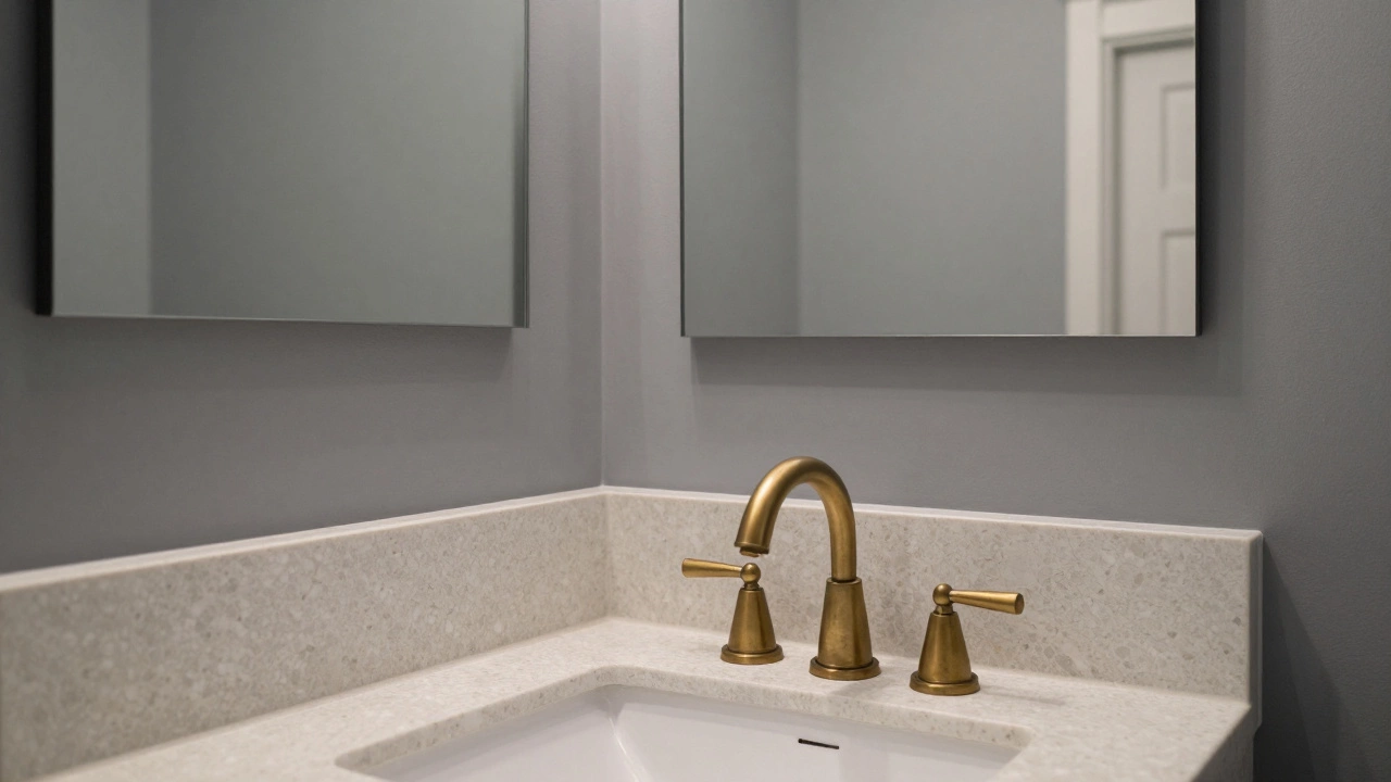
Same goes for fixtures. Chrome and brushed nickel have been around for decades because they work with everything. Brass? It’s making a comeback, but not the shiny, yellow kind. Think unlacquered brass that develops a patina over time. It doesn’t look trendy-it looks lived-in in a good way.
And don’t forget the floor. Large-format porcelain tiles in a soft gray or cream are more timeless than patterned or colored tiles. They’re durable, slip-resistant, and blend with any wall color. Avoid bold patterns, especially geometric or floral. They date fast.
What About Accent Colors?
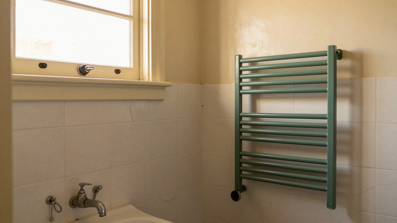
You can add color without breaking timelessness. Think of accents like accessories-removable, replaceable, low-commitment. A deep green towel rack. A single terracotta vase. A blue shower curtain you change every season. These are the details that keep a bathroom feeling fresh without forcing you to repaint.
Green, especially sage or muted olive, has been used in bathrooms for over a century. It’s calming, natural, and pairs beautifully with white and wood. Blue? Soft blues like Benjamin Moore’s Blue Nova or Quiet Blue feel like a breath of ocean air-without the overwhelming intensity of navy.
But avoid trends like millennial pink, mustard yellow, or mint green unless you’re okay with changing them in five years. These colors were born from Instagram, not longevity.
Real Homes, Real Timelessness
Look at bathrooms in old Australian bungalows, mid-century homes in California, or even European villas. What do they have in common? White or off-white walls. Simple tile. Natural materials. Minimal clutter. They’re not fancy. But they’re never ugly. They don’t shout. They just work.
I’ve seen a 1947 bathroom in Hawthorn, Melbourne, that still has its original white enamel tub and cream walls. The tiles are cracked in places, the faucet is worn, but the space still feels serene. Why? Because the color never fought against the light, the water, or the passage of time.
Timeless doesn’t mean perfect. It means forgiving. It means you can walk into the bathroom after a long day, turn on the light, and feel like you’re somewhere calm. Not trendy. Not loud. Just right.
Final Rule: Let Light Decide
The best way to pick a timeless bathroom color? Test it. Paint a large swatch on the wall. Watch it at 8 a.m., 2 p.m., and 7 p.m. for three days. See how it looks with your existing fixtures, your towel colors, your natural light. If it still feels calm and clean at every hour? You’ve got it.
Timeless bathroom colors don’t need to be expensive. They don’t need to be new. They just need to feel like they belong. And that’s something no trend can give you.