
Curtain Mood Matcher
Select your desired mood and room type to find the perfect curtain color recommendation based on color psychology.
1. Choose Your Goal
2. Your Recommendation
Select a mood and room above to see recommendations.
Visual Palette Explorer
Click a swatch to preview how it filters light in a room setting.
You walk into a room and instantly feel calm. Or maybe you feel energized. It’s rarely the furniture that does it-it’s often the light filtering through your curtains. While we obsess over sofa shapes and rug textures, we forget that fabric acts as a filter for both light and emotion. If you’ve been feeling sluggish in your living room or anxious in your bedroom, your window treatments might be the culprit. Let’s talk about how specific hues can shift your mood, backed by basic color psychology and real-world application.
The Science Behind Your Window Dressings
Color isn’t just decoration; it’s a sensory input. Our brains process color faster than text or images, triggering emotional responses before we even realize what’s happening. This is known as color psychology, which studies how different shades influence human behavior and feelings. When sunlight hits colored fabric, it doesn’t just change the aesthetic; it changes the temperature of the light entering your space. Warm tones like reds and oranges tend to increase heart rate and energy levels, while cool tones like blues and greens lower blood pressure and promote relaxation. Understanding this mechanism helps you choose curtains that serve a purpose beyond hiding the neighbors’ view.
Consider the source of the light. Melbourne, for instance, gets intense southern exposure in many homes. If you hang heavy, dark velvet curtains there, you might block out too much natural joy. Conversely, thin, bright linen allows in high-energy daylight. The goal is balance. You want enough light to boost serotonin-the happiness hormone-but not so much glare that you get headaches. It’s a practical equation: Light Intensity + Color Hue = Emotional Output.
Hues That Spark Joy and Energy
If your goal is to wake up with a spring in your step or host lively dinner parties, you need warm, vibrant colors. These are the "get up and go" palettes. But don’t confuse vibrancy with chaos. There’s a sweet spot between stimulating and overwhelming.
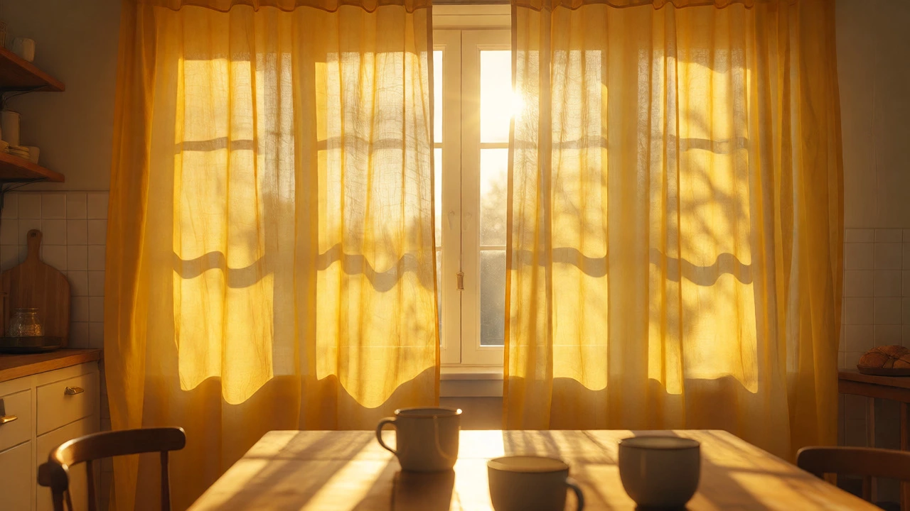
Yellow is widely considered the happiest color in the spectrum. It mimics sunlight and is associated with optimism and clarity. However, pure lemon yellow can cause eye strain if used on large surface areas. Instead, look for softer buttery yellows or mustard tones. These provide the mood lift without the visual noise. They work exceptionally well in kitchens and breakfast nooks where you start your day.
Orange, particularly in its softer peach or terracotta forms, brings warmth and social connection. It’s less aggressive than red but still invites conversation. If you’re feeling isolated or low-energy, swapping grey drapes for a soft coral pair can make a room feel more welcoming. Just keep the saturation moderate. Neon orange might spike anxiety rather than happiness.
- Butter Yellow: Best for north-facing rooms needing artificial warmth.
- Terracotta: Ideal for creating cozy, grounded vibes in living areas.
- Peach: Great for children’s rooms or playrooms to encourage activity.
Calm and Clarity: The Power of Cool Tones
Sometimes happiness means peace. If your stress levels are high, you don’t want stimulation; you want decompression. This is where cool colors shine. They recede visually, making small rooms feel larger and chaotic minds feel quieter.
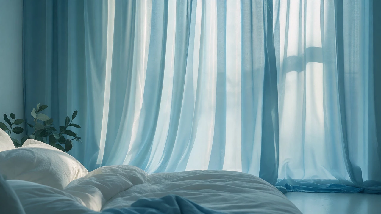
Blue is the most universally liked color for a reason. It lowers cortisol levels and slows down breathing. For bedrooms, sky blue or pale aqua curtains can significantly improve sleep quality. Avoid deep navy if you struggle with seasonal affective disorder, as it can absorb too much light and make a room feel gloomy during winter months. Stick to lighter blues that reflect the morning sun gently.
Green connects us to nature. Biophilic design suggests that seeing green reduces mental fatigue. Sage green or olive curtains bring the outdoors in, promoting a sense of restoration. This is perfect for home offices where focus is required. Unlike blue, which sedates, green refreshes. It keeps you alert but calm, a tricky balance to strike with other colors.
| Color Family | Primary Emotion | Best Room Application | Light Effect |
|---|---|---|---|
| Warm Yellows | Optimism, Energy | Kitchen, Dining Room | Brightens dim spaces |
| Soft Blues | Calm, Trust | Bedroom, Bathroom | Cools down hot rooms |
| Sage Green | Balance, Focus | Home Office, Study | Natural, diffused light |
| Neutral White/Cream | Clarity, Simplicity | Living Room, Hallway | Maximizes brightness |
Neutrals: The Unsung Heroes of Happiness
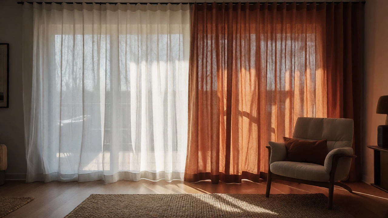
You might think neutrals are boring, but they are actually powerful tools for mental clarity. Cluttered visuals create cognitive load. When your eyes aren’t fighting for attention against competing patterns, your brain relaxes. White and cream curtains maximize natural light, which is directly linked to improved mood and vitamin D production. In darker climates or urban settings with limited sunlight, sheer white fabrics are non-negotiable for maintaining a cheerful atmosphere.
However, stark white can feel clinical. To add warmth without adding color noise, opt for off-whites, ivories, or beige linens. These textures add depth and comfort. A rumpled linen curtain feels tactile and inviting, whereas a stiff polyester white drape can feel sterile. Texture matters as much as hue when aiming for comfort.
Avoiding Mood Killers
Not every color serves your emotional needs. Some hues, while trendy, can drain energy if misused. Grey is the classic example. While chic, large amounts of cool grey can induce feelings of melancholy, especially in rooms with poor lighting. If you love grey, pair it with warm wood tones or colorful accessories to prevent the "sad office" effect.
Similarly, overly saturated purples can feel heavy and introspective. While lavender is soothing, deep eggplant might make a small room feel cramped and oppressive. Always test a swatch in your actual room at different times of the day. Artificial light changes how these colors hit your retina. What looks happy under store lights might look depressing under your ceiling bulb.
Practical Tips for Choosing Your Happy Fabric
Choosing the right color is half the battle; execution is the other half. Here is how to ensure your choice actually delivers the mood boost you want.
- Test Before You Buy: Never buy curtains based on a thumbnail online. Order samples. Tape them to your wall near the window. Look at them in the morning, noon, and night.
- Consider the Lining: The back of the curtain affects the front. Blackout lining makes colors richer but blocks light. Unlined sheers let light pass through, changing the room’s ambient color. Decide if you want light filtration or total darkness.
- Mix Textures: Combine smooth silk-like fabrics with rougher wools or linens. Visual variety keeps the eye engaged without causing stress.
- Follow the 60-30-10 Rule: Use your main color for 60% of the room (walls/floors), secondary color for 30% (furniture), and accent color for 10% (curtains/accessories). This creates harmony, which equals peace of mind.
Remember, happiness is subjective. One person finds joy in a bold red kitchen; another finds it in a minimalist white bedroom. The key is intentionality. Don’t pick a color because it’s trending on Instagram. Pick it because it makes you exhale when you walk in the door.
Do dark curtains make a room feel smaller?
Yes, generally speaking. Dark colors absorb light, which can make boundaries feel closer. If you have a small room, stick to lighter neutrals or pastels to create an illusion of space and openness, which contributes to a less claustrophobic, happier environment.
Which curtain color is best for sleeping?
Cool tones like soft blue, sage green, or muted lavender are best for bedrooms. These colors lower physiological arousal, helping you fall asleep faster. Ensure the curtains also offer adequate blackout capability to maintain a dark environment, which is crucial for melatonin production.
Can I mix different colored curtains in one room?
Absolutely. Layering is a great way to combine mood benefits. For example, use a sheer white layer for daytime brightness and a heavier blue or green layer for evening calm. This gives you control over the room's atmosphere depending on the time of day.
How does lighting affect curtain color perception?
Lighting dramatically alters color. North-facing light is cool and blue, making warm colors pop but cool colors look dull. South-facing light is warm and golden, enhancing yellows and oranges. Always test your chosen fabric under the specific natural and artificial light conditions of your room before committing.
Are patterned curtains better than solid colors for mood?
It depends on your sensitivity to visual clutter. Simple, organic patterns can add interest without stress. Busy, geometric patterns might increase anxiety in already busy households. If you seek peace, stick to solids or subtle textures. If you seek creativity, gentle patterns can stimulate the mind.