Flooring Compatibility Finder
Ready to Design?
Select your room conditions and style preferences on the left to get personalized flooring recommendations.
You’re standing in the paint aisle, staring at a swatch of 'Greige,' wondering if it will clash with the floor you haven’t even installed yet. Or maybe you already have that dark walnut plank and your new cream sofa looks like it’s floating on ice. It’s a common headache: we want a foundation that doesn’t fight with our changing tastes, our kids’ toys, or our future furniture purchases. The truth is, there isn’t one magic color that works in every single house, but there are three specific tones that come dangerously close to being universal chameleons.
If you want a floor that survives trends, hides dust, and makes any wall color pop, you need to understand light reflection and undertones. This isn’t about picking what’s popular on Instagram today; it’s about picking what will still look good when you swap your rug next year. Let’s break down the actual winners in the versatile flooring game, why they work, and where they might trip you up.
The Short Answer: What Actually Works?
Before we get into the nitty-gritty of grain patterns and finishes, here is the quick takeaway for those who just want the answer so they can go home:
- Medium-Warm Wood (Honey/Oak): The absolute safest bet for warmth and compatibility. Hides dirt well.
- Light Grey with Warm Undertones: The modern neutral. Avoids the "cold hospital" look if chosen correctly.
- Dark Brown/Espresso: Best for high-contrast elegance, but shows dust and scratches easily.
- Beige/Tan Stone or Tile: Classic, timeless, but risks looking dated if not styled carefully.
Notice I didn’t say "white." White floors are beautiful, but they are not low-maintenance or universally forgiving. They show every speck of mud from the garden. If you want "goes with everything," you usually mean "low friction," and white has high friction.
Why Medium-Warm Woods Are the King of Versatility
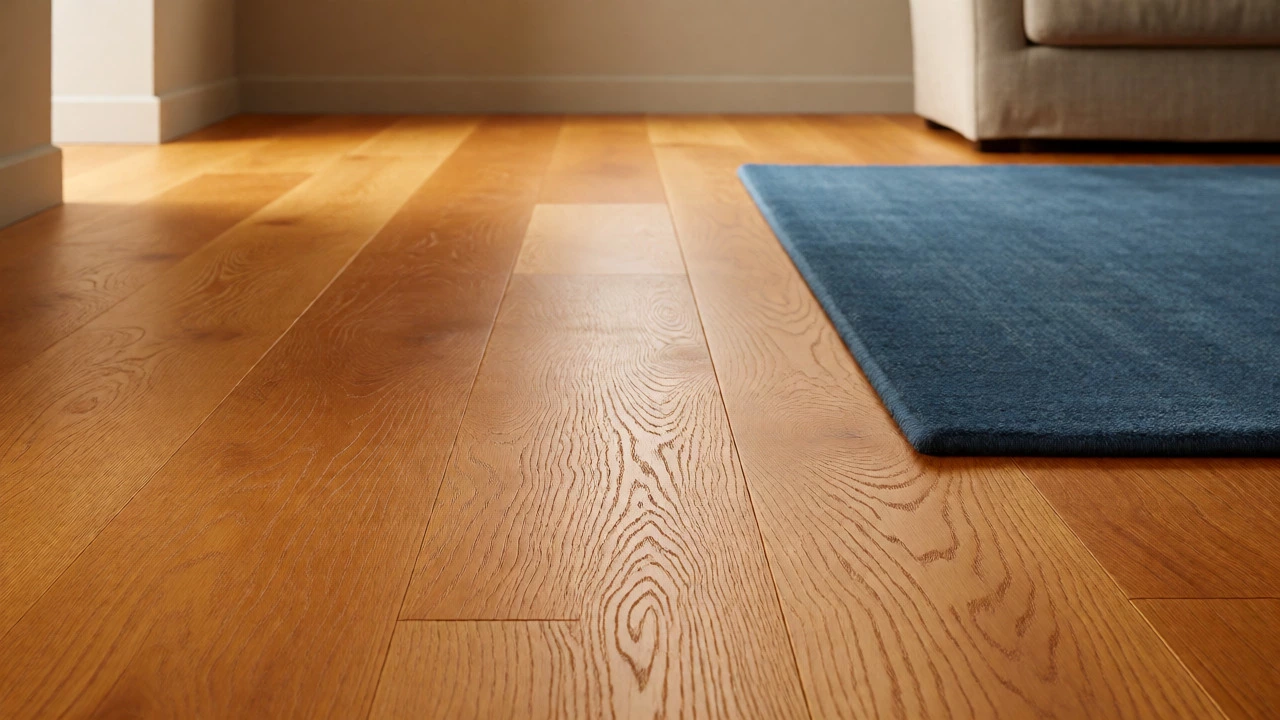
Let’s talk about Red Oak and medium-toned hardwoods like Hickory or Maple. These aren't the trendy "blonde" woods of the early 2010s, nor are they the super-dark stains of the 2000s. They sit right in the middle, around a Janka hardness rating suitable for family homes, with a natural yellow-to-orange undertone.
Why does this work? Because human skin tones, most natural textiles (linen, cotton, wool), and warm wall paints all share similar undertones. When you put a blue rug on a medium-oak floor, the orange undertone in the wood complements the blue without clashing. It’s basic color theory: orange and blue are opposites on the color wheel, which creates vibrancy rather than conflict.
I’ve seen clients try to pair cool-grey walls with cool-grey floors, and the result often feels flat and sterile. But throw a medium-warm oak floor under those same grey walls, and suddenly the room has depth. The wood adds life. Plus, let’s be real: medium tones hide the inevitable chaos of daily life. Dog hair? Barely visible. Sand from the beach? Disappears into the grain. Dark floors scream "I am dirty!" while medium floors whisper "it’s fine."
The Grey Dilemma: Cool vs. Warm Neutrals
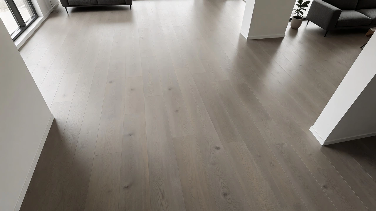
Grey is the other contender for the throne of "goes with everything," but it comes with a massive caveat. Not all greys are created equal. There is a huge difference between a cool, steel-grey and a warm, taupe-grey.
Cool greys (those with blue or green undertones) are tricky. They pair beautifully with crisp whites, navy blues, and stark black accents. Think industrial lofts or Scandinavian minimalism. But if you try to pair a cool steel-grey floor with warm terracotta tiles or an orange leather chair, things get ugly fast. The colors vibrate against each other.
The solution? Look for Taupe or greige (grey-beige) flooring options. These are greys that have been warmed up with brown or beige pigments. They act as a bridge. You can pair them with both cool modern furniture and warm traditional pieces. In Melbourne, where we love a mix of mid-century modern and coastal styles, a warm grey vinyl plank or engineered timber is often the smartest compromise. It keeps the space feeling airy and large, which is great for smaller apartments, without committing to the coldness of pure grey.
Dark Floors: High Impact, High Maintenance
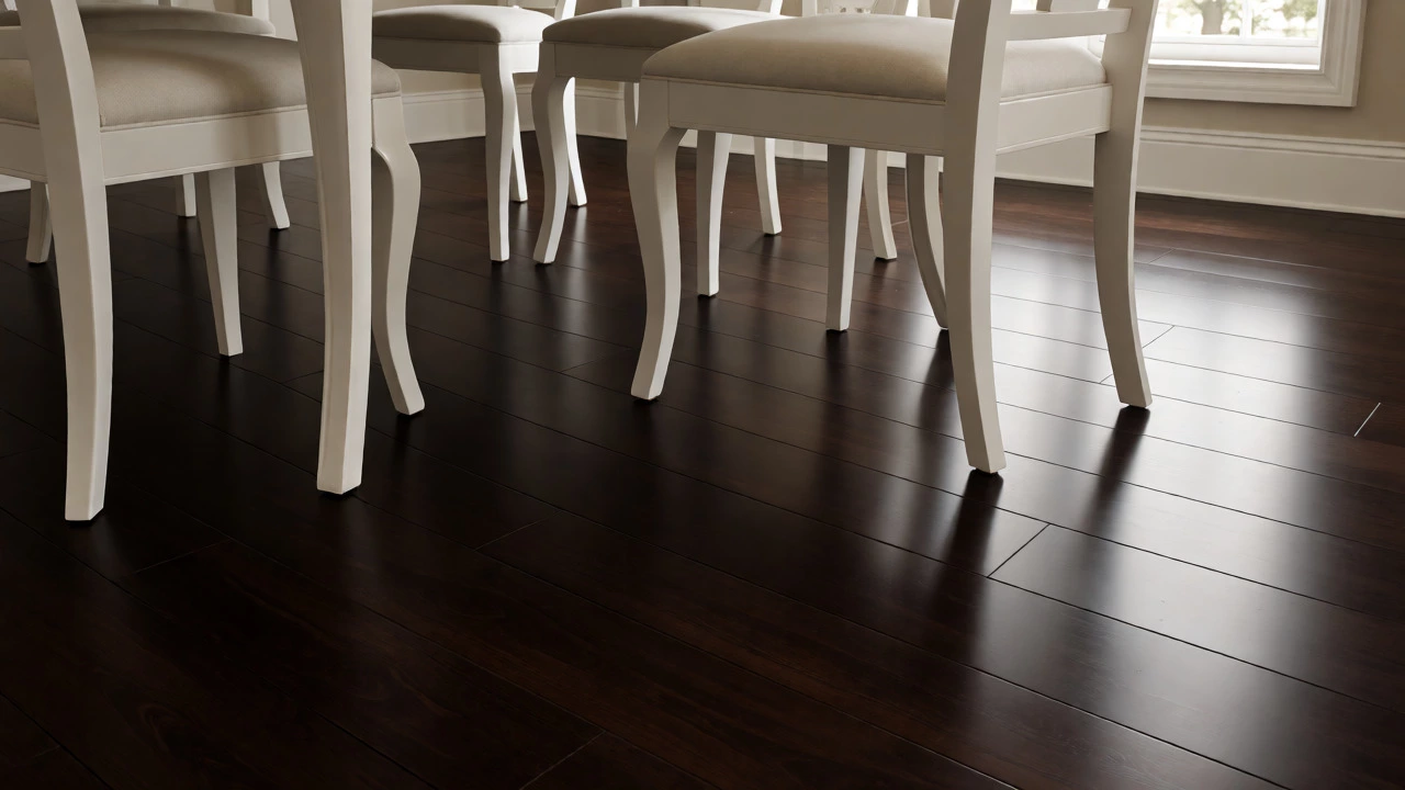
Dark brown, espresso, or charcoal floors create drama. They anchor a room and make light-colored furniture pop off the page. If you have a lot of natural light-large windows, skylights-a dark floor can make a spacious living room feel cozy and grounded.
However, dark floors are the divas of the flooring world. They demand attention and constant cleaning. Every piece of lint, every water spot, and every scratch stands out against the dark background. If you have pets with light fur, you will spend more time vacuuming than you did before.
Where do they shine? In rooms where you want sophistication. A dining room with a dark walnut floor and a white tablecloth looks expensive. A study with dark mahogany and bookshelves feels serious and academic. Just don’t use dark floors in small, dimly lit hallways unless you want them to feel like caves. And please, avoid pairing dark floors with dark walls unless you are very confident in your lighting plan. You risk creating a box that feels too heavy.
Stone and Tile: Beige Isn’t Boring (If Done Right)
For kitchens, bathrooms, and entryways, tile is often non-negotiable. Here, the question shifts from wood tones to stone colors. For decades, beige travertine was the default. It got a bad rap because people paired it with avocado appliances and dated grout. But modern beige tiles-think limestone, sandstone, or porcelain that mimics concrete-are incredibly versatile.
Beige is a true neutral. It doesn’t push or pull. It allows colorful cabinets or bold backsplashes to take center stage. The key is texture. A flat, glossy beige tile can look cheap. A matte, textured beige porcelain tile that catches the light differently throughout the day looks organic and expensive. It pairs well with almost any cabinet color: white, navy, sage green, or even red.
One trap to avoid: matching your floor exactly to your wall color. If you have beige walls and beige floors, the room loses definition. You want contrast. Pair beige floors with white trim or darker furniture legs to keep the eye moving. Also, consider the grout. Light grout on beige tile is hard to keep clean. Dark grout creates a grid pattern that can make small rooms look smaller. Stick to a grout color slightly darker than the tile for a seamless look, or significantly lighter for a graphic look.
How to Test Your Choice Before Buying
Never trust a sample chip from the store. Store lighting is designed to make everything look bright and uniform. Your home has shadows, sunbeams, and artificial bulbs that change the color temperature of your floor multiple times a day.
Here is my foolproof testing method:
- Get Large Samples: Don’t take the tiny square. Buy a full plank or a large sheet of tile. Some stores will sell samples for a refundable deposit.
- Place Them in Three Spots: Put one sample near the window (natural light), one in the corner (shadow), and one under your main ceiling light (artificial).
- Wait 48 Hours: Watch how the color changes from morning to night. Does the grey turn purple at sunset? Does the wood look redder under warm bulbs?
- Add Your Existing Items: Bring a swatch of your current sofa fabric, a piece of your rug, and a paint chip from your walls. Lay them next to the floor sample. Do they harmonize? Or do they fight?
This step saves thousands in regret. I once saw a client install a "light grey" laminate that looked perfectly nice in the showroom but turned a sickly green in their north-facing living room because of the tree outside. Testing prevents disasters.
Common Mistakes That Ruin Neutral Floors
Even if you pick the right color, you can mess it up with finish and sheen. Here are the pitfalls I see most often:
- Too Much Sheen: High-gloss floors reflect everything, including footprints and dust. Matte or satin finishes are far more forgiving and look more contemporary.
- Ignoring Undertones: Mixing a yellow-based wood with a pink-based carpet is a recipe for visual noise. Keep your neutrals in the same family (warm with warm, cool with cool).
- Skipping Transitions: If you have different floors in adjacent rooms, ensure the transition strips match the tone of the dominant floor. Mismatched transitions draw the eye downward and break the flow.
- Over-Matching: Trying to match your floor exactly to your door trim or kitchen cabinets can look like a hotel lobby. Aim for coordination, not identity. Let the floor be the backdrop, not the star.
| Floor Color | Best For | Maintenance Level | Style Compatibility |
|---|---|---|---|
| Medium Oak/Hickory | Family homes, high traffic | Low (hides dirt) | Traditional, Farmhouse, Modern |
| Warm Grey/Greige | Small spaces, modern interiors | Medium (shows lint) | Scandi, Industrial, Minimalist |
| Dark Espresso/Walnut | Dining rooms, studies | High (shows dust/scratches) | Classic, Luxury, Contemporary |
| Beige Limestone/Porcelain | Kitchens, Bathrooms, Entryways | Medium (grout care needed) | Mediterranean, Coastal, Traditional |
Frequently Asked Questions
Does light grey flooring make a room look bigger?
Yes, generally speaking. Light colors reflect more light, which creates an illusion of space. However, this only works if the walls are also light or neutral. If you pair light grey floors with dark walls, the contrast can actually chop up the visual space, making the room feel segmented rather than expansive.
What is the best floor color for resale value?
Neutral is king. Medium-toned hardwoods (like oak) and light, warm greys tend to appeal to the widest range of buyers. Buyers want to imagine their own furniture in the space, and highly personalized or extreme colors (like bright red or jet-black gloss) can narrow the pool of interested purchasers. Stick to safe, clean neutrals to maximize appeal.
Can I mix wood tones in the same open-plan area?
You can, but it requires skill. The rule of thumb is to vary the tone but keep the undertone consistent. For example, a warm cherry floor can work with a warm walnut sideboard, but mixing a cool grey-stained floor with a warm honey-oak table often looks disjointed. Alternatively, separate the zones with rugs or distinct architectural features to visually break up the different woods.
Is white flooring practical for families with kids?
It depends on your tolerance for cleaning. White floors show every crumb, footprint, and pet hair. While they look stunning and bright, they require frequent sweeping and mopping to maintain their pristine look. If you choose white, opt for a matte or textured finish to help camouflage minor scuffs, and consider using runners in high-traffic areas like hallways.
How do I choose between warm and cool neutrals?
Look at your fixed elements. Check your countertop, fireplace brick, or existing tile. If these have yellow, red, or orange undertones, choose warm neutrals (creams, tans, honey woods). If they have blue, green, or grey undertones, choose cool neutrals (whites, greys, ash woods). Matching the temperature of your fixed elements ensures harmony.