What Color Should Not Be Used in Dining Spaces? Design Rules Explained
Imagine sitting down to a long, celebratory dinner. The food is hot, the conversation is lively, but suddenly you feel a strange urge to leave. You’re not tired, and the meal isn’t bad. The problem might be staring right at you: the walls. Choosing the wrong dining room colors can subtly sabotage your appetite, shorten your conversations, and make a cozy evening feel like a clinical waiting room. We often think of color as just decoration, but in a dining space, it acts as a psychological trigger that controls how much we eat, how long we stay, and how we feel about the people around us.
The dining room is unique among home spaces. It’s not just for looking at; it’s for doing. Specifically, it’s for eating and socializing. This dual purpose means the color palette needs to support digestion (which requires relaxation) and communication (which requires energy). When these two needs clash with poor color choices, the room fails its primary job. Before you pick up a paint swatch, you need to understand which hues create tension rather than tranquility, and why some shades that look great on Instagram can ruin your actual dinner parties.
Why does color affect appetite?
Color triggers psychological responses linked to our evolutionary past. Warm tones like red and orange mimic ripe fruits and fire, stimulating hunger. Cool tones like blue and green signal safety or, in the case of pure blue, potential toxicity, which suppresses appetite.
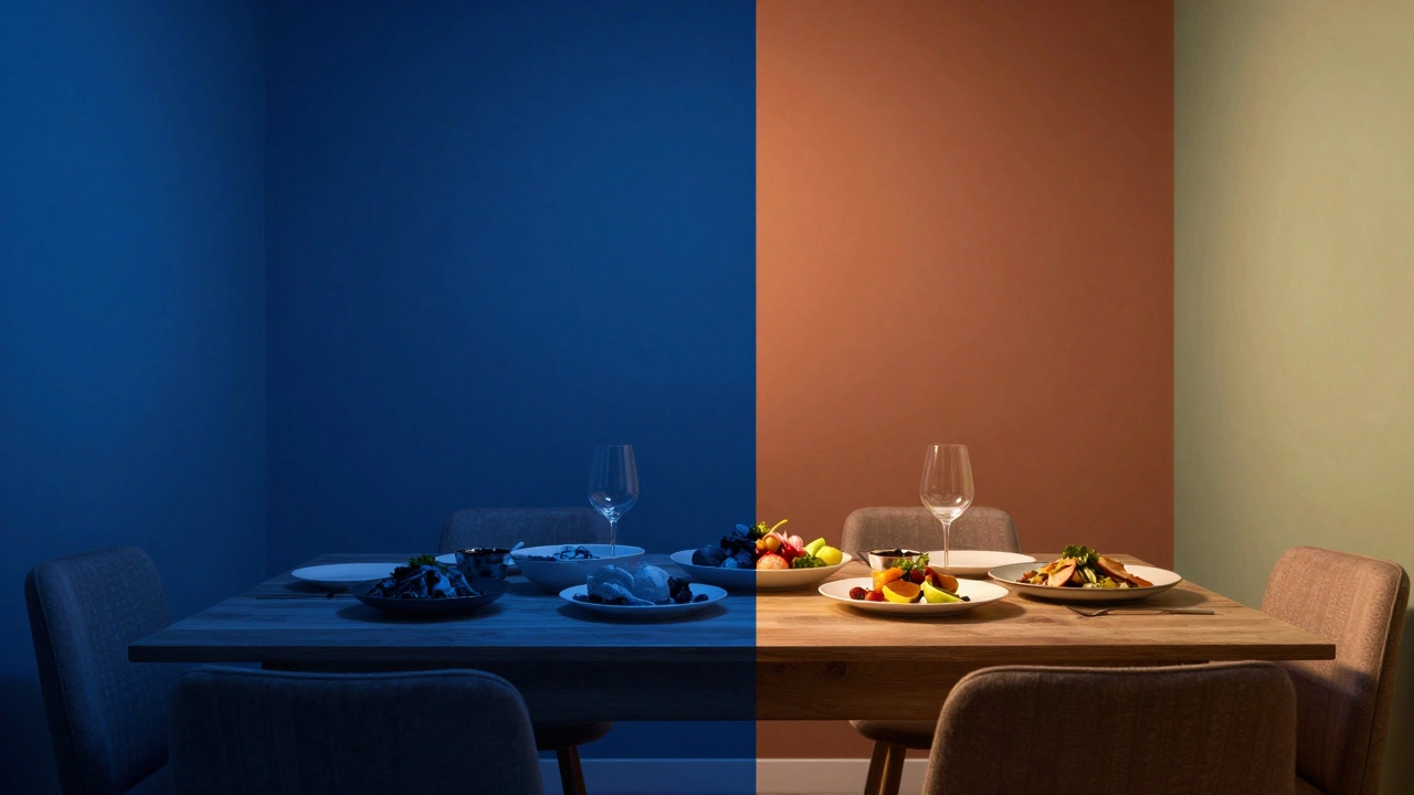
The Appetite Suppressants: Why Blue Is Risky
If there is one color that stands out as the biggest offender in dining spaces, it is blue. Nature rarely pairs blue with edible food. Think about it: when was the last time you saw a blue apple, a blue steak, or blue bread? Most naturally occurring blue foods are berries, which are small snacks, not main courses. In fact, many toxic mushrooms and spoiled meats turn bluish-green as they decay. Our brains have evolved to associate this hue with caution.
This phenomenon is so well-documented that fast-food chains almost never use blue in their branding or interiors. They want you to eat quickly and move on, but more importantly, they don’t want to accidentally kill your hunger. A study published in the journal *Appetite* found that participants ate significantly less when served meals on blue plates compared to yellow or white ones. Painting your entire dining room a deep navy or electric blue creates a subconscious barrier to eating. It doesn’t mean you can’t use blue at all, but using it as the dominant wall color is a mistake if you want guests to enjoy a hearty meal.
However, context matters. A light, airy sky blue might work in a breakfast nook where you’re having toast and coffee, but it will feel cold and sterile during a formal roast beef dinner. If you love blue, keep it to accessories—cushions, artwork, or a single accent chair—rather than the architectural shell of the room.
The Agitators: High-Energy Reds and Oranges
On the opposite end of the spectrum, you have colors that stimulate too much. Red is famous for boosting metabolism and increasing heart rate. This is why it works brilliantly in restaurants that want high table turnover. But in a home dining room, where the goal is often connection and leisurely enjoyment, too much red can cause anxiety. It raises the volume of conversation, literally and figuratively. People tend to talk faster and interrupt more in red-dominated environments.
Orange shares this energetic trait. While it can be warm and inviting in small doses, a wall-to-wall bright orange feels chaotic. It lacks the sophistication needed for intimate dinners. Imagine trying to have a serious discussion over wine while surrounded by neon-orange walls. It’s visually exhausting. The eye has nowhere to rest. Over time, this visual noise leads to mental fatigue, making guests want to leave sooner rather than later.
The key here isn’t to ban these colors entirely, but to avoid them as primary wall colors. Use terracotta or burnt orange as an accent on a sideboard or in textiles. These earthier versions provide warmth without the aggressive energy of their brighter counterparts.
The Muted Mistakes: Gray and Beige Fatigue
We’ve talked about colors that do too much (red/orange) and colors that suppress appetite (blue). Now let’s talk about colors that do too little. For years, gray and beige were the default safe choices for neutral interiors. But in a dining room, they often fail to create the necessary atmosphere. Pure gray, especially cool-toned grays, can feel institutional. It reminds people of hospitals, offices, or waiting rooms. It lacks the warmth required for hospitality.
Beige, while warmer, can sometimes feel flat and uninspired. If you pair beige walls with beige carpet and beige furniture, the room loses depth. Food presentation suffers because there’s no contrast. A vibrant dish looks dull against a monochromatic background. Furthermore, these neutrals don’t encourage lingering. They are functional but not emotional. A dining room should evoke feelings of comfort, celebration, or intimacy. Sterile neutrals struggle to achieve this without significant help from lighting and texture.
If you prefer a neutral base, opt for warm whites, creams, or soft taupes. These shades reflect light better and add a subtle glow that makes skin tones look healthier and food look more appealing. They provide a canvas that enhances rather than detracts from the meal.
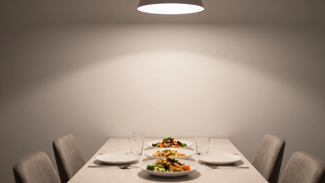
Lighting Interference: How Paint Changes Under Bulbs
A critical factor often overlooked is how artificial light interacts with paint. Most of us dine in the evening, under artificial lights. Many homes still use standard incandescent or warm-white LED bulbs, which cast a yellowish glow. Cool-colored paints, like those with blue or green undertones, can look muddy or even sickly under warm light. Conversely, warm paints can become overly saturated and intense.
Always test paint samples on all four walls of your dining room. Live with them for a few days, observing them in morning natural light, afternoon shadow, and evening artificial light. What looks elegant in the store sample strip might look completely different on your specific walls. This step prevents costly mistakes and ensures the color supports the mood you want to create during dinner hours.
While we focus on creating the perfect domestic atmosphere, it's worth noting that aesthetic preferences vary wildly across cultures and contexts. For instance, when traveling to places like Dubai, the approach to luxury and companionship reflects a different set of values and visual cues, as seen in resources like this directory, which highlights how distinct environments cater to specific desires and experiences.
Best Alternatives: Colors That Enhance Dining
So, what should you use instead? The best dining room colors strike a balance between stimulation and relaxation. Here are the top contenders:
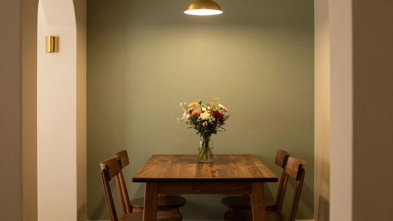
- Sage Green: Associated with nature and freshness, sage green promotes calmness without suppressing appetite. It pairs beautifully with wooden furniture and fresh flowers.
- Warm Terracotta: This earthy tone adds warmth and energy without the aggression of bright red. It stimulates conversation and complements Mediterranean-style cuisine.
- Deep Navy (Accent Only): If you love dark colors, use navy on a single feature wall or in cabinetry. It adds drama and sophistication, especially when paired with gold or brass fixtures.
- Creamy White: A timeless choice that reflects light and makes any space feel larger and cleaner. It allows the food and table settings to take center stage.
Comparing Dining Room Color Impacts
| Color | Psychological Effect | Appetite Impact | Best Use Case |
|---|---|---|---|
| Blue | Calm, Sad, Toxic association | Suppresses | Accessories only |
| Bright Red | Exciting, Anxious, Urgent | Stimulates (fast eating) | Fast-casual accents |
| Gray | Neutral, Cold, Institutional | Neutral/Low | Avoid as primary |
| Sage Green | Relaxing, Fresh, Natural | Supports | Walls, Upholstery |
| Terracotta | Warm, Inviting, Social | Stimulates (slow eating) | Feature Walls, Tiles |
Practical Tips for Choosing Your Palette
Start with your furniture. If you have a heavy, dark wood table, lighter walls will create necessary contrast. If your furniture is light oak or painted white, you can afford darker, moodier walls. Consider the size of the room. Small dining rooms benefit from lighter colors to expand the sense of space, while large rooms can handle deeper hues that add coziness.
Don’t forget the ceiling. Painting the ceiling a slightly darker shade than the walls can lower the perceived height, making a cavernous room feel more intimate. Alternatively, a crisp white ceiling keeps the focus downward on the table.
Finally, think about the art. Your wall color should complement, not compete with, your artwork. If you have bold, colorful paintings, a neutral wall lets them shine. If your art is minimal, you can experiment with bolder wall colors.
Frequently Asked Questions
Can I use black in my dining room?
Black can be used effectively as an accent or on a single feature wall to create drama and intimacy. However, painting all walls black can make the room feel claustrophobic and may require significant lighting adjustments to ensure food looks appetizing.
Is yellow a good color for dining rooms?
Yes, yellow is generally excellent for dining spaces. It mimics sunlight and ripe citrus, promoting happiness and appetite. Opt for muted yellows like mustard or cream to avoid visual strain.
How does lighting affect wall color perception?
Lighting dramatically shifts color appearance. Warm bulbs enhance reds and oranges but can mute blues. Cool bulbs make greens and blues pop but can make warm tones look washed out. Always test samples under your actual dining lights.
What color makes a small dining room look bigger?
Light, reflective colors like white, cream, or pale gray make small rooms feel larger. Using the same color on walls and trim eliminates visual boundaries, further expanding the space.
Should the dining room match the kitchen color?
It’s not necessary for them to match exactly, but they should harmonize. Since these spaces are often connected, clashing colors can disrupt flow. Choose complementary tones or a shared accent color to tie them together.
Imagine sitting down to a long, celebratory dinner. The food is hot, the conversation is lively, but suddenly you feel a strange urge to leave. You’re not tired, and the meal isn’t bad. The problem might be staring right at you: the walls. Choosing the wrong dining room colors can subtly sabotage your appetite, shorten your conversations, and make a cozy evening feel like a clinical waiting room. We often think of color as just decoration, but in a dining space, it acts as a psychological trigger that controls how much we eat, how long we stay, and how we feel about the people around us.
The dining room is unique among home spaces. It’s not just for looking at; it’s for doing. Specifically, it’s for eating and socializing. This dual purpose means the color palette needs to support digestion (which requires relaxation) and communication (which requires energy). When these two needs clash with poor color choices, the room fails its primary job. Before you pick up a paint swatch, you need to understand which hues create tension rather than tranquility, and why some shades that look great on Instagram can ruin your actual dinner parties.
Why does color affect appetite?
Color triggers psychological responses linked to our evolutionary past. Warm tones like red and orange mimic ripe fruits and fire, stimulating hunger. Cool tones like blue and green signal safety or, in the case of pure blue, potential toxicity, which suppresses appetite.
The Appetite Suppressants: Why Blue Is Risky
If there is one color that stands out as the biggest offender in dining spaces, it is blue. Nature rarely pairs blue with edible food. Think about it: when was the last time you saw a blue apple, a blue steak, or blue bread? Most naturally occurring blue foods are berries, which are small snacks, not main courses. In fact, many toxic mushrooms and spoiled meats turn bluish-green as they decay. Our brains have evolved to associate this hue with caution.
This phenomenon is so well-documented that fast-food chains almost never use blue in their branding or interiors. They want you to eat quickly and move on, but more importantly, they don’t want to accidentally kill your hunger. A study published in the journal *Appetite* found that participants ate significantly less when served meals on blue plates compared to yellow or white ones. Painting your entire dining room a deep navy or electric blue creates a subconscious barrier to eating. It doesn’t mean you can’t use blue at all, but using it as the dominant wall color is a mistake if you want guests to enjoy a hearty meal.
However, context matters. A light, airy sky blue might work in a breakfast nook where you’re having toast and coffee, but it will feel cold and sterile during a formal roast beef dinner. If you love blue, keep it to accessories-cushions, artwork, or a single accent chair-rather than the architectural shell of the room.
The Agitators: High-Energy Reds and Oranges
On the opposite end of the spectrum, you have colors that stimulate too much. Red is famous for boosting metabolism and increasing heart rate. This is why it works brilliantly in restaurants that want high table turnover. But in a home dining room, where the goal is often connection and leisurely enjoyment, too much red can cause anxiety. It raises the volume of conversation, literally and figuratively. People tend to talk faster and interrupt more in red-dominated environments.
Orange shares this energetic trait. While it can be warm and inviting in small doses, a wall-to-wall bright orange feels chaotic. It lacks the sophistication needed for intimate dinners. Imagine trying to have a serious discussion over wine while surrounded by neon-orange walls. It’s visually exhausting. The eye has nowhere to rest. Over time, this visual noise leads to mental fatigue, making guests want to leave sooner rather than later.
The key here isn’t to ban these colors entirely, but to avoid them as primary wall colors. Use terracotta or burnt orange as an accent on a sideboard or in textiles. These earthier versions provide warmth without the aggressive energy of their brighter counterparts.
The Muted Mistakes: Gray and Beige Fatigue
We’ve talked about colors that do too much (red/orange) and colors that suppress appetite (blue). Now let’s talk about colors that do too little. For years, gray and beige were the default safe choices for neutral interiors. But in a dining room, they often fail to create the necessary atmosphere. Pure gray, especially cool-toned grays, can feel institutional. It reminds people of hospitals, offices, or waiting rooms. It lacks the warmth required for hospitality.
Beige, while warmer, can sometimes feel flat and uninspired. If you pair beige walls with beige carpet and beige furniture, the room loses depth. Food presentation suffers because there’s no contrast. A vibrant dish looks dull against a monochromatic background. Furthermore, these neutrals don’t encourage lingering. They are functional but not emotional. A dining room should evoke feelings of comfort, celebration, or intimacy. Sterile neutrals struggle to achieve this without significant help from lighting and texture.
If you prefer a neutral base, opt for warm whites, creams, or soft taupes. These shades reflect light better and add a subtle glow that makes skin tones look healthier and food look more appealing. They provide a canvas that enhances rather than detracts from the meal.
Lighting Interference: How Paint Changes Under Bulbs
A critical factor often overlooked is how artificial light interacts with paint. Most of us dine in the evening, under artificial lights. Many homes still use standard incandescent or warm-white LED bulbs, which cast a yellowish glow. Cool-colored paints, like those with blue or green undertones, can look muddy or even sickly under warm light. Conversely, warm paints can become overly saturated and intense.
Always test paint samples on all four walls of your dining room. Live with them for a few days, observing them in morning natural light, afternoon shadow, and evening artificial light. What looks elegant in the store sample strip might look completely different on your specific walls. This step prevents costly mistakes and ensures the color supports the mood you want to create during dinner hours.
While we focus on creating the perfect domestic atmosphere, it's worth noting that aesthetic preferences vary wildly across cultures and contexts. For instance, when traveling to places like Dubai, the approach to luxury and companionship reflects a different set of values and visual cues, as seen in resources like this directory, which highlights how distinct environments cater to specific desires and experiences.
Best Alternatives: Colors That Enhance Dining
So, what should you use instead? The best dining room colors strike a balance between stimulation and relaxation. Here are the top contenders:
- Sage Green: Associated with nature and freshness, sage green promotes calmness without suppressing appetite. It pairs beautifully with wooden furniture and fresh flowers.
- Warm Terracotta: This earthy tone adds warmth and energy without the aggression of bright red. It stimulates conversation and complements Mediterranean-style cuisine.
- Deep Navy (Accent Only): If you love dark colors, use navy on a single feature wall or in cabinetry. It adds drama and sophistication, especially when paired with gold or brass fixtures.
- Creamy White: A timeless choice that reflects light and makes any space feel larger and cleaner. It allows the food and table settings to take center stage.
Comparing Dining Room Color Impacts
| Color | Psychological Effect | Appetite Impact | Best Use Case |
|---|---|---|---|
| Blue | Calm, Sad, Toxic association | Suppresses | Accessories only |
| Bright Red | Exciting, Anxious, Urgent | Stimulates (fast eating) | Fast-casual accents |
| Gray | Neutral, Cold, Institutional | Neutral/Low | Avoid as primary |
| Sage Green | Relaxing, Fresh, Natural | Supports | Walls, Upholstery |
| Terracotta | Warm, Inviting, Social | Stimulates (slow eating) | Feature Walls, Tiles |
Practical Tips for Choosing Your Palette
Start with your furniture. If you have a heavy, dark wood table, lighter walls will create necessary contrast. If your furniture is light oak or painted white, you can afford darker, moodier walls. Consider the size of the room. Small dining rooms benefit from lighter colors to expand the sense of space, while large rooms can handle deeper hues that add coziness.
Don’t forget the ceiling. Painting the ceiling a slightly darker shade than the walls can lower the perceived height, making a cavernous room feel more intimate. Alternatively, a crisp white ceiling keeps the focus downward on the table.
Finally, think about the art. Your wall color should complement, not compete with, your artwork. If you have bold, colorful paintings, a neutral wall lets them shine. If your art is minimal, you can experiment with bolder wall colors.
Frequently Asked Questions
Can I use black in my dining room?
Black can be used effectively as an accent or on a single feature wall to create drama and intimacy. However, painting all walls black can make the room feel claustrophobic and may require significant lighting adjustments to ensure food looks appetizing.
Is yellow a good color for dining rooms?
Yes, yellow is generally excellent for dining spaces. It mimics sunlight and ripe citrus, promoting happiness and appetite. Opt for muted yellows like mustard or cream to avoid visual strain.
How does lighting affect wall color perception?
Lighting dramatically shifts color appearance. Warm bulbs enhance reds and oranges but can mute blues. Cool bulbs make greens and blues pop but can make warm tones look washed out. Always test samples under your actual dining lights.
What color makes a small dining room look bigger?
Light, reflective colors like white, cream, or pale gray make small rooms feel larger. Using the same color on walls and trim eliminates visual boundaries, further expanding the space.
Should the dining room match the kitchen color?
It’s not necessary for them to match exactly, but they should harmonize. Since these spaces are often connected, clashing colors can disrupt flow. Choose complementary tones or a shared accent color to tie them together.