
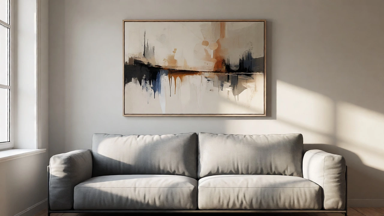
Wall Art Proportion Calculator
Enter the width of the furniture piece (sofa, bed, console) you plan to hang art above. We will calculate the ideal art width range using the professional 2/3 rule.
Recommended Art Width:
Perfect Balance-- inches
Based on 60-70% coverage of furniture width.💡 Pro Tips:
- • Height: Keep the bottom edge of the art 6–10 inches above the furniture.
- • Gaps: If using multiple pieces, keep gaps between frames tight (2–3 inches) so they read as one unit.
- • Empty Walls: Without furniture, center art at eye level (57–60 inches from floor).
You’ve bought the perfect piece of art. It’s got the right colors, the right vibe, and it cost a pretty penny. You hang it above your sofa, step back, and something feels… off. The gap between the frame and the couch cushions looks like a canyon, or maybe the art looks tiny, lost in a sea of drywall. This isn’t bad luck; it’s usually a math problem. Enter the 2/3 rule, a fundamental guideline in interior design that helps determine the correct width for artwork relative to the furniture below it. If you want your walls to look intentional rather than accidental, this simple ratio is your best friend.
| Furniture Width | Target Art Width (60-70%) | Recommended Setup |
|---|---|---|
| Standard Sofa (84") | 50" - 59" | One large horizontal piece or triptych |
| King Bed (76") | 45" - 53" | Single wide canvas or gallery cluster |
| Console Table (48") | 29" - 34" | Medium framed print or mirror |
| Dining Bench (60") | 36" - 42" | Linear arrangement or single landscape |
Why Proportions Matter More Than Style
Let’s be honest: most people buy art because they love the image, not because they measured their wall first. That’s fine. But once you’re ready to hang it, style takes a backseat to proportion. Human eyes are wired to notice imbalance. When a piece of art is too small for its anchor-usually a sofa, bed, or console-it creates visual tension. It looks like the artist forgot to finish the job, or worse, that you didn’t have enough money for a bigger frame. The 2/3 rule solves this by giving you a concrete target. Ideally, the total width of your art should cover about two-thirds to three-quarters of the width of the furniture underneath it. Why this specific number? Because it creates a sense of containment. The art visually "holds" the furniture down, grounding the space. If the art is wider than the furniture, it can feel top-heavy and unstable. If it’s much narrower, it floats away, leaving awkward negative space on either side.
How to Calculate Your Sweet Spot
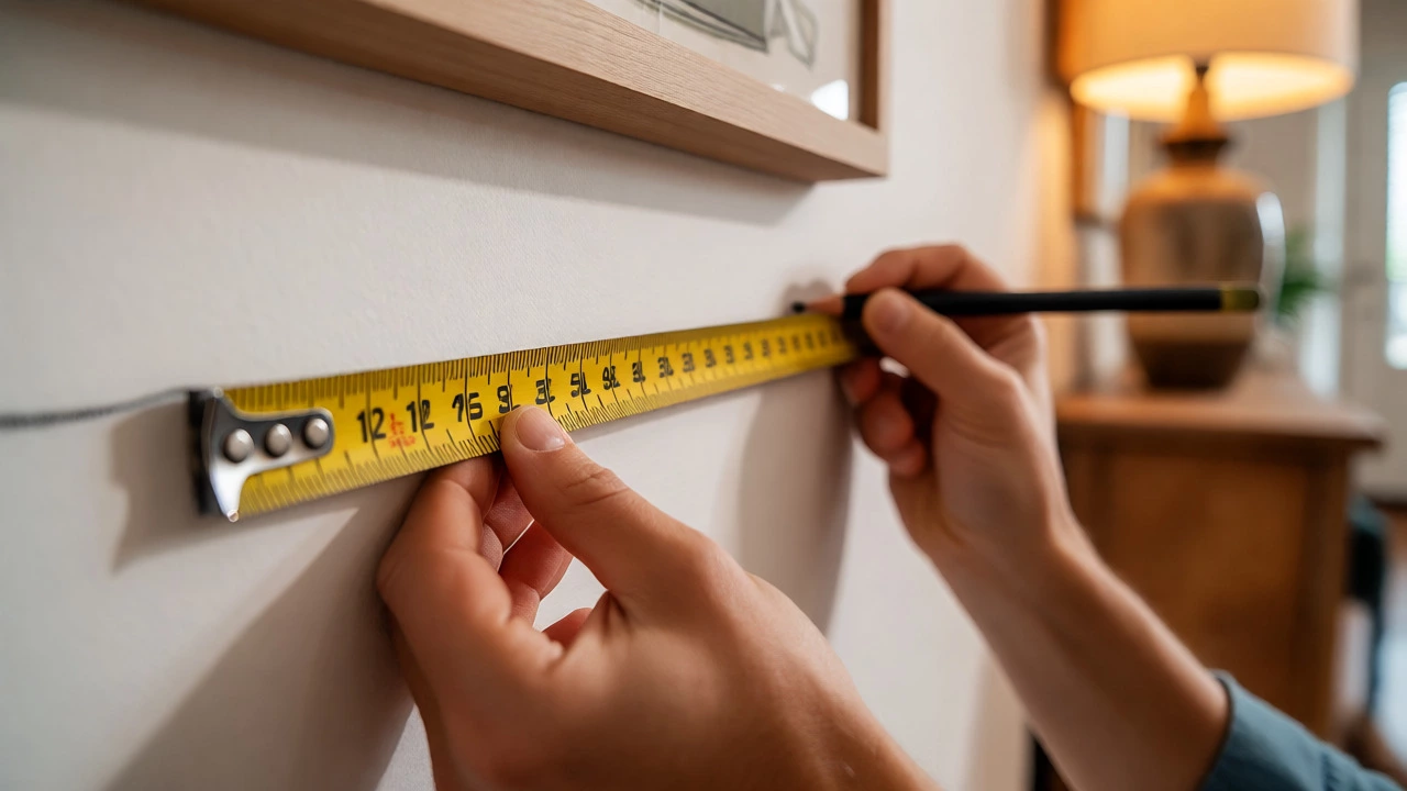
You don’t need an engineering degree to get this right. Grab a tape measure. Measure the widest part of the furniture piece you plan to hang the art over. Let’s say you have a standard three-seater sofa that is 84 inches wide. Now, do the quick math: multiply 84 by 0.66. That gives you roughly 55 inches. So, any combination of frames that totals between 50 and 59 inches will likely look balanced. But what if you don’t have one giant canvas? This is where people get stuck. They think they need a single massive piece. You don’t. You can achieve the same visual weight with multiple smaller pieces. If you’re using a set of three prints, each print should ideally be spaced evenly so that the entire group spans that 55-inch target. The key is the total silhouette, not the individual size of each frame. A common mistake is spacing the frames too far apart. If you spread three small frames across the whole 84-inch sofa, they’ll look disconnected. Keep them tight, within that 2/3 zone, and they’ll read as one cohesive unit.
Hanging Height: The Other Half of the Equation
Sizing is only half the battle. Even if you nail the width, hanging the art at the wrong height ruins everything. There’s another golden rule here: the bottom edge of your art should sit 6 to 10 inches above the top of the furniture. Never leave a huge gap. We tend to hang things too high because we’re afraid of bumping into them, but that disconnects the art from the room. It makes the ceiling feel lower and the room feel disjointed. If you’re hanging art in an empty wall space without furniture nearby, center it at eye level. For the average person, that’s 57 to 60 inches from the floor to the center of the artwork. In galleries, they often use 57 inches as the standard, which works well for most living rooms. But remember, context matters. If you’re looking at the art while sitting down, lower it slightly. If you’re walking past it in a hallway, keep it higher. The goal is comfort, not rigid adherence to a chart.
When to Break the Rules
Is the 2/3 rule absolute law? No. Design is subjective, and sometimes breaking the grid creates more interest. Here are a few scenarios where you might ignore the math:
- The Gallery Wall: If you’re creating a dense collage of photos and prints, the overall shape matters more than strict width ratios. Just ensure the cluster doesn’t dwarf the furniture.
- Mirrors: Mirrors reflect light and space, so they can sometimes feel lighter than solid art. You might go slightly wider than 2/3 to maximize the reflection effect.
- Asymmetrical Arrangements: If you have a tall plant or lamp next to your sofa, you can balance the visual weight there instead of relying solely on the art width.
Common Pitfalls to Avoid
I see these mistakes constantly in Melbourne homes and beyond. First, buying art based on the wall size, not the furniture size. You have a big blank wall above a small loveseat? Don’t fill it with a giant canvas unless you want the sofa to look like a toy. Scale the art to the furniture, not the wall. Second, ignoring the color palette. Large amounts of dark art can make a room feel heavy, even if the size is correct. If you’re sticking to the 2/3 rule but the room still feels cramped, try swapping a dark frame for a white one, or choosing a piece with more negative space. White matting can also help expand the visual footprint of a smaller piece, allowing it to occupy the required width without overwhelming the space with color. Third, forgetting about lighting. Proper illumination can draw the eye up and connect the art to the room. Track lights or picture lights positioned 30 degrees above the frame can reduce glare and highlight texture, making the proportional choices feel more deliberate.
Practical Example: The Living Room Layout
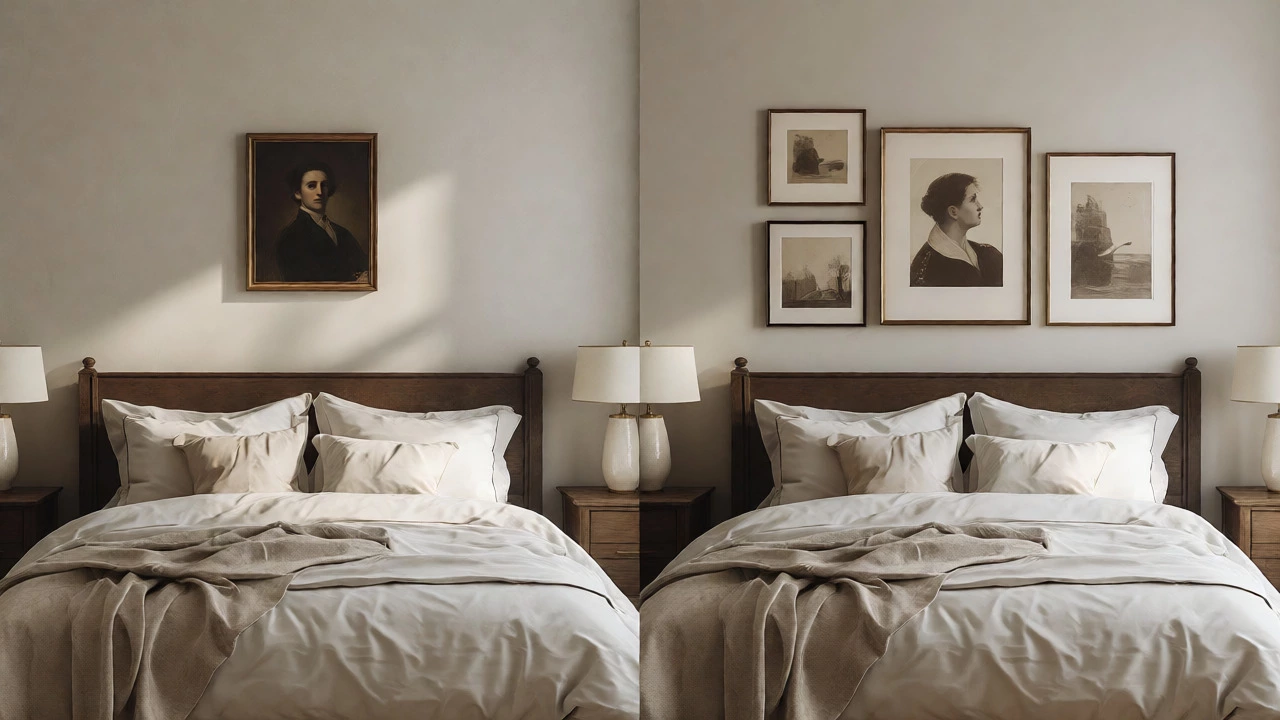
Imagine a typical living room. You have a grey fabric sofa, 80 inches wide. Behind it is a beige wall. You have three options:
- Option A: One large abstract painting, 70 inches wide. This exceeds the 2/3 rule (which would be ~53 inches). It might feel too dominant, sucking the oxygen out of the room.
- Option B: Two medium prints, 20 inches each, hung with a 10-inch gap. Total width is 50 inches. This fits the rule perfectly. It feels balanced and airy.
- Option C: One small portrait, 24 inches wide. This is way under the limit. It will look lonely and insignificant against the bulk of the sofa.
Tools to Help You Visualize
Don’t trust your gut alone. Use paper templates. Cut out newspaper or kraft paper to the exact dimensions of your art frames. Tape them to the wall using painter’s tape. Step back. Walk around the room. Sit on the sofa. Does it feel right? This low-tech method saves you from patching holes later. There are also apps available that let you upload a photo of your room and drag-and-drop virtual frames onto the wall. These can be helpful for checking width ratios quickly, though nothing beats seeing physical paper on the actual wall. Lighting changes throughout the day, and shadows cast by real frames add depth that digital overlays miss.
Does the 2/3 rule apply to vertical spaces?
No, the 2/3 rule specifically refers to width proportions relative to furniture. For height, the general guideline is to center art at eye level (57-60 inches from the floor) or keep it 6-10 inches above furniture. Vertical stacking follows different logic, often requiring equal gaps between pieces to maintain balance.
What if my art is wider than 2/3 of the furniture?
It’s not fatal, but proceed with caution. Wider art can dominate a room, making furniture look smaller. To mitigate this, use lighter frames, less saturated colors, or ensure the art has significant negative space (white background). If the art is significantly wider, consider moving it to a standalone wall instead of anchoring it to furniture.
Can I use the 2/3 rule for a TV?
Yes, but TVs are darker and heavier visually. Aim for the lower end of the spectrum (around 60% width) or slightly less. A TV that matches the full width of a console often looks like a black hole absorbing the room’s energy. Leaving breathing room on the sides helps integrate it better.
How does frame thickness affect the rule?
Frame thickness adds visual weight. A thick, ornate gold frame reads larger than a thin black metal frame of the same dimensions. If you’re using heavy frames, aim for the lower end of the 2/3 range (closer to 60%) to prevent the arrangement from feeling cluttered.
What if I have no furniture to hang art over?
In open wall spaces, focus on centering the art horizontally within the available wall section, avoiding corners. Vertically, stick to the eye-level rule (57-60 inches center). Without furniture to anchor it, the art becomes a focal point on its own, so symmetry and isolation are key.