60-30-10 Color Ratio Calculator
Check if your room's color proportions follow the 60-30-10 decorating rule for balanced design.
Enter your color percentages to see if they follow the 60-30-10 rule.
Ever walked into a room and just felt it was right-calm, balanced, not too loud, not too dull? That’s not luck. It’s probably the 60-30-10 rule at work. This isn’t some fancy design theory reserved for magazines. It’s a practical, tried-and-true formula used by pros and homeowners alike to create spaces that feel put together without trying too hard.
What exactly is the 60-30-10 rule?
The 60-30-10 rule is a simple color proportion guideline for interior spaces. It breaks down how much of each color you should use in a room:
- 60% dominant color - the main backdrop. Think walls, large rugs, or built-in cabinetry.
- 30% secondary color - supports the dominant color. Usually furniture, curtains, or larger textiles.
- 10% accent color - pops of contrast. Think throw pillows, artwork, lamps, or decorative objects.
This ratio isn’t about being exact to the square inch. It’s about creating visual harmony. Too much of one color overwhelms. Too little of another makes the room feel flat. The 60-30-10 rule gives you a structure so your space doesn’t look like a paint store exploded.
Why does this ratio work?
Your brain naturally likes balance. Think of it like music. A song with only one note gets boring. One with too many notes feels chaotic. The 60-30-10 rule is the sweet spot between rhythm and contrast.
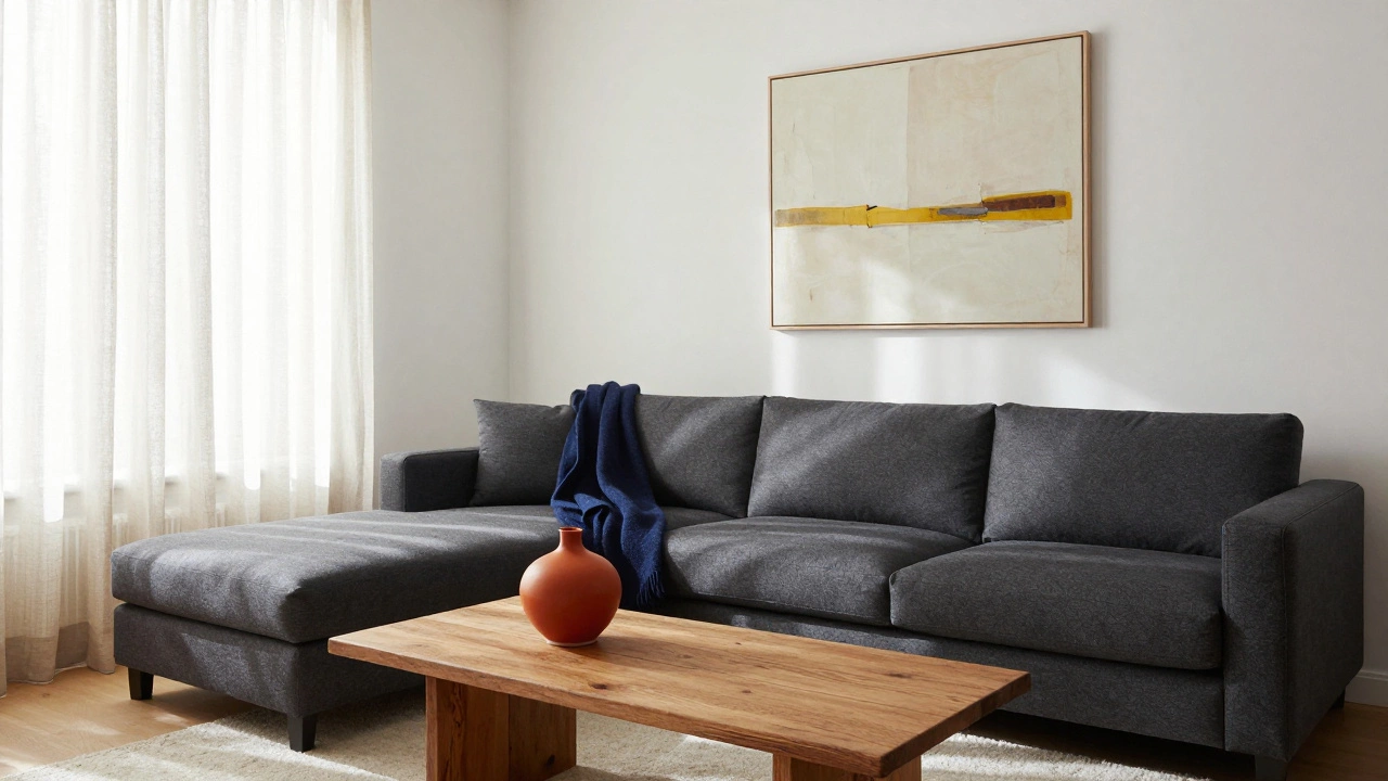
In a living room, if your walls are a soft beige (60%), your sofa and curtains are a warm gray (30%), and you add navy blue throw pillows and a gold lamp (10%), the room feels grounded but still interesting. The beige holds everything together. The gray adds depth. The navy and gold? They catch your eye and make you pause.
Designers use this because it prevents the common mistake of using too many colors at once. People often buy a bold rug, a colorful armchair, patterned curtains, and bright art-then wonder why the room feels messy. The 60-30-10 rule stops that before it starts.
How to apply it in real rooms
Let’s break it down by space.
Living Room
Start with your largest surfaces. Walls or large area rugs make up the 60%. If you have dark wood floors, that can count toward the dominant color too. Pick a neutral tone-beige, warm gray, soft white. Then choose a secondary color for your sofa, side tables, and maybe window treatments. This can be a muted blue, olive green, or even a warm taupe. Finally, add your 10%: a bright yellow vase, red books on a shelf, or a patterned accent pillow. One or two pieces are enough. Don’t go overboard.
Bedroom
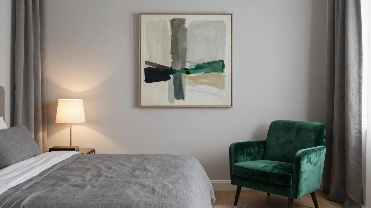
Bedrooms need calm. Your 60% should be soothing: light gray, creamy white, or a pale blue. Your 30% can be a slightly deeper version of that same color family-maybe a slate gray bedding set or linen curtains. The 10%? A single piece of art with a pop of color, or a velvet accent chair in emerald. Keep the 10% intentional. One strong accent is better than five small ones.
Kitchen
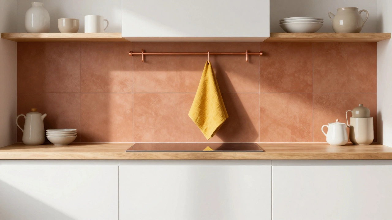
Here, the 60% is often cabinetry or countertops. White or wood-toned cabinets work well. The 30% could be your backsplash or island color-maybe a soft green or warm terracotta. The 10%? That’s where you get playful: a red kettle, a set of mustard-yellow dish towels, or a single piece of hanging copper cookware. The key is to keep the 10% small and concentrated. Too much color in the kitchen feels chaotic.
Bathroom
Even small spaces benefit. White tiles (60%), a dark wood vanity (30%), and a single bright towel or soap dispenser in cobalt blue (10%) instantly elevate the space. You don’t need to repaint. Just swap out accessories.
What if I don’t like neutrals?
Great question. The 60-30-10 rule doesn’t mean you have to use beige. It just means you need a base. You can use deep navy as your 60%, charcoal as your 30%, and a bright coral as your 10%. The rule is flexible-it’s about proportion, not palette.
Try this: pick a color you love. Make it your 60%. Then find a slightly darker or lighter version of it for the 30%. For the 10%, pick a color that’s opposite on the color wheel. For example, if your 60% is sage green, your 30% could be a deeper forest green, and your 10% could be a soft terracotta. The contrast feels intentional, not random.
Common mistakes to avoid
Even when people know the rule, they still mess it up.
- Using too many accents. One or two 10% items are enough. Five throw pillows in five different colors? That’s not a 10% accent-it’s a 50% disaster.
- Ignoring lighting. Colors change under different lights. A soft gray might look blue in morning light and purple at night. Test your colors on the wall at different times of day before committing.
- Forgetting texture. The 60-30-10 rule is about color, but texture adds depth. A wool rug, linen curtains, and a velvet pillow in the same color family create richness without needing more color.
- Thinking it’s a strict formula. It’s a guide, not a law. If your 65% is a little off, no one will notice. The goal is balance, not math.
Real example: A Melbourne living room
Take a typical inner-city Melbourne apartment. The walls are a warm white (60%). The large sectional sofa is a charcoal wool blend (30%). The coffee table is reclaimed timber. On the sofa: one navy blue throw and two cream cushions. On the side table: a small ceramic vase in burnt orange. A single abstract painting above the sofa has a stripe of mustard yellow. That’s it. No other colors. The room feels cozy, modern, and intentional-all because of the 60-30-10 structure.
Tools to help you plan
You don’t need to guess. Use free tools like:
- Adobe Color (create a palette based on one main color)
- Canva’s color palette generator (upload a photo and extract dominant tones)
- Paint samples from Bunnings or Resene-hold them up on your wall at different times of day
Take photos of your space with your phone. Use the photo editor to adjust brightness and saturation. You’ll start seeing which colors dominate and which are missing.
When to break the rule
There’s always an exception. If you have a bold feature wall, you might let that take up 70% and reduce the secondary to 20%. Or if you’re decorating a child’s room and want to use multiple bright colors, you can stretch the 10% to 15%-just keep the rest neutral.
Design rules exist to help you, not trap you. The 60-30-10 rule is your safety net. Once you understand it, you can bend it. But start with it. Most people who skip it end up regretting it.
Final tip: Start small
You don’t need to repaint your whole house. Pick one room. Start with the largest item-the sofa, the rug, the bed. Decide what color it is. That’s your 60%. Then pick one supporting color for the next biggest thing. Finally, grab a few small items you already own-maybe a lamp, a book, a plant pot-and move them around until they feel like the right pop. That’s your 10%.
Do that for one room. See how it feels. Then do it again. You’ll start seeing the difference-not just in how the room looks, but how it makes you feel. Calm. Grounded. Like it was made for you.
Can the 60-30-10 rule be used in small rooms?
Yes, and it’s even more important in small spaces. Small rooms can feel cluttered quickly. Using the 60-30-10 rule keeps the color palette clean and prevents visual overload. Stick to light or medium tones for the 60% to make the room feel larger. Use the 10% accent sparingly-one small piece of color can make the space feel intentional without crowding it.
Do I have to use three different colors?
No. You can use variations of the same color family. For example, your 60% could be light gray, your 30% a medium gray, and your 10% a dark gray with a subtle pattern. This creates depth without introducing new hues. The rule is about proportion, not variety.
What if my furniture doesn’t match the 60-30-10 rule?
You don’t need to replace everything. Adjust the 60% and 30% with walls, rugs, and curtains instead. If your sofa is bright red (which might be your 30%), make your walls a neutral cream (60%) and add gray throw pillows and a black lamp for the 10%. The room still balances-you’re just shifting where the color lives.
Can I use patterns with the 60-30-10 rule?
Absolutely. A striped rug or floral curtain can count as your 30% if the main color in the pattern matches your dominant color. Just make sure the pattern doesn’t introduce more than one new color. If your rug has red, blue, and cream, and cream is your 60%, then red or blue can be your 30%-but not both. Pick one to carry through.
Is the 60-30-10 rule only for color?
Primarily, yes. But you can extend it to textures and materials. Use 60% of one texture (like linen or wood), 30% of another (like wool or metal), and 10% of a contrasting one (like glass or velvet). This adds depth without needing more color.
Next steps: Try it today
Grab a notepad. Walk into your living room or bedroom. Look around. What’s the biggest color you see? That’s your 60%. What’s the second most common? That’s your 30%. Now look for one small thing that stands out-the colorful mug, the framed photo, the plant pot. That’s your 10%. Write it down. Now ask yourself: does it feel balanced? If not, what one change could bring it closer? Maybe swap a pillow. Maybe move a lamp. You don’t need a renovation. Just a shift in perspective.
The 60-30-10 rule isn’t magic. It’s just smart design. And once you start seeing it everywhere, you’ll wonder how you ever lived without it.