Wall Art Balance Calculator
Room Dimensions
Recommended Art Size
Ever walked into a room and felt something was off-even though everything looked expensive or stylish? That’s often not about the pieces you chose, but how they’re balanced. The 70-30 rule in interior design isn’t a secret formula passed down from designers-it’s a practical way to stop your space from feeling chaotic or boring. And when it comes to wall art, this rule makes all the difference.
What Exactly Is the 70-30 Rule?
The 70-30 rule is a simple guideline for distributing visual weight in a room. Seventy percent of the space should feel calm, neutral, and grounded. The remaining 30% is where you bring in personality, color, texture, or bold statements. Think of it like a painting: the background sets the mood, and the focal point pulls your eye in.
This isn’t about exact measurements. You’re not measuring square footage. It’s about how your eyes experience the room. If your walls are all covered in art, your floor is patterned, your furniture is colorful, and your curtains clash with your rug? You’ve flipped the rule. That’s 100% noise. No calm. No rest.
When applied to wall art, the 70-30 rule means letting your walls breathe. Most of your wall surface should be bare, painted, or textured in a quiet way. Then, you add art-maybe one large piece, or a small grouping-that stands out because it has room to be seen.
Why Wall Art Needs the 70-30 Rule
Wall art is one of the easiest ways to inject style into a room. But it’s also one of the most overused. People buy a few prints, hang them all in a row, and think they’ve done their job. The result? A visual mess.
Here’s what happens when you ignore the rule:
- Your eyes don’t know where to rest
- The room feels busy, not curated
- Even expensive art looks cheap because it’s lost in the noise
On the flip side, when you follow the 70-30 rule with wall art:
- Each piece becomes a statement
- The room feels intentional and calm
- You create moments of discovery-like finding a favorite painting after walking in
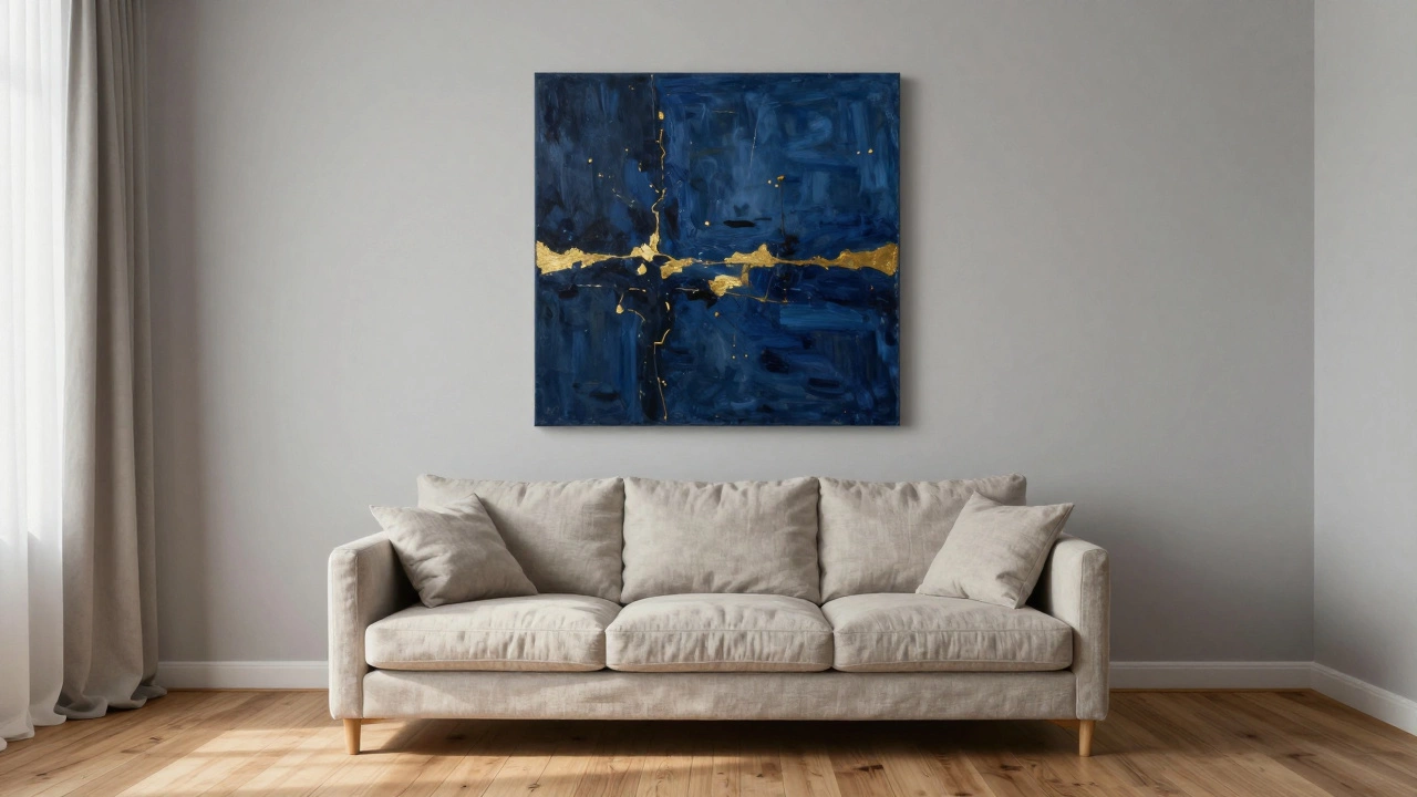
Take a living room in Melbourne with soft gray walls, a linen sofa, and wooden floors. That’s your 70%. Now, hang one large abstract oil painting above the sofa-deep indigo with gold accents. That’s your 30%. The art doesn’t compete. It sings.
How to Apply the 70-30 Rule to Wall Art
Here’s how to make it work in practice:
- Start with your base-walls, floors, large furniture. These should be neutral or muted. Think beige, warm gray, soft white, natural wood tones. This is your 70% foundation.
- Choose one or two key art pieces-not five. One large piece (like a 48x60 inch canvas) or a pair of smaller ones (say, two 24x36 inch prints) that feel connected. Avoid clusters of six or more unless they’re part of a single unified design.
- Place art strategically-above a sofa, at the end of a hallway, beside a bed. Don’t just hang it where it fits. Let it anchor a space.
- Leave breathing room-at least 6-12 inches of wall space around each piece. Crowding art makes it feel like an afterthought.
- Match the mood-if your room is calm, let your art be bold. If your room is already full of texture (woven baskets, patterned rugs), keep the art simple. The 70-30 rule is about contrast, not repetition.
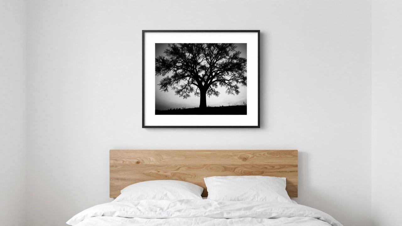
For example, a bedroom with white walls, linen bedding, and a wooden headboard (70%) can handle one striking black-and-white photograph of a tree silhouette (30%). No need for matching nightstand lamps or framed family photos on the dresser. One strong piece does the work.
Common Mistakes People Make
Even when people know the rule, they still mess it up. Here are the top three errors:
- Hanging too many small pieces-A gallery wall of ten 8x10 inch photos might seem curated, but it’s still 100% noise. The rule isn’t about quantity-it’s about visual weight. One large piece can outweigh ten small ones.
- Choosing art that matches everything-If your art has every color in your room, it disappears. The 30% should stand out, not blend in. A pop of color or unexpected texture is what makes it work.
- Ignoring scale-A tiny piece on a huge wall looks lost. A massive piece on a small wall feels overwhelming. The art should be about two-thirds the width of the furniture below it. So if your sofa is 80 inches wide, your art should be 50-60 inches wide.
One client in Carlton had a 10-foot wall in her dining room covered with six small landscape prints. It looked like a flea market display. We replaced it with one large 72-inch landscape painting in muted greens and grays. The room went from cluttered to calm in five minutes.
What About Color? Can I Use Color in the 70%?
Yes-but carefully. The 70% doesn’t mean you need to paint everything white. It means your dominant colors should be quiet. Warm taupe, soft sage, light oak, cream-these are all 70% colors. They’re neutral enough to let the 30% shine.
You can use color in the 70% if it’s consistent and low-saturation. Think of a navy blue wall in a bedroom. It’s bold, but it’s still a single tone, flat, and doesn’t compete. That’s still 70%. Now add a single gold-framed mirror with a textured surface above the dresser-that’s your 30%.
But if you have a mustard yellow wall, a red rug, and a teal armchair? That’s not 70-30. That’s 100% chaos.
Real-Life Examples
Here are three real setups that nailed the 70-30 rule:
- Minimalist Living Room-White walls, gray sectional, oak floor. One large black-and-white photograph of a city skyline at night (72 inches wide). No other wall art. Result: feels spacious, modern, and intentional.
- Boho Bedroom-Beige linen walls, rattan bed frame, jute rug. One large woven textile hanging above the bed (48 inches tall), no frames. No photos, no mirrors. Result: warm, textural, and calming.
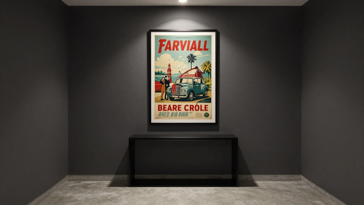
- Urban Apartment Entryway-Dark gray walls, concrete floor, black console table. One single framed vintage travel poster (36x48 inches), centered. No other decorations. Result: feels like a curated museum moment.
Notice a pattern? In each case, the art was the only thing drawing attention. Everything else was background.
What If I Love Lots of Art?
Then use the rule differently. Instead of hanging art on every wall, pick one wall to be your 30% canvas. Let the rest of the room stay quiet. You can still have five pieces-but only if they’re grouped as one unified composition.
For example, hang three vertical prints in a column on one wall. Make them the same size, same frame, same theme (like botanical drawings). That’s one 30% statement. The other three walls? Bare. Or just a single shelf with a plant.
It’s not about how much art you own. It’s about how much you let speak at once.
Final Thought: Less Is More, But Only If It’s Right
The 70-30 rule isn’t about being minimal. It’s about being thoughtful. You can have a full, rich home and still follow this rule. It’s not about removing things-it’s about choosing what matters.
Wall art should feel like a pause in the rhythm of your home. Not a drum solo. Let your space breathe. Let your favorite piece have room to breathe too.
Is the 70-30 rule only for wall art?
No, the 70-30 rule applies to the whole room-furniture, textures, colors, lighting. But wall art is one of the most common places people break it. The rule helps you avoid overcrowding, whether it’s with art, throw pillows, or decorative objects. The principle stays the same: let most of the space be calm, and use a smaller portion to create interest.
Can I use the 70-30 rule in small apartments?
Absolutely. Small spaces benefit even more from this rule. When you have limited square footage, visual clutter feels heavier. Stick to one statement piece of art, maybe a mirror, or a single shelf with one or two objects. Keep walls mostly bare. This makes the room feel larger and more intentional, not cramped.
What if my walls are already colored or textured?
If your wall has a strong color or texture-like exposed brick, dark paint, or wallpaper-that’s your 70%. Then choose art that complements, not competes. A neutral-toned photo on a red wall works. A bright yellow painting on a red wall? Too much. Let the wall be the background, and the art be the accent.
Do I need to follow the 70-30 rule exactly?
No, it’s a guideline, not a law. Some rooms work better with 60-40 or 80-20. The goal is balance, not math. If your 30% feels right-like it adds soul without overwhelming-you’ve done it. Trust your eye more than the numbers.
Can lighting affect how the 70-30 rule works?
Yes. Good lighting makes your 30% pop. Use a picture light, a floor lamp angled toward the art, or recessed spots to highlight your statement piece. Without light, even the best art blends in. Light turns art from decoration into experience.