Wallpaper Luxury Visualizer
Select Your Luxury Wallpaper
Based on design principles from the article, select textures and colors that create genuine luxury
Natural fiber with subtle texture that changes with light
Subtle woven texture with natural variations
Textured finish that mimics hand-troweled plaster
Unique variations between panels for artisanal quality
What Makes This Luxury?
True luxury wallpapers prioritize texture over patterns, quality materials over price tags, and craftsmanship over trends. This tool evaluates your selection based on the article's key principles:
- Textured surfaces that change with light
- Deep, sophisticated color palettes
- Professional installation quality
- Materials that age gracefully
Luxury Wallpaper Assessment
Wallpaper isn’t just paper on a wall. In homes that feel rich, even without gold trim or crystal chandeliers, the walls tell a story. You won’t find glittering gold leaf in most modern luxury homes-but you will find texture, depth, and quiet confidence. So which wallpaper is for wealth? It’s not about price tags. It’s about intention.
Wallpaper That Feels Rich Isn’t Always Expensive
Many people think luxury wallpaper means hand-embroidered silk or imported Italian damask. But real wealth in design doesn’t shout. It whispers. The most expensive-looking walls in 2026 are often made from simple, high-quality materials with thoughtful application. Take textured grasscloth-a natural fiber woven into paper. It’s not flashy, but it catches light differently than flat paint. In morning sun, it shimmers subtly. At night, under soft lighting, it adds warmth without glare. It’s the kind of detail that makes people pause, not because they recognize the brand, but because they feel the quality.
Grasscloth has been around for decades, but now it’s the go-to for designers working with high-net-worth clients. Why? Because it ages well. It doesn’t look dated. It doesn’t show fingerprints. And it’s never trendy. That’s the opposite of what most people expect.
The Color That Says ‘Wealth’ Without Saying It
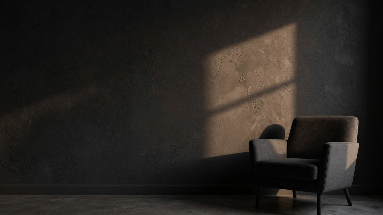
Forget white. Forget beige. The most common wall color in wealthy homes today is deep charcoal-not black, not gray, but a rich, slightly warm charcoal with a hint of brown. It’s not a paint. It’s a wallpaper. Brands like Farrow & Ball and Cole & Son have versions that mimic hand-painted plaster, with slight variations in tone that make each panel feel unique.
This color doesn’t reflect light. It absorbs it. That makes rooms feel smaller, cozier, more intimate. In homes where people entertain, it creates a sense of privacy even in open spaces. It’s not about hiding. It’s about creating space that feels like a sanctuary.
According to a 2025 survey by the International Society of Interior Designers, 68% of clients who spent over $200,000 on home renovations chose charcoal-based wallpapers for their main living areas. Not because it’s trendy. But because it lasts.
Patternless Is the New Pattern
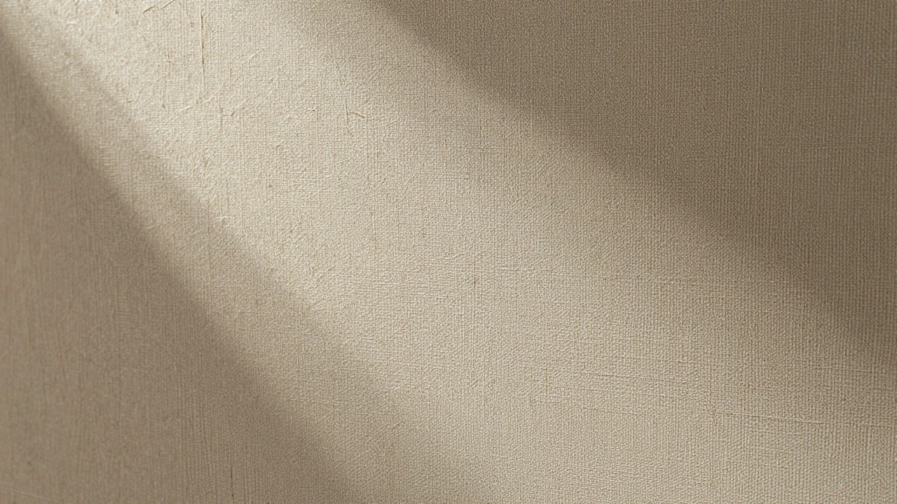
Patterns used to be the sign of luxury. Damask. Paisley. Floral scrolls. But today, the most expensive-looking walls are often the ones with no pattern at all. Solid-textured wallpapers-like linen-look, concrete-embossed, or hand-troweled plaster finishes-are dominating high-end interiors.
Why? Because they’re hard to fake. A cheap wallpaper can mimic a floral print. But a true textured wall requires precision in application, proper substrate, and skilled installers. You can’t slap it on yourself. That’s why it costs more. And that’s why it signals wealth.
Look at the walls in the homes of collectors, architects, and artists. You’ll see walls that look like they’ve been hand-finished over weeks. Not because they’re ornate. But because they’re deliberate.
Texture Over Flash
Here’s a secret: wealth doesn’t use metallics. Not anymore. Gold-leaf wallpaper? It’s outdated. Copper? Too much. The new luxury is in matte, non-reflective surfaces that feel alive under touch.
Wallpapers made from recycled paper with natural pigments are now preferred by designers working with eco-conscious wealthy clients. These aren’t just sustainable-they’re tactile. They feel like stone, like wool, like old parchment. They change with the light. They don’t glare. They don’t look like a product. They look like a part of the building.
One designer in London told me she stopped using any wallpaper with a glossy finish after a client said, ‘I don’t want my walls to look like they’re sweating.’
What Wallpaper Is Not for Wealth
Let’s be clear. Some things scream ‘trying too hard.’
- Overly busy patterns-like repeating 3D geometrics or neon florals-feel like a theme park, not a home.
- Wallpaper with visible seams-if you can see where the strips meet, it’s not luxury. Real high-end installation is seamless, with no overlap or misalignment.
- Mass-market faux finishes-like peel-and-stick metallics or vinyl that looks like marble-these are the opposite of wealth. They’re temporary. They age poorly.
- Too many colors-wealthy homes rarely have more than two wall tones in a single room. One main, one accent. That’s it.
Wallpaper that costs $50 a roll? It’s not the price. It’s the intention behind it. If it was chosen because it looked ‘expensive’ on Instagram, it probably isn’t.
The Real Test: Does It Last?
Here’s how you know if wallpaper is for wealth: wait five years.
True luxury wallpaper doesn’t fade, peel, or look dated. It deepens. Grasscloth becomes softer. Textured plaster gains character. Dark tones grow richer. A wall that was once ‘just a backdrop’ becomes a conversation piece-not because it changed, but because the people in the room changed around it.
Most people replace wallpaper every 7-10 years. But in homes where wealth is quietly present, the same wall might stay for 20. Not because it’s perfect. But because it’s meaningful.
Where to Look for Real Wealth in Wallpaper
You won’t find it at big-box stores. You won’t find it in bulk online. You find it in places that specialize in artisan-made papers-small studios in France, Japan, or the Pacific Northwest that hand-mix pigments and use traditional papermaking techniques.
Look for brands like:
- Zuber (France) - known for hand-blocked scenic wallpapers, often used in historic homes.
- Claremont (UK) - offers woven textiles as wallpaper, with natural dyes.
- Thibaut (USA) - specializes in non-repeating, hand-painted textures.
- Oslo Paper (Norway) - uses recycled fibers and low-impact printing.
These aren’t the most expensive. But they’re the most respected. And they’re the ones that appear in homes that don’t need to advertise their wealth.
Final Thought: Wealth Is in the Quiet
There’s no wallpaper that magically makes you rich. But there is wallpaper that makes a home feel like it belongs to someone who doesn’t need to prove anything.
It’s the wall that doesn’t catch your eye at first. But when you sit in the room for an hour, you notice it. The way the light moves. The way the texture changes. The way it feels more like a part of the house than a decoration.
That’s the wallpaper for wealth.
Is expensive wallpaper always better?
No. The most expensive wallpaper isn’t always the best. What matters is craftsmanship, material quality, and how well it fits the space. A $200-a-roll grasscloth from a reputable maker will look better and last longer than a $50 metallic print that peels after a year. Wealth in design isn’t about cost-it’s about durability and subtlety.
Can wallpaper make a small room look bigger?
Yes-but not the way you think. Light colors and horizontal stripes used to be the go-to. Today, the opposite works better. Dark, textured wallpapers like deep charcoal or matte linen create depth. They don’t reflect light outward-they pull it inward, making the space feel enclosed and intimate, which paradoxically makes it feel more spacious in a cozy, luxurious way. It’s about atmosphere, not optical tricks.
Is wallpaper outdated in modern homes?
Not at all. In fact, 2025 saw a 40% increase in wallpaper use in new luxury builds compared to 2020. Modern homes now use wallpaper for its texture, acoustic properties, and ability to soften hard architectural lines. It’s not a retro trend-it’s a material choice, like stone or wood. The best modern interiors use wallpaper the way they use concrete: as a natural, enduring surface.
Can I install luxury wallpaper myself?
You can, but you shouldn’t if you want it to look premium. High-end wallpapers like grasscloth or hand-painted designs require perfect wall prep, precise alignment, and specialized adhesive. A single misaligned seam can ruin the entire effect. Most designers recommend professional installation-even for homeowners who are handy. It’s not about laziness. It’s about protecting the investment.
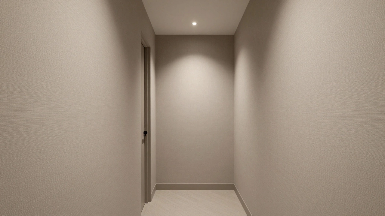
What’s the best room to start with if I want to add wealth through wallpaper?
Start with the hallway or powder room. These are small spaces where you can make a bold statement without a big cost. A richly textured wallpaper here creates a memorable first impression. It’s also easier to experiment. Once you see how the light changes the texture or how guests react, you’ll know whether to extend it to larger areas like the living room or bedroom.