Living Room Curtain Color Visualizer
Configuration
Analysis
Adjust settings to see recommendations.
Walk into any living room and look up. What do you see? If your eyes land on curtains that clash with the sofa or shrink the space, you’re not alone. Choosing the right curtain color feels simple until you stand in front of a rack holding hundreds of fabric swatches. Suddenly, "blue" isn't just blue-it’s navy, slate, powder, and teal. One wrong pick can make a sunny room feel gloomy or a cozy den feel sterile.
The truth is, there is no single "best" color for every living room. The perfect shade depends on your wall color, natural light, ceiling height, and the mood you want to create. But don’t worry. You don’t need an interior designer’s degree to get it right. By understanding how color interacts with light and space, you can pick curtains that elevate your entire room without costing a fortune.
Start With Your Walls: The Golden Rule of Contrast
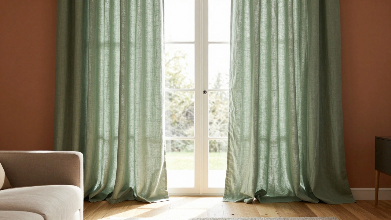
Before you even think about trends, look at your walls. They are the canvas; your curtains are the frame. The most common mistake people make is matching their curtains exactly to their walls. It sounds safe, but it often makes the windows disappear and the room feel flat. Instead, aim for contrast.
If your walls are white or off-white, almost any color works. This is your lucky break. You can go bold with emerald green or deep charcoal, or keep it soft with beige or gray. If your walls are painted a strong color-like a warm terracotta or a cool navy-you have two good options:
- Go lighter: Choose a cream, ivory, or pale gray curtain. This creates a crisp border around the window and keeps the room feeling airy.
- Go darker: Pick a shade within the same family but deeper. For example, pair sage green walls with forest green curtains. This adds depth and drama without clashing.
Avoid picking a curtain color that sits right next to your wall color on the spectrum unless you’re aiming for a monochromatic look. Even then, ensure there’s enough texture difference (like linen vs. paint) to keep it interesting.
Neutral Colors: Why Beige, Gray, and White Still Win
Let’s talk about neutrals. Many homeowners skip them because they seem boring. In reality, neutral curtains are the workhorses of interior design. They offer flexibility, longevity, and a sense of calm that bright colors sometimes lack.
| Color | Best For | Potential Pitfall |
|---|---|---|
| Cream/Ivory | Small rooms, north-facing rooms, traditional styles | Can look dingy if not washed regularly; stains show easily |
| Light Gray | Modern interiors, rooms with mixed metals (silver/gold) | Can feel cold in south-facing rooms without warm lighting |
| Warm Beige/Taupe | Scandinavian designs, rooms with wood floors | May blend too much with beige walls if not textured |
| Charcoal/Black | Large rooms, industrial styles, high ceilings | Can overwhelm small spaces; absorbs heat in summer |
Gray has become the new black in recent years. A medium-toned gray curtain pairs beautifully with both warm woods and cool metals. However, be careful with undertones. Some grays lean blue, while others lean pink. Hold your swatch against your existing furniture to check. If you have oak floors, a blue-gray might clash. A warmer taupe-gray would harmonize better.
White curtains are timeless but require maintenance. They show dust, pet hair, and sun fading quickly. If you love the look of pure white, consider a slightly off-white or oatmeal tone. It gives the same brightness but hides everyday wear much better.
Bold Choices: When to Use Color and How to Do It Right
Ready to add personality? Bold curtain colors can transform a living room from generic to gallery-worthy. But here’s the catch: color needs balance. If your curtains are loud, everything else should whisper.
Here’s how to use bold colors effectively:
- Anchor with Neutrals: If you choose mustard yellow or deep teal curtains, keep your sofa, rug, and walls neutral. Let the curtains be the star.
- Match an Accent: Look at your throw pillows, artwork, or vase. If you have a recurring accent color, match your curtains to that. This creates cohesion rather than chaos.
- Consider Light Exposure: Dark colors absorb light. In a room with only one small window, dark purple curtains might make the space feel cave-like. In a sun-drenched room with large windows, those same curtains will look rich and luxurious.
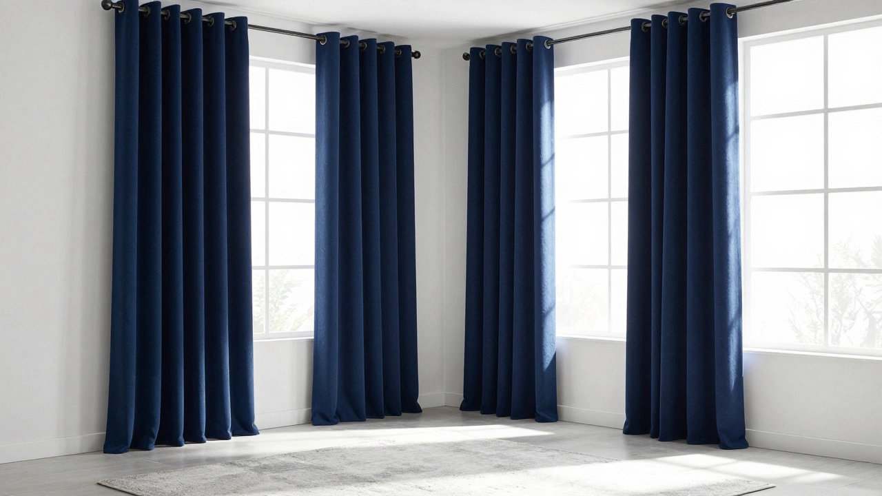
Green is having a major moment in 2026. Sage, olive, and emerald greens bring nature indoors and work well with plants. Blue remains a classic choice for calmness. Navy blue curtains paired with brass hardware and a light-colored sofa create a sophisticated, nautical-adjacent vibe without looking like a ship cabin.
Patterns vs. Solids: Which Should You Choose?
Solid colors are safer and easier to style, but patterns add character. Stripes, florals, geometrics-each tells a different story. Here’s what to know before committing to a patterned curtain.
Scale matters. Large-scale patterns (big flowers, wide stripes) can overwhelm a small room. They work best in spacious areas with high ceilings. Small-scale patterns (tiny dots, narrow checks) can get lost in large rooms. They’re ideal for cozy dens or smaller windows.
If you’re worried about patterns dating quickly, stick to timeless motifs. Botanical prints, subtle stripes, and abstract textures rarely go out of style. Avoid trendy graphics or overly specific themes (like sports logos or cartoon characters) unless you plan to change them in two years.
Mixing patterns is advanced territory. If you must, vary the scale significantly. Pair a large floral curtain with a small geometric rug. Keep the color palette unified so the eye doesn’t jump around confusedly.
How Natural Light Changes Everything
Light is the secret ingredient in curtain color selection. Two identical rooms can look completely different based on which direction their windows face.
- North-Facing Windows: These receive indirect, cooler light. Warm colors like beige, cream, gold, and terracotta help counteract the chill. Avoid cool grays and blues unless you want a very stark, modern feel.
- South-Facing Windows: Bright, consistent sunlight floods these rooms. Almost any color works here. Darker shades won’t darken the room as much because the light is so strong. You can experiment with jewel tones like ruby red or sapphire blue.
- East-Facing Windows: Morning light is warm and gentle. Soft pastels, light greens, and whites enhance this serene atmosphere.
- West-Facing Windows: Afternoon sun is intense and golden. Cooler colors like lavender, mint, or steel gray can balance the warmth. Consider blackout linings to prevent fading.
If your room gets little natural light, avoid dark, heavy fabrics. Opt for sheer or semi-sheer curtains in light colors to maximize whatever light you have. Sheers also add softness and movement, making the space feel larger.
Material Matters: Fabric Affects Color Perception
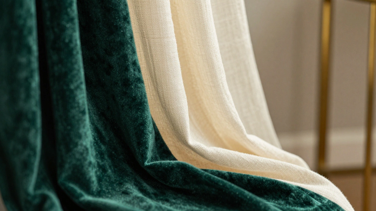
The fabric you choose changes how the color looks. Velvet reflects light differently than linen. Cotton drapes differently than silk. Always ask for a physical sample, not just a digital image.
Linen has a casual, textured look. Its weave scatters light, making colors appear softer and more muted. A navy linen curtain looks less severe than a navy velvet one. Linen wrinkles easily, which adds to its relaxed charm.
Velvet is plush and reflective. It makes colors pop and adds luxury. Great for formal living rooms or spaces where you want drama. Be aware that velvet shows water spots and vacuum marks easily.
Cotton blends** are durable and easy to clean. They hold dye well, so colors stay vibrant longer. Ideal for families with kids or pets.
Silk** offers a luminous sheen but fades quickly in direct sunlight. Reserve silk for rooms with minimal sun exposure or use it as a lining behind a more durable outer layer.
Practical Tips for Testing Curtain Colors
Don’t buy online without testing first. Here’s a foolproof method:
- Get Samples: Order free or low-cost fabric swatches from multiple brands.
- Hold Them Up: Place the swatch against your window at different times of day. Watch how morning, noon, and evening light affect the color.
- Check Against Furniture: Lay the swatch on your sofa or coffee table. Does it clash? Complement? Stand out too much?
- Live With It: Leave the swatch up for three days. See how it feels when you’re tired, stressed, or happy. Your initial reaction might change.
- Consider Hardware: Silver rods suit cool tones; brass suits warm tones. Mismatched hardware can ruin an otherwise perfect color choice.
If you’re renting and can’t drill holes, consider tension rods or clip-on rings. They limit fabric choices but still allow you to update your space temporarily.
Common Mistakes to Avoid
Even experienced decorators slip up. Here are pitfalls to sidestep:
- Ignoring Ceiling Height: Floor-to-ceiling curtains elongate the room. Short curtains chop it off visually. Always hang curtains as high as possible, even if it means drilling above the window frame.
- Choosing Width Wisely: Curtains should be at least twice the width of the window when open. Pinched, tight-looking curtains look cheap regardless of color.
- Forgetting Lining: Unlined curtains fade faster and offer poor insulation. A white lining preserves color and improves energy efficiency.
- Overcomplicating: Too many colors compete for attention. Stick to three main colors in your room: wall, curtain, and upholstery. Accents can vary.
Final Thoughts: Trust Your Eye
Rules are helpful, but your comfort matters most. If you love turquoise curtains and they make you smile every time you walk in, that’s worth more than any design guideline. The best curtain color is the one that makes your living room feel like home. Experiment, test, and don’t be afraid to swap things out later. Interior design is iterative, not permanent.
What is the most popular curtain color for living rooms in 2026?
Neutral tones like warm beige, light gray, and cream remain the most popular due to their versatility. Among colored options, sage green and navy blue are trending strongly this year for adding subtle personality without overwhelming the space.
Should my curtains match my walls or contrast with them?
Contrast is generally better. Matching curtains to walls can make windows disappear and flatten the room’s dimension. Aim for a curtain color that is either noticeably lighter or darker than your walls to create visual interest and define the window area.
Do dark curtains make a room look smaller?
Not necessarily. Dark curtains can actually make a room feel cozier and more intimate. To prevent a cramped feeling, ensure the curtains are hung high and wide, extending close to the floor. In rooms with abundant natural light, dark colors won’t shrink the space as much as in dimly lit areas.
How do I choose curtain colors for a north-facing room?
North-facing rooms receive cooler, indirect light. Choose warm-toned curtains like cream, beige, gold, or soft terracotta to add warmth and counteract the chill. Avoid cool grays and blues unless you specifically want a stark, minimalist aesthetic.
Are patterned curtains still in style?
Yes, but scale and subtlety matter. Timeless patterns like botanicals, subtle stripes, and abstract textures remain stylish. Avoid overly trendy or graphic prints. Mix large-scale patterns in big rooms and small-scale patterns in cozy spaces to maintain balance.
What fabric is best for living room curtains?
Linen and cotton blends are excellent for everyday living rooms due to their durability, breathability, and casual elegance. Velvet adds luxury and light reflection but requires more care. Silk is beautiful but prone to fading and should be reserved for low-light areas or used as a lining.
Can I mix two different curtain colors?
You can, but it’s tricky. Layering a sheer white curtain behind a colored opaque one is a common and effective technique. Mixing two solid colors side-by-side usually looks disjointed. Stick to one dominant color for the main panels and use sheers for light control and softness.
How wide should my curtains be?
Curtains should be at least twice the width of the window frame when fully open. This ensures they gather nicely and don’t look stretched or skimpy. For a fuller, more luxurious look, aim for 2.5 to 3 times the window width.