Dining Room Art Size Calculator
Find the perfect width for your dining room artwork based on your table size. Follows professional guidelines from interior design experts.
Your dining room isn’t just for eating. It’s where conversations spark, memories form, and guests feel welcome. But too many people treat it like an afterthought when it comes to wall art. You’ve got the table, the chairs, maybe a sideboard-but the walls? Bare. Or worse, cluttered with random prints that don’t belong. So what kind of pictures actually belong in a dining room? It’s not about matching the sofa or matching your curtains. It’s about creating a vibe that makes food taste better and people feel at ease.
Start with what you eat
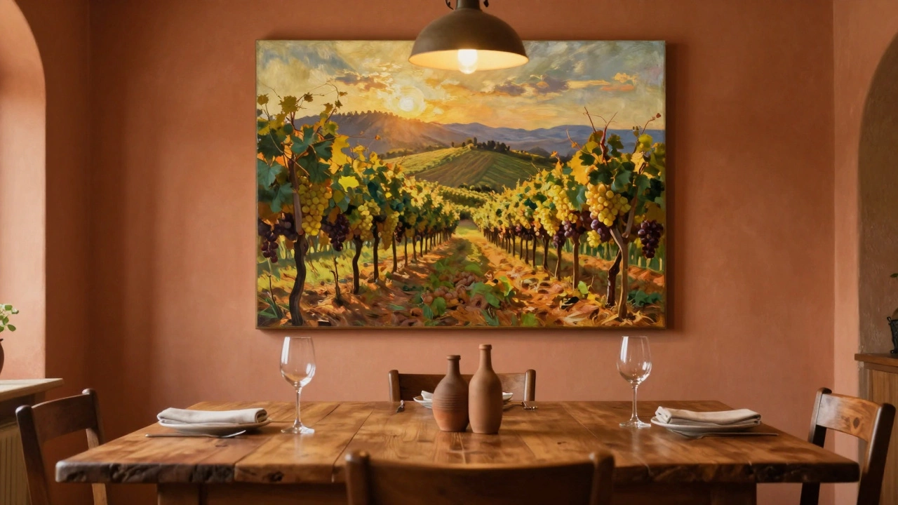
Think about your meals. Do you serve slow-cooked stews on weekends? Do you host brunch with fresh fruit and pastries? Do you have family dinners with roasted chicken and mashed potatoes? The art on your walls should echo that rhythm. A large, warm-toned painting of a rustic kitchen table with a loaf of bread and a bottle of wine feels right for a home that values comfort. A bright, colorful still life of citrus fruits, herbs, or seafood works if your meals are fresh, light, and seasonal. This isn’t about literal food photos-it’s about mood. A painting of a vineyard in Tuscany might feel out of place if you rarely drink wine, but it could feel perfect if you host wine nights every Friday.Size matters more than you think
A tiny print above your dining table looks lost. A huge canvas that towers over your head feels overwhelming. The sweet spot? The artwork should be about two-thirds the width of your dining table. So if your table is 180cm wide, aim for art between 120cm and 150cm wide. If you’re hanging multiple pieces, treat them as one unit. Group them like a puzzle-leave 5 to 8cm between each frame. Don’t spread them out like a gallery wall in the hallway. This space is intimate. Keep it focused.Color that makes food look better
Colors affect appetite. Red and orange stimulate hunger. That’s why fast-food chains use them. But in a home dining room, you don’t want to feel like you’re in a burger joint. Soft reds, terracotta, burnt sienna, and warm ochres work beautifully. They make roasted meats glow and add warmth to wooden tables. Blues and greens? They’re calming, but can suppress appetite if used too heavily. A muted sage green or a soft navy can work if balanced with warm wood tones or metallic accents. Avoid cool grays and stark whites unless you’re going for a minimalist, high-end restaurant look-and even then, add a pop of color elsewhere.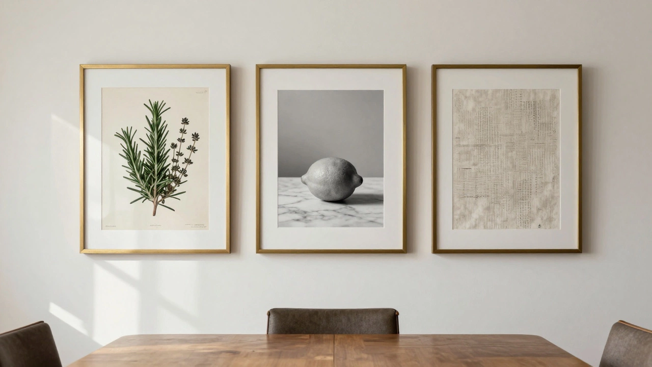
Go beyond paintings
You don’t need oil on canvas. A set of vintage botanical prints of herbs and vegetables adds quiet elegance. A framed collection of old recipe cards in your grandmother’s handwriting? That’s personal and meaningful. A large, high-quality photograph of a misty morning market in Italy or a bustling street food stall in Bangkok brings energy without being loud. Even a single, well-framed mirror can work wonders-it reflects light, makes the room feel bigger, and bounces the glow of candles or pendant lights back into the space. Just don’t hang it so it reflects the dining table directly. That’s weird.Style should match your furniture
If your dining table is mid-century modern with clean lines and tapered legs, go for abstract art or minimalist line drawings. A heavy, dark oak table with ornate carvings? A classic landscape or a richly detailed still life fits better. Don’t force a modern abstract piece into a traditional space-it’ll feel like a mismatched sock. The same goes the other way. A rustic farmhouse table doesn’t need a Picasso. It needs texture: woven tapestries, hand-printed linen panels, or even a large wooden sign with a simple phrase like “Eat. Laugh. Repeat.” Keep it grounded.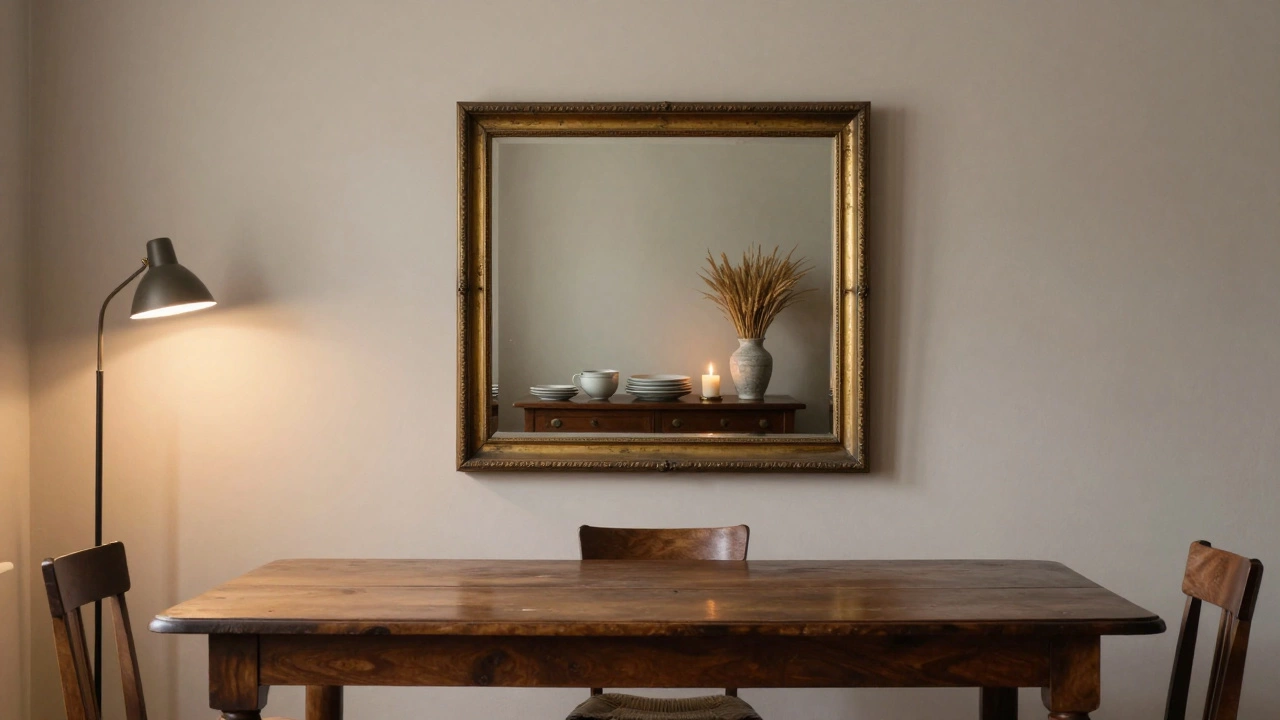
Avoid these common mistakes
- Don’t hang art too high. The bottom of the frame should be about 15cm above the back of your dining table. That’s eye level when you’re seated.
- Don’t use glossy frames. They reflect light and create glare during meals. Matte or brushed metal is better.
- Don’t hang family photos unless they’re part of a curated collection. A single portrait of your kids is fine. A wall full of vacation snapshots? Save that for the hallway.
- Don’t use cheap, mass-produced prints with plastic frames. They look thin and temporary. Even if you’re on a budget, buy one good piece. It lasts longer and feels more intentional.
Lighting makes the art come alive
Art in a dining room needs help. Natural light changes during the day, but you need consistent glow in the evening. A simple pendant light above the table helps, but if you want the art to stand out, add picture lights. These are narrow, focused LED strips that mount above the frame. They don’t take up space, and they make colors pop without washing out the wall. If you don’t want to install anything permanent, try a small floor lamp angled toward the wall. It’s subtle, but it changes everything.What to do if you’re stuck
If you’re not sure what to pick, start with texture. A woven wall hanging in natural fibers-linen, jute, wool-adds depth without color. It’s neutral, calming, and works with any style. Or try a single large-format print of a single object: a lone lemon on a marble surface, a stack of plates, a single wine glass catching the light. Less is more here. One powerful image beats five mediocre ones.And if you still can’t decide? Go with what makes you smile. Not what Pinterest says. Not what your interior designer recommends. When you walk into your dining room and you feel a little lift in your chest-that’s the sign you got it right.
Can I hang mirrors in the dining room?
Yes, but be thoughtful. A mirror can make the room feel larger and reflect candlelight or ambient lighting, which enhances the mood. Avoid placing it so it directly reflects the dining table-this can feel odd during meals. Instead, hang it on a side wall to reflect a beautiful sideboard, a plant, or a window with natural light.
Should dining room art be food-related?
Not necessarily. While food-themed art can enhance the atmosphere, it’s not required. Abstract pieces, landscapes, or even black-and-white photography can work just as well if they match the room’s tone. The goal is to create a calm, inviting space-not a restaurant menu board.
How many pieces of art should I hang above the dining table?
One large piece is ideal for most dining rooms. If you prefer multiple pieces, group them as a single unit-like a triptych or a symmetrical grid. Avoid scattering small prints across the wall. Keep the focus tight. The rule of thumb: the total width of your art group should be about two-thirds the width of your table.
What’s the best color for dining room art?
Warm tones like terracotta, burnt orange, deep red, and olive green encourage relaxation and appetite. Avoid overly cool colors like icy blue or stark white unless balanced with warm wood or metallic accents. The art should complement your table and chairs-not clash with them.
Can I use photographs instead of paintings?
Absolutely. High-quality, large-format photographs of nature, urban scenes, or even abstract textures work beautifully. Just make sure they’re printed on quality paper and framed properly. Avoid casual snapshots-stick to images with strong composition and mood. A photo of mist over a vineyard or a single loaf of bread on a wooden table can be more powerful than any painting.