
Living Room Color Pairing Simulator
Select a curated color pair from the list below or customize your own shades to see how they interact in a simulated living room space.
Customize Shades
Design Tip
Remember the 60-30-10 rule: Use your primary color for 60% of the room (walls/large furniture), secondary for 30% (curtains/rugs), and add texture with neutrals for the remaining 10%. Always test samples under different lighting conditions before committing. North-facing rooms need brighter tones; south-facing rooms can handle deeper hues.
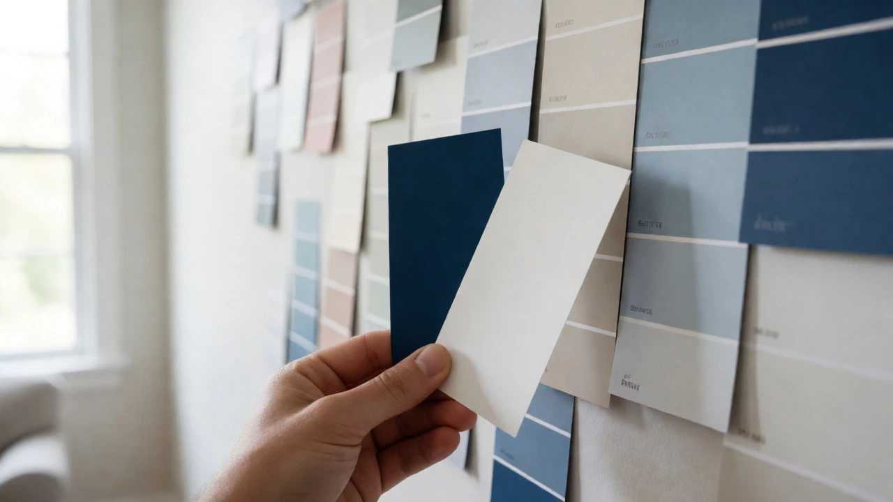
Staring at a wall of paint chips can feel like trying to solve a puzzle with missing pieces. You want your living room to look cohesive, stylish, and inviting, but the sheer number of options is paralyzing. The good news? You don't need a degree in art history to pick a winning combo. Most stunning interiors rely on just two main colors working in harmony. Whether you are aiming for a cozy retreat or a modern statement space, understanding how specific hues interact saves you from costly repaints and mismatched furniture.
The Science Behind Color Harmony
Before grabbing a brush, it helps to know why certain pairs work while others clash. It’s not magic; it’s geometry. The color wheel is the designer's best friend. If you place two colors opposite each other on this wheel, they create high contrast and energy-think blue and orange. These are called complementary colors. They grab attention but can be overwhelming if used in equal amounts. A safer bet is analogous colors, which sit next to each other on the wheel, like blue and green. These create a serene, unified vibe that feels natural to the eye because nature uses them constantly.
Then there are monochromatic schemes, where you use different shades and tints of a single hue. This looks sophisticated and clean but risks feeling flat without texture. The key takeaway here is balance. You rarely want a 50/50 split between two colors. Designers often use the 60-30-10 rule: 60% dominant color (walls), 30% secondary color (upholstery or curtains), and 10% accent color (pillows or art). Since we are focusing on two main colors, think of one as your foundation and the other as your personality.
Classic Combinations That Never Fail
If you want a safe starting point, some pairings have stood the test of time for good reason. Navy Blue and White is arguably the most versatile duo in existence. Navy adds depth and drama without being too heavy, especially when balanced by crisp white walls or trim. This combo works beautifully in coastal homes or modern apartments where you want structure but also airiness. It feels nautical without leaning into cheesy sailor motifs.
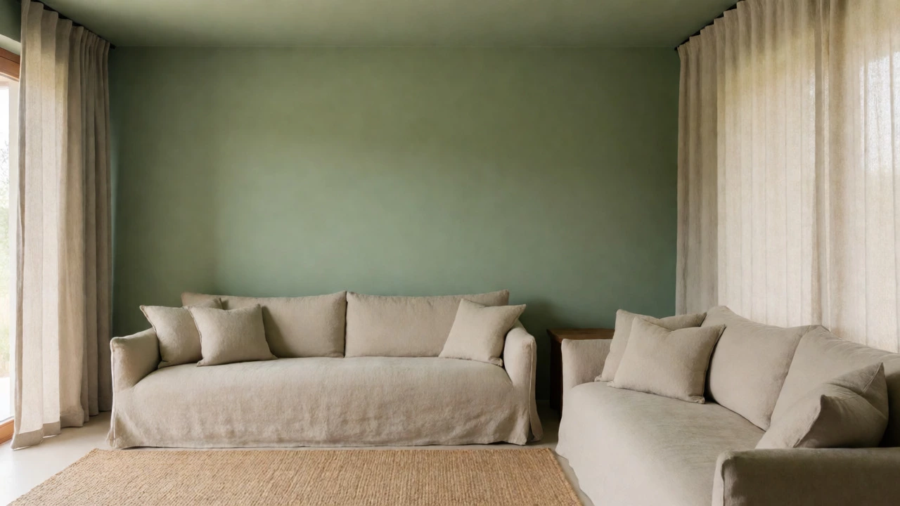
Another timeless favorite is Sage Green paired with Warm Beige. This earthy combination brings the outdoors in, creating a calming sanctuary. Sage isn't a bright lime; it’s muted, dusty, and soft. When mixed with beige, which acts as a neutral canvas, the room feels grounded. This is perfect for people who find pure gray too cold and stark white too clinical. It invites relaxation, making it ideal for family rooms where you spend evenings unwinding.
Modern and Moody Pairings
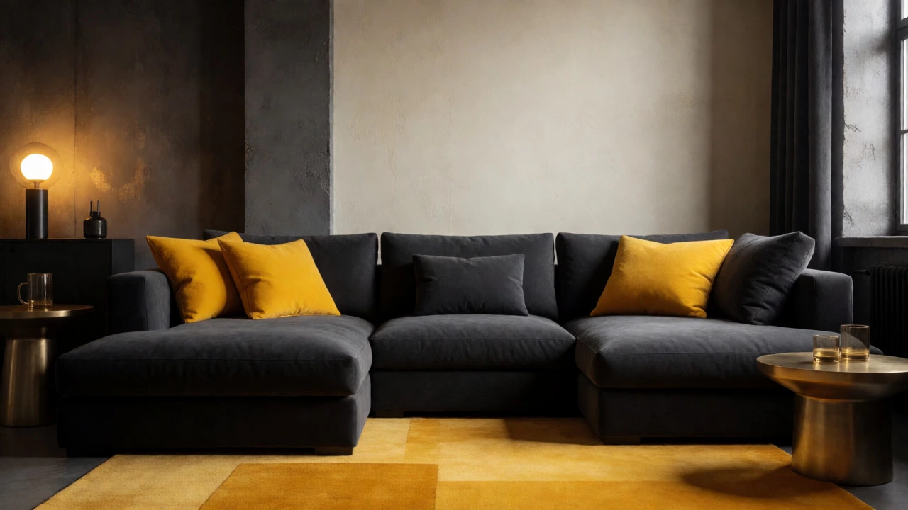
For those who prefer a contemporary edge, darker tones are having a major moment. Charcoal Gray and Mustard Yellow offer a bold industrial feel. Charcoal provides a serious, masculine base, while mustard injects warmth and vibrancy. Use charcoal on larger surfaces like an accent wall or a large sofa, then bring in mustard through throw pillows, a rug, or artwork. Too much yellow can induce anxiety, so keeping it as the secondary color prevents visual fatigue.
If you lean towards minimalism, try Black and Cream. Unlike black and white, which can feel harsh, cream softens the intensity of black. This pairing screams sophistication. Picture a sleek black leather sectional against creamy plaster walls. Add metallic accents like brass or gold to bridge the gap between the dark and light elements. This look requires discipline; clutter will ruin the effect, so keep lines clean and spaces open.
| Primary Color | Secondary Color | Vibe | Best For |
|---|---|---|---|
| Navy Blue | Crisp White | Clean, Coastal | Small spaces, bright rooms |
| Sage Green | Warm Beige | Calming, Organic | Family rooms, bedrooms |
| Charcoal Gray | Mustard Yellow | Bold, Industrial | Lofts, modern studios |
| Terracotta | Soft Pink | Warm, Trendy | Boho, eclectic styles |
| Forest Green | Rust Orange | Rich, Autumnal | Dining-living combos |
Using Lighting to Change the Game
Here is something many beginners miss: paint colors change throughout the day. A North-facing room in Melbourne receives cool, indirect light, which can make warm colors like terracotta look dull or muddy. In these spaces, you might need to choose brighter versions of your chosen palette. Conversely, south-facing rooms get intense sunlight all day, which can wash out pale colors. Here, deeper hues like forest green hold their own better.
Artificial lighting matters just as much. Warm bulbs (2700K-3000K) enhance reds, oranges, and yellows, making a cream-and-gold scheme glow. Cool bulbs (4000K+) emphasize blues and grays. If you pair teal with silver, stick to cooler lighting to maintain that icy, modern aesthetic. Always buy sample pots and paint large patches on your actual walls. Watch them morning, noon, and night before committing. It sounds tedious, but it beats repainting an entire room twice.
Texture Matters More Than You Think
You might think sticking to two colors limits your creativity, but texture offers endless variety. Imagine a living room painted entirely in Greige (gray-beige). It could look boring, right? Not if you mix materials. Use a velvet sofa in deep greige, a jute rug in lighter greige, and linen curtains in mid-tone greige. The play of light on different fabrics creates depth without introducing new colors.
This approach is particularly useful if you’re renting or afraid of commitment. You can swap out textured accessories easily. A chunky knit blanket in your secondary color instantly changes the room’s temperature. Leather adds shine, wool adds matte softness, and wood adds organic grain. By varying finishes-matte paint versus satin trim versus glossy ceramics-you keep the eye engaged even within a strict two-color limit.
Avoiding Common Mistakes
The biggest error people make is choosing colors that compete rather than complement. Avoid pairing highly saturated versions of both colors unless you want a circus-like atmosphere. Muted tones blend better. Another trap is ignoring the fixed elements in your room. Does your floor have reddish undertones? Then avoid green walls, as red and green together can look festive rather than refined. Instead, opt for neutrals that harmonize with your flooring.
Also, don’t forget the ceiling. Painting it the same color as the walls can make small rooms feel smaller, but leaving it stark white can break the immersion of a moody palette. Consider painting the ceiling a very light tint of your primary color to blur the boundaries. This trick expands the perceived height of the room while maintaining color continuity.
Frequently Asked Questions
Can I use more than two colors?
Yes, but keep it simple. Stick to two dominant colors and add a third only as a tiny accent (less than 10% of the room). This maintains cohesion while allowing for personality.
How do I match my existing furniture?
Identify the dominant color in your largest piece, like the sofa. Choose a wall color that contrasts slightly or matches closely. Use accessories in the second color to tie everything together.
Are gray and white outdated?
Not necessarily, but cool grays are fading. Warmer grays, often called greiges, are trending. Pairing gray with white remains classic, but adding wood tones or plants makes it feel current.
What if my room has no windows?
Opt for lighter shades of your chosen colors to reflect artificial light. Darker colors can make windowless rooms feel cave-like. Use mirrors to bounce light around.
How many samples should I buy?
Buy at least three shades of each color: one lighter, one true-to-sample, and one darker. Paint them on separate sections of the wall to see how they interact.
Next Steps for Your Redesign
Ready to start? First, assess your room’s orientation and lighting. Next, pick one anchor color based on your mood preference-calm greens/blues or energetic yellows/oranges. Finally, select a neutral or contrasting partner. Remember, paint is cheap compared to the stress of indecision. Grab those sample pots, tape them up, and live with them for 48 hours. You’ll know immediately which pair makes your living room feel like home.