Color Psychology in Home Design: How Colors Influence Mood and Style
Ever walked into a room and felt instantly relaxed or suddenly energized? That’s color psychology at work. The shades on your walls, cushions, and accessories do more than look good – they cue your brain to feel certain ways. Understanding those cues can turn a bland space into a place that supports your daily vibe.
Research shows that the brain reacts to color in the same part that processes emotions. Warm reds and yellows can boost energy, while cool blues and greens tend to calm you down. The effect isn’t magic; it’s a mix of cultural cues and how our eyes signal the brain. Knowing which hue does what lets you design rooms that match the activity you want there.
Understanding the Basics: Warm vs. Cool, Bright vs. Muted
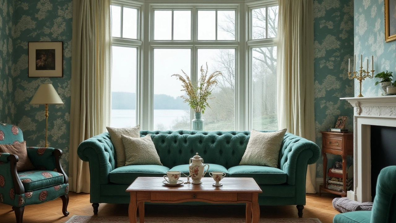
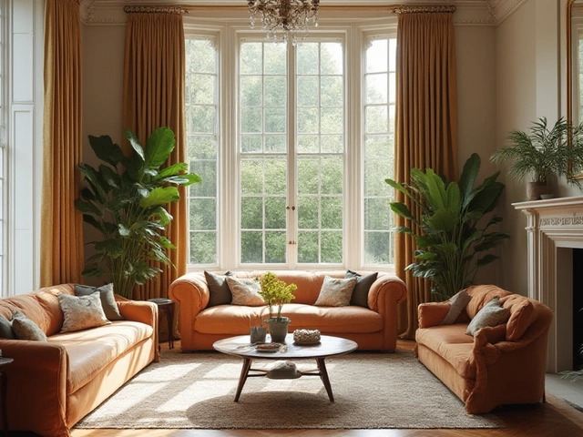
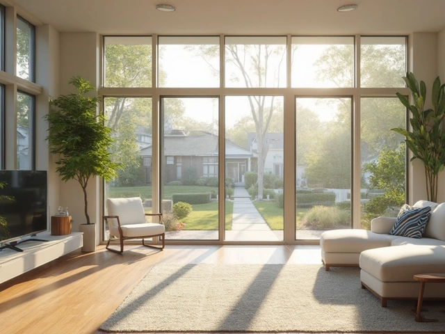
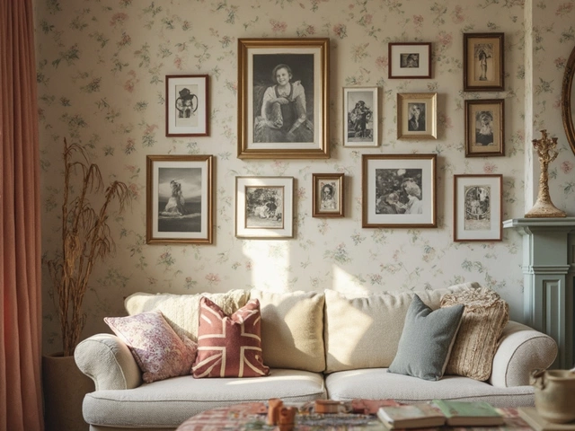
Warm colors – think reds, oranges, and golden yellows – create a sense of movement and intimacy. They’re great for spaces where you want conversation to flow, like living rooms or dining areas. If you love a cozy, lively feel, try an accent wall in terracotta or a bright mustard throw. On the flip side, cool colors – blues, greens, soft purples – signal calm and spaciousness. Use them in bedrooms or bathrooms to promote relaxation.
Brightness also matters. Highly saturated hues can feel energetic but may become overwhelming if overused. Pair a saturated shade with neutrals like white, gray, or soft beige to keep the room balanced. Muted tones, such as dusty rose or sage, give the same mood benefits without the visual punch, making them ideal for larger surface areas.
Applying Color Psychology to Every Room
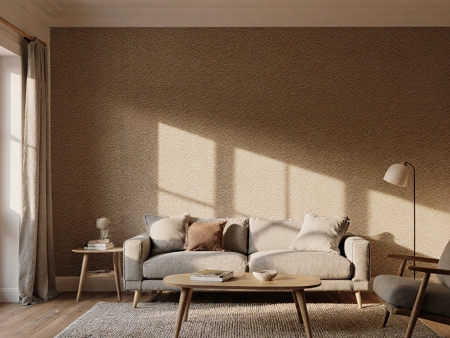
Living rooms thrive on a mix of social energy and comfort. Start with a neutral base, then add a pop of warm color through a rug, cushions, or artwork. If you want a more laid‑back vibe, lean on cool blues or muted greens for the walls and keep the furniture in natural wood tones.
Bedrooms are your sleep sanctuary, so calming colors win here. Light blues, lavender, or soft gray can lower stress levels. Add texture with textiles in complementary shades – a light teal duvet with a gray accent wall feels soothing without feeling flat.
In kitchens, you often want a balance of stimulation and cleanliness. Warm yellows can inspire appetite and conversation, while crisp whites keep the space feeling fresh. A pale green backsplash adds a subtle natural touch that doesn’t compete with the food prep action.
Bathrooms benefit from cooler tones that mimic water and sky. Pale teal, sea‑foam, or even a gentle sage can make a small bathroom feel larger and more spa‑like. Pair with bright white fixtures for a clean, crisp look.
All the posts under our "color psychology" tag dive deeper into these ideas – from modern decor palettes to lighting tricks that enhance hue impact. Browse the articles to see real‑world examples, budget‑friendly tips, and step‑by‑step guides that help you put color psychology into practice right now.